How to Create a Google Sheets Dashboard in 2026 (Jan update)

If a picture is worth a thousand words, then a dashboard is worth a thousand rows and columns of a spreadsheet. Dashboards make reporting easier, foster cross-collaboration in different business departments and increase productivity. With dashboards, you can make sense of a complex sheet of data. But how can you create it?
In this article, you'll learn how to create a Google Sheets Dashboard using three methods. As a plus, you'll get access to another modern tool that lets you create dashboards without hassle.
Already familiar with Google Sheets dashboards? Don't miss our review of the best 15 dashboards for Google Sheets.
What is a Google Sheets Dashboard?
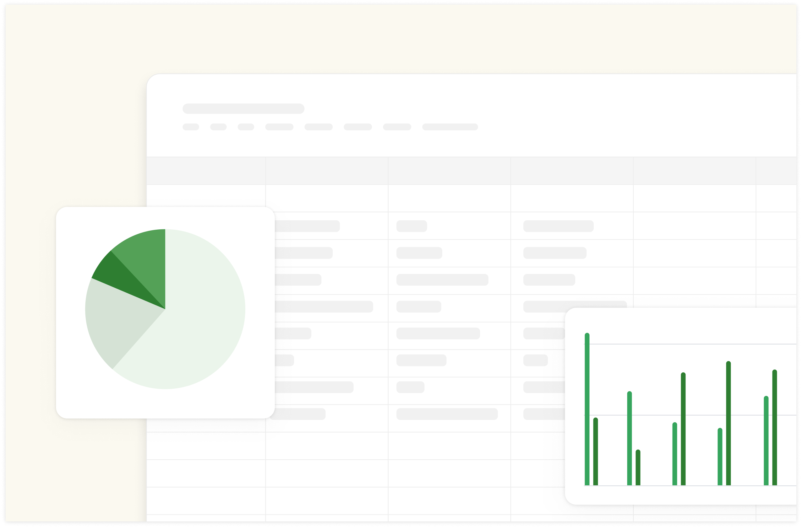
A Google Sheets dashboard is a data visualization tool created in Google Sheets that displays key metrics, KPIs (Key Performance Indicators), numbers, and important spreadsheet elements in a visually appealing and easy-to-understand format.
Google Sheets dashboard is where numbers become visual gold. Imagine not having to dig through 10 different sheets every time the boss asks, "How is the marketing campaign going?" That's the magic of a good dashboard.

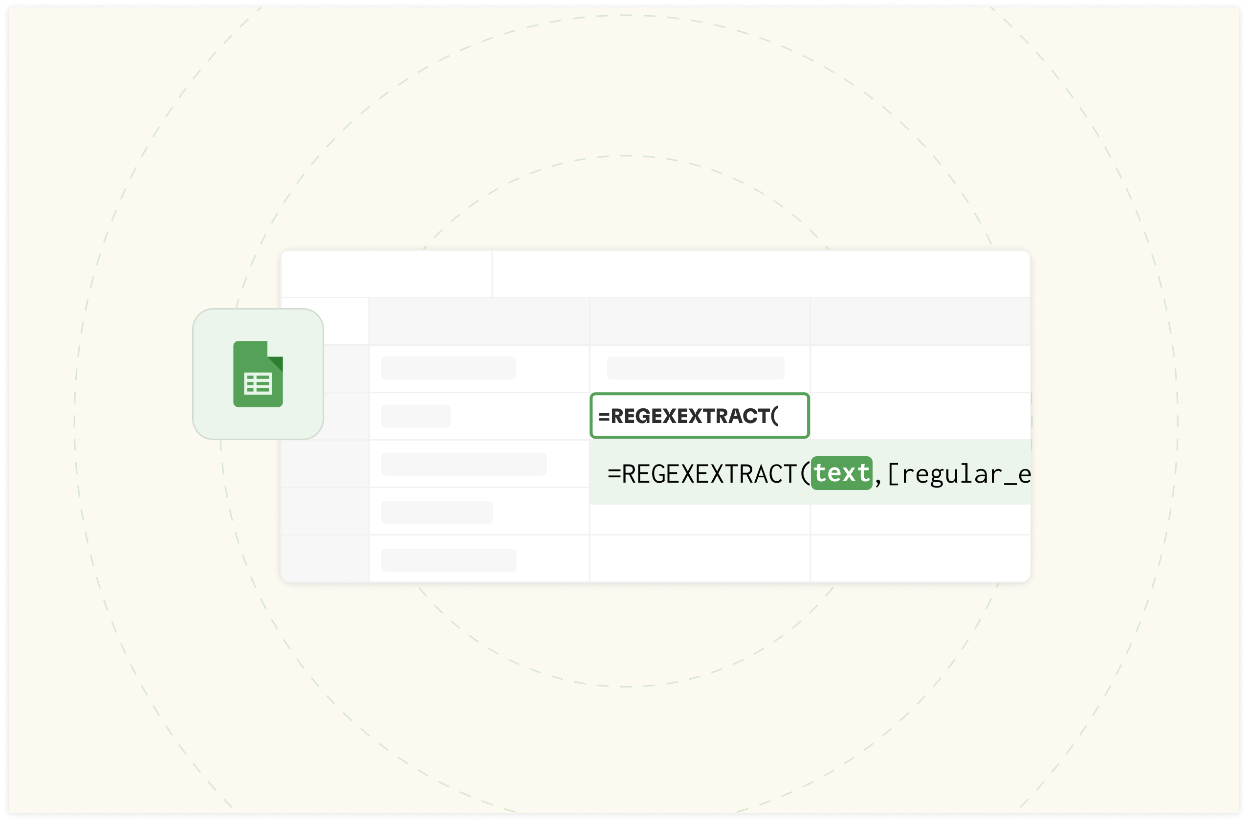
Build better dashboards faster
Aggregate and visualize live data from 50+ sources, automate analysis with AI and share it interactively with your team.
Try Rows for FreeWhat are the benefits of creating Dashboards in Google Sheets?
A well-crafted dashboard gives you a glimpse into the future of your business, research work, or personal work. What it does is simple — It spots trends before they become obvious and highlights issues before they blow up in your face. There's so much it does; here are the benefits below:
Accessibility and Collaboration
Google Sheets' cloud-based nature revolutionizes spreadsheet collaboration. That means you don't have to worry about delays in accessing reports from other teams in your organization. You can access it from anywhere: Office, home, or on-the-go. Additionally, multiple users can edit simultaneously because of the familiarity of the standard spreadsheet feature that makes everything easy to maintain.
Integration with the Google Suite
Google Sheets dashboards connect with the entire Google Workspace ecosystem. It helps you import data directly from Google Analytics, Google forms, Google slides, calendar, e.t.c. For example, you can link a chart, table, or slide from Google Sheets directly into a Google Slides presentation. Additionally, Google Looker studio is integrated and it has a drag-and-drop report editor for creating customizable dashboards and reports with interactive features like filters and date range controls
Cost-effectiveness
Google Sheets is a free tool, so creating a dashboard in Sheets can be a cost-effective solution compared to other software. It provides an array of features that might be premium on other tools, so it's cost-effective and very efficient.
How to Create a Dashboard in Google Sheets?
To create a dashboard in Google Sheets, you'll need to follow either of the three methods below:
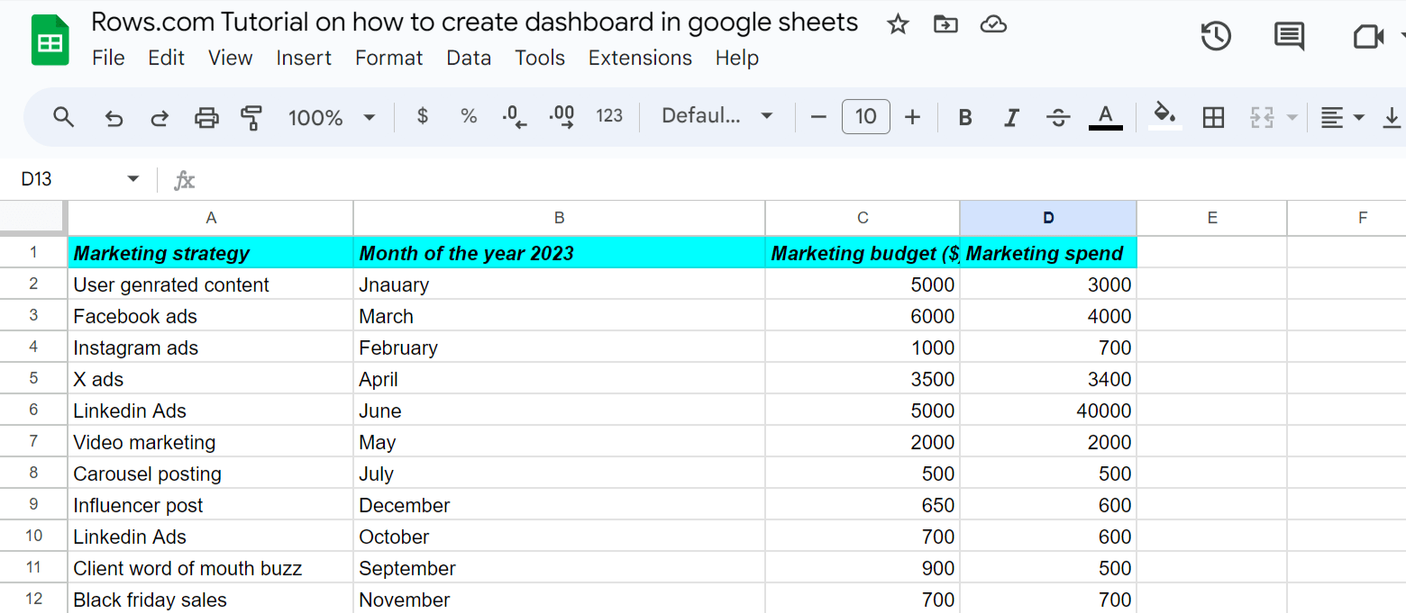
Step 1: Prepare your data
The first step to creating a dashboard on Google Sheets is to prepare your data. Clean fluffs in your data and ensure that your inputs are accurate. You can create a new spreadsheet or import data from a CSV Google form or GA4.
For example, here's what my data looks like for this step-by-step guide:
Step 2: Highlight your data and click “Insert”. Afterwards, look for “Chart” and click it.
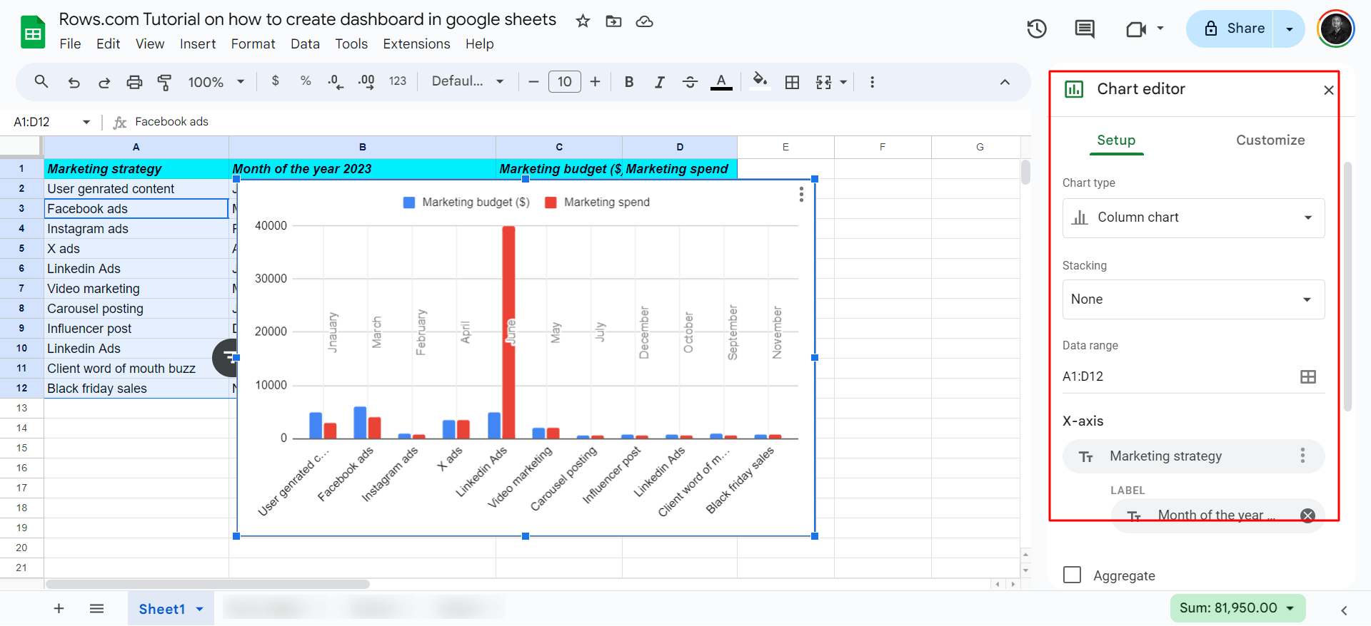
Step 3: After the previous step, you'll see a side panel of the Chart editor. With this editor, you can customize your chart to suit your taste.
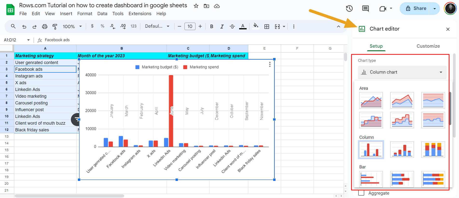
Additionally, you can choose the type of chart you want — ranging from pie chart, column chart, line chart, area chart, scorecards e.t.c
Step 4: After editing your chart, click on the “three dots" on the top left corner of your chart. Click “Move to your sheet”. However, you can publish a chart, which is not ideal because it's too slow.
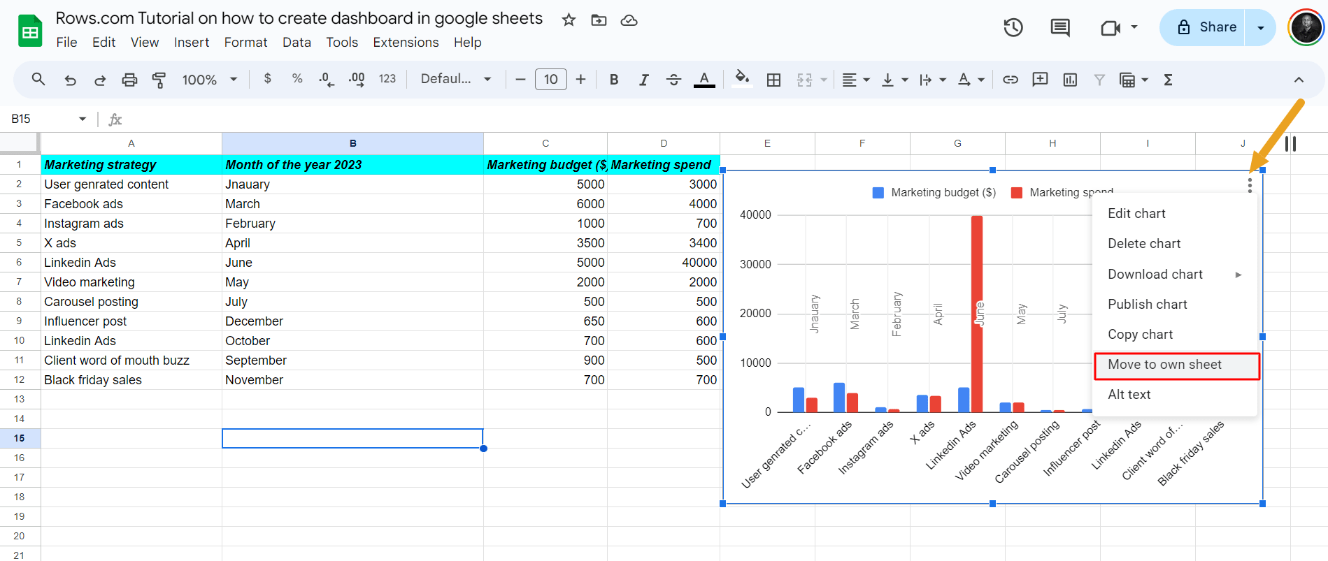
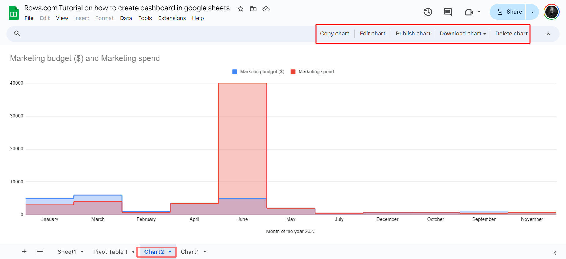
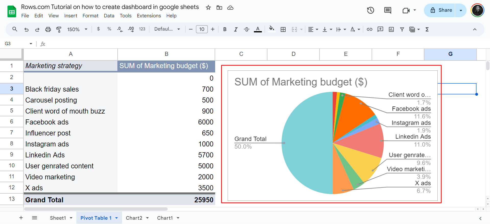
So, opt for “Move to own sheet”. Once you do that, you'll get a separate tab for all your charts. For example, I had already created a first chart of the report in a different chart format.
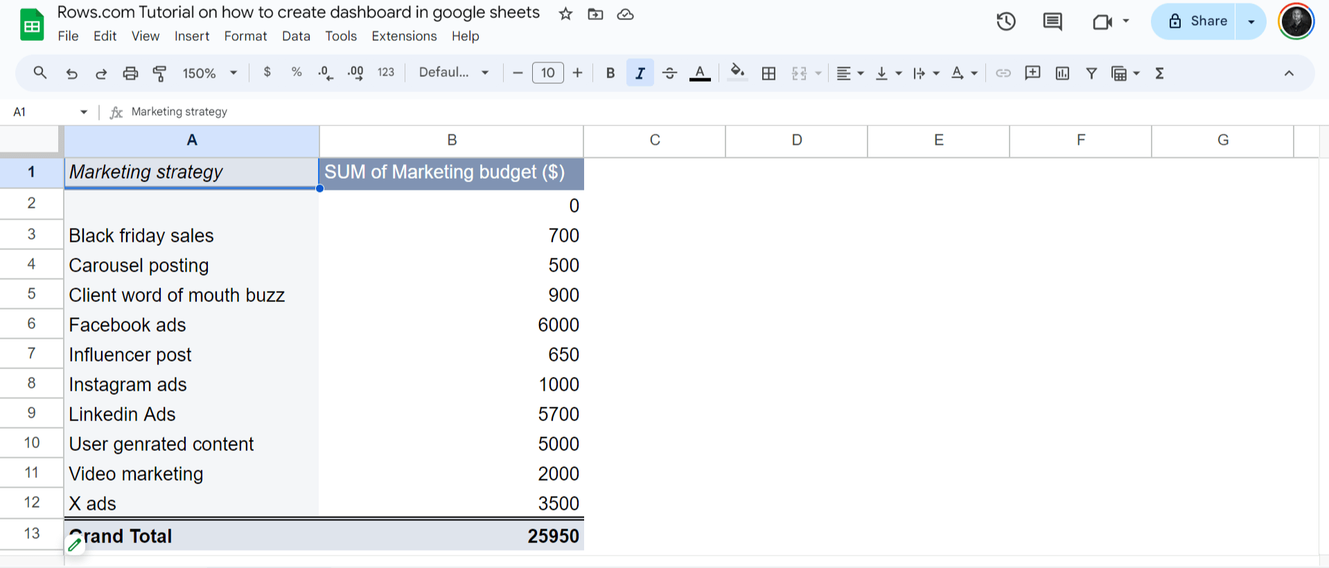
Pro tip💡: Use Pivot tables to add data summarization to your dashboards. You can use pivot tables to create a dashboard in Google Sheets in three easy steps.
The first step is to create a pivot table in Google Sheets
How do you do that?
Go through this step-by-step on how to create a Google Sheets pivot table in Google Sheets.
After creating your pivot table, it will look like this based on the filters you choose:
After this, follow step 2 above in the first method of creating a dashboard in Google Sheets— Highlight your pivot table by pressing Ctrl A. Then click Insert and choose Charts.
Once done, you'll see a pop of your chart in a suggested chart type by Google Sheets.
And here you go! Your dashboard is ready.
ICYMI: How to use the Google Sheets QUERY function [2025].
Drawbacks of Using Google Sheets for Dashboarding
Here are the top 3 drawbacks of using Google Sheets for dashboarding:
Poor UI
Unlike other dashboarding software, elements on Google Sheets often overlap and take time to build a tidy layout.
Missing Automation
Google Sheets comes short when it comes to automate data ingestion and aggregation from multiple sources. Plus, in the AI era, Google Sheets fails to automate an otherwise manual job. It lacks AI-powered features that help you extract insights from your data.
Lack of advanced visualization features
While Google Sheets offers good charting capabilities, it falls short when creating interactive and error-proof visualizations: there is no handy way to share a fully-working dashboard without exposing its full logic.
So, moving to a tool like Looker becomes a mandatory choice to get robust features for creating compelling visualizations.
Build Dashboards Easily with Rows
Rows is a comprehensive AI data analysis platform, that uses a spreadsheet backbone to give business teams autonomy over their data.
It comes with a tidier UI, automated data ingestion capabilities, and native AI copilot that make analyses and reporting 10x more accessible and faster.
Rows Top Features for Creating Dashboards
When it comes to building dashboards, Rows comes with five main killer features:
1. Data ingestion via AI
You can pull and aggregate data from 50+ sources thanks to built-in data integrations, most of which are also supported in our AI copilot:
Marketing: GA4, GSC, Facebook, Instagram, TikTok e.t.c
Finance: Stripe and Plaid (over 12k banks supported)
Productivity software: OpenAI, Notion, Slack, Email, Translate
Data Warehouse: MySQL, BigQuery, PostgreSQL, Snowflake, Amazon Redshift
And many more.
In the following use cases, we use Rows built-in data integrations to fetch data from popular analytics, productivity and social platforms. The thing that
Using the Google Analytics 4 integration, you can build reports in seconds, just by asking:
Other examples include:
Pull Query data from Google Search Console
Import Google Ads campaign metrics:
💡 Pro tip: With Rows you have the possibility of creating custom connections via our HTTP functions (GET, PUT, POST, PATCH) making the catalog of integrations virtually infinite. Try it yourself in the tool embedded below. See it building an API just using plain English:
2. Modern UI
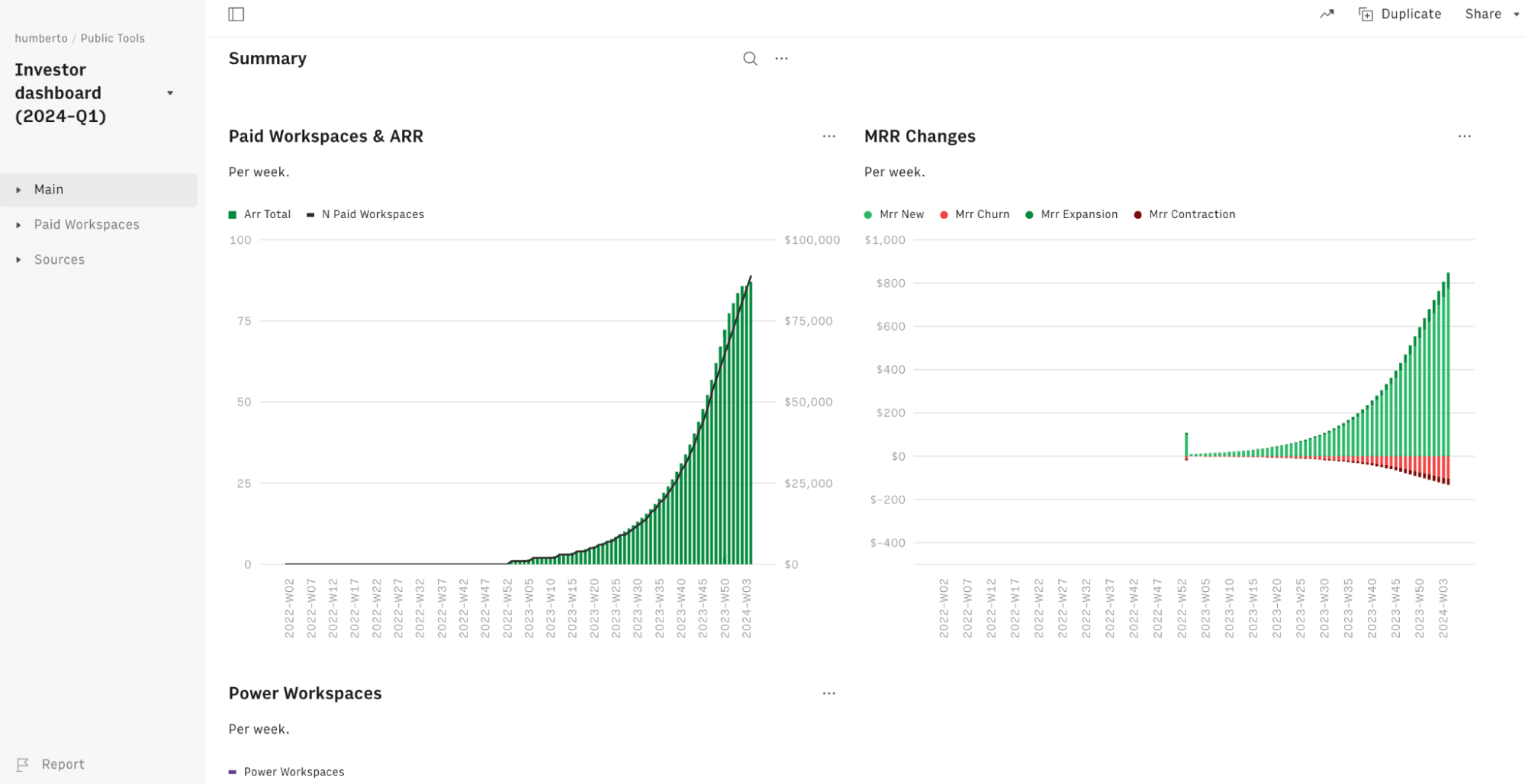
Spreadsheets in Rows present a document-like layout with standalone tables and charts that are stacked vertically and horizontally.
WYSIWYG: the spreadsheet IS the dashboard. All data is rendered as regular spreadsheet tables. And you can move elements vertically and horizontally with drag&drop. And if something breaks, you can intervene on that table or chart very flexibly, without the need to dive into complex workflows.
Watch it arrange a client-ready report from scratch:
3. Easy data manipulation
Compared to other dashboard tools, like Looker or Metabase, both the setup and the maintenance are easy and quick because they leverage familiar spreadsheet features and structure:
Data is retrieved through regular authentication.
Each table can be automated via a scheduled refresh.
If you want to plot existing data, you can do it just by selecting the entire table content and inserting a chart. If you want to add a column in any table with a calculated metric that is not included in the data source, all you need to do is to add a Formula Column and use regular spreadsheet formulas, like VLOOKUP or SUMIFS.
If you want to apply specific (conditional) formatting freeze a row, or create a Pivot table, you do so as in any regular spreadsheet.
Click here to learn How to create a pivot table!
4. View mode
This mode lets you share a dashboard that looks like a web app: thanks to input fields, visitors can interact with the spreadsheet without the risk of breaking its logic (example). The following dashboard combines multiple charts side-by-side and is fed directly by a BigQuery SQL Query.
To view the dashboard above, click here!
5. Embed
With embed you can re-use dashboard components and embed them in Notion, Confluence, or any other HTML-ready doc. Watch the video below:
How to Build a Dashboard on Rows
To build a dashboard in Rows, follow the steps below:
Step 1: Prepare your data.
Ingest data into the spreadsheet by importing existing data from integrated apps like Google Search Console, Notion, or CSV — or by creating a new spreadsheet.
See the following example using Google Search Console data:
Step 2: Use the AI Analyst to automate summaries and pivot tables. Click on the ✨icon in the top right corner of any table and use natural language to describe the table you want to add, as follows
Step 3: Following the exact steps for creating a chart on Google Sheets — highlight your data, click “Insert,” and pick “Chart.” Once you do that, here's the pop-up below, with a side panel of the Chart editor.
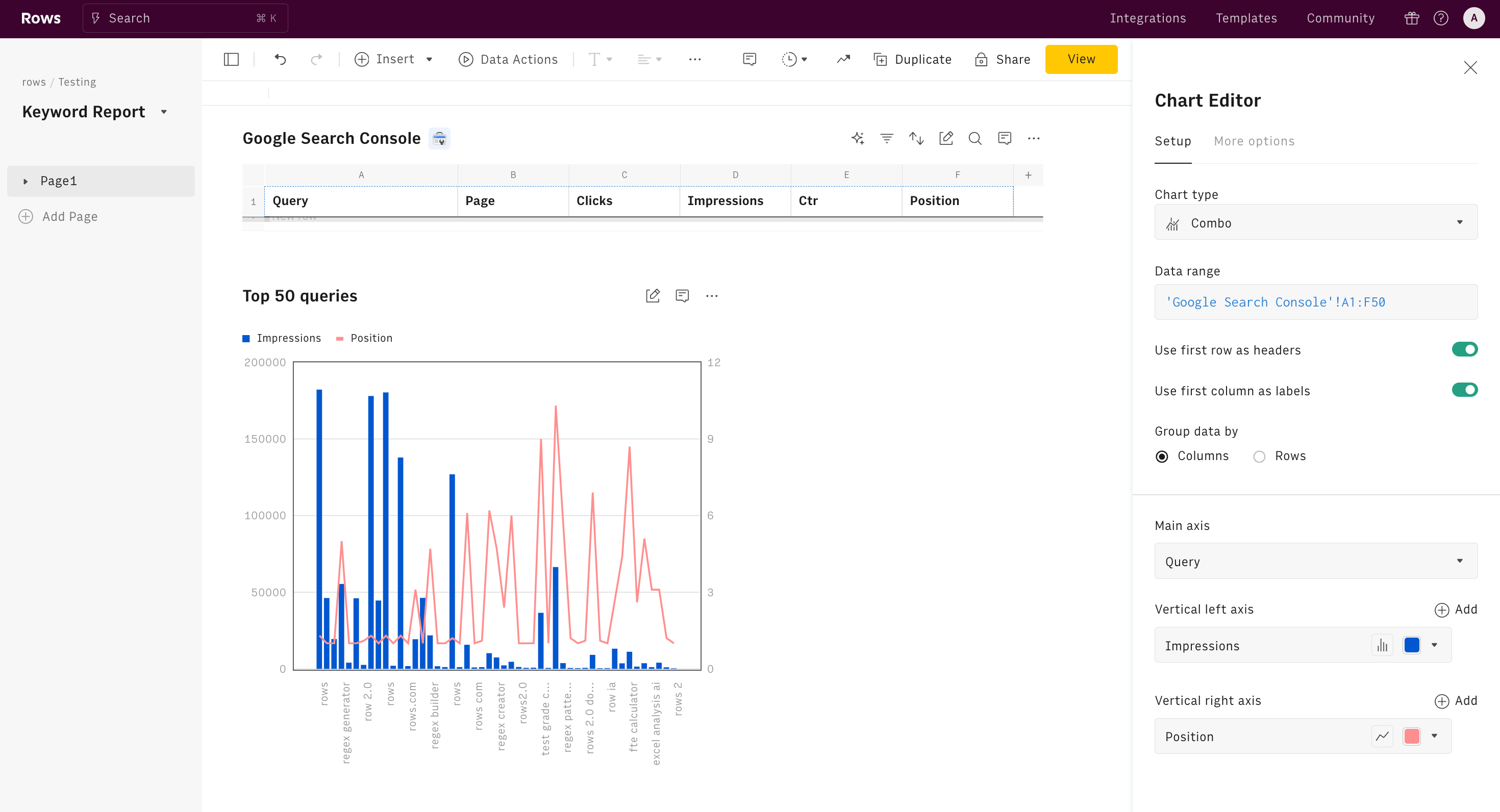
Once that's done, edit and set up your chart. You can edit the data range by excluding some rows or columns.
Compared to Google Sheets, the charts on Rows stay below your main sheet in a tidy manner, so you wouldn't need to go to another tab to view charts. Use drag and drop to easily reorder elements in the dashboard.
Build better dashboards faster
Aggregate and visualize live data from 50+ sources, automate analysis with AI and share it interactively with your team.
Try Rows for FreeUsing Rows Dashboard Templates
As pointed out earlier when I told you about the top features of Rows, our tool comes with over 50+ integrations to make it easier for you to create reports in split seconds. With these integrations come dashboard templates for your reports in business.
So, how does it work? To show you that, we'll walk you through a few dashboard templates:
1. Website Analytics Dashboard
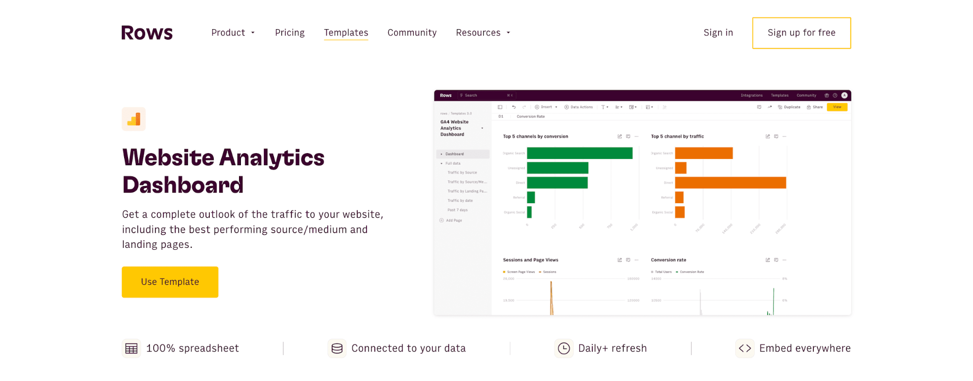
Whether you are curious about your best-performing landing pages, your site's bounce rate, or other SEO details, the Rows dashboard template makes it easy to access them.
Interested in marketing analytics? Discover our additional dashboards:
2. YouTube Analytics Dashboard
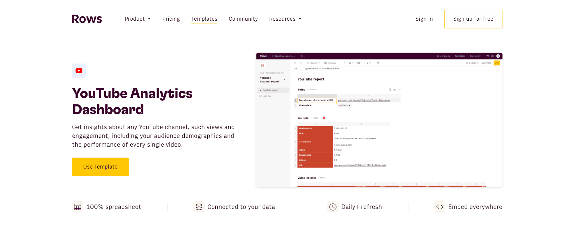
This dashboard visualizes insights about your YouTube channels, from views, engagement, and audience demographics to other key performance indicators.
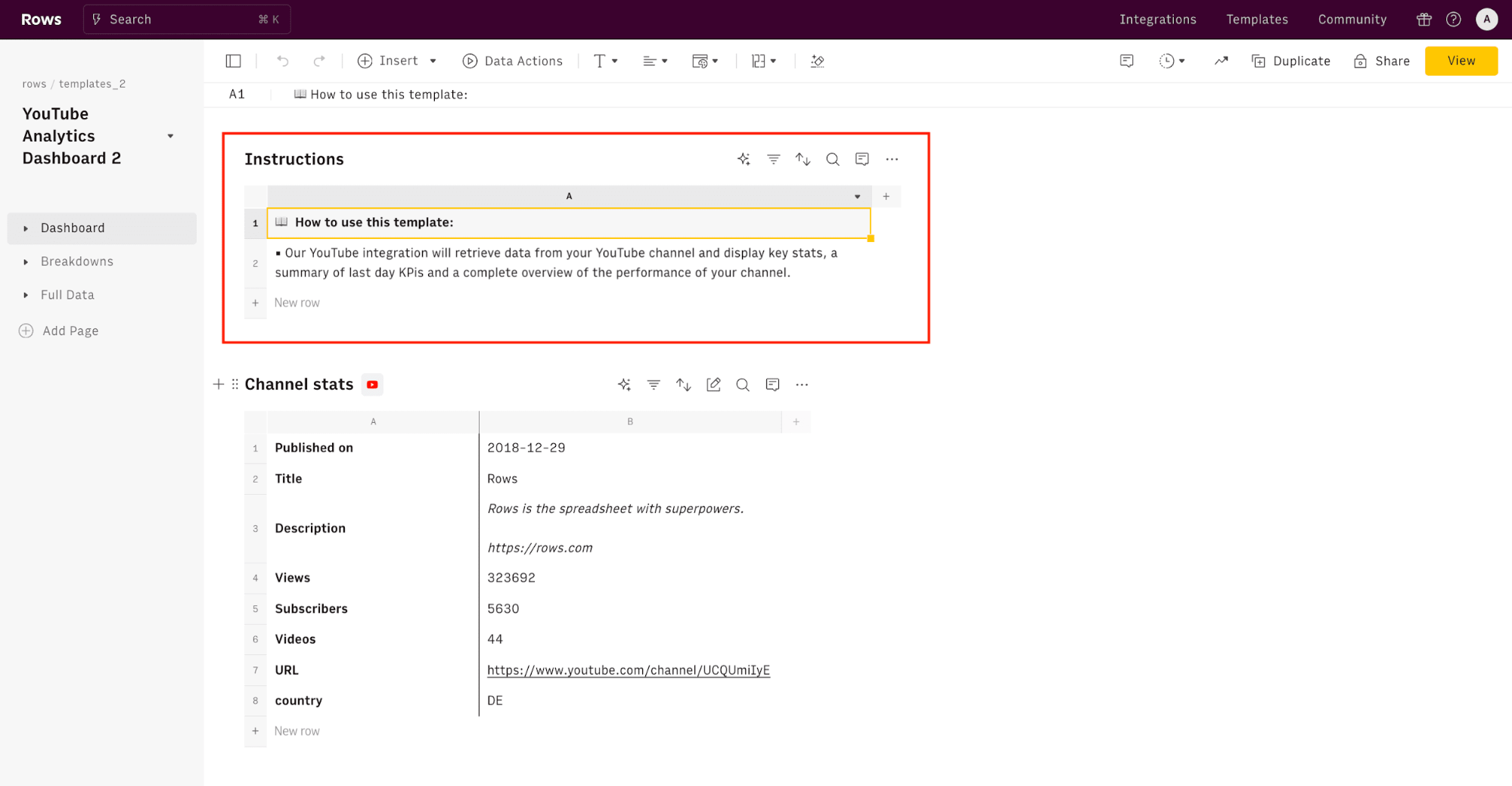
All you have to do is click “Use Template.” Once you've done this, you'll see a tidy dashboard overview with an already prepared dashboard showing your channel stats. However, you must integrate your YouTube channel with Rows to use this template. Worry not; it's safe, as we have data regulations.
Try also our YouTube Subscriber Tracker
3. LinkedIn page analytics dashboard
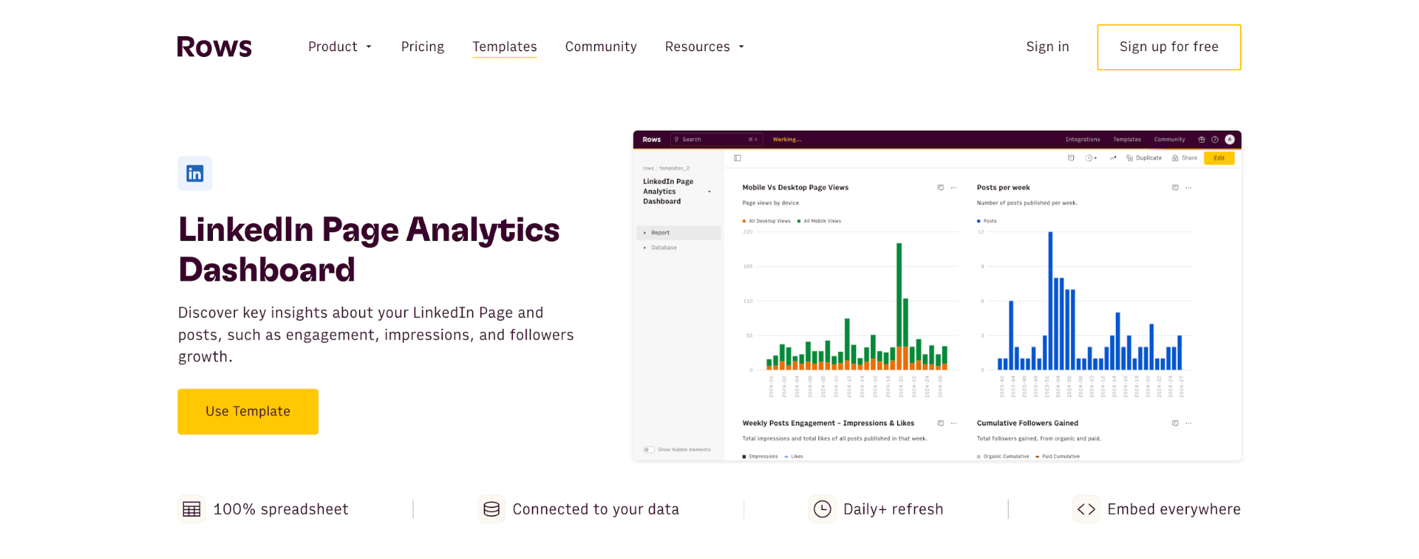
With the LinkedIn page analytics dashboard, you can get a bird's-eye view of your company's LinkedIn page's performance.
Are you active on other social media? Discover other social media dashboards:
You may also be interested in:
50 Free Marketing Templates You Can Use in 2025
20 Free Spreadsheet Templates for Google Sheets, Excel, and Rows in 2026
Get Started with Rows
Creating multiple dashboards gets easier with Rows. With Rows.com, you can easily manipulate your data using our built-in AI analyst. And, of course, we offer you a variety of dashboard templates to meet your everyday business tasks.
Ready to get started with Rows.com? Start using the product right away for free