9 Best Airtable Alternatives & Competitors in 2025

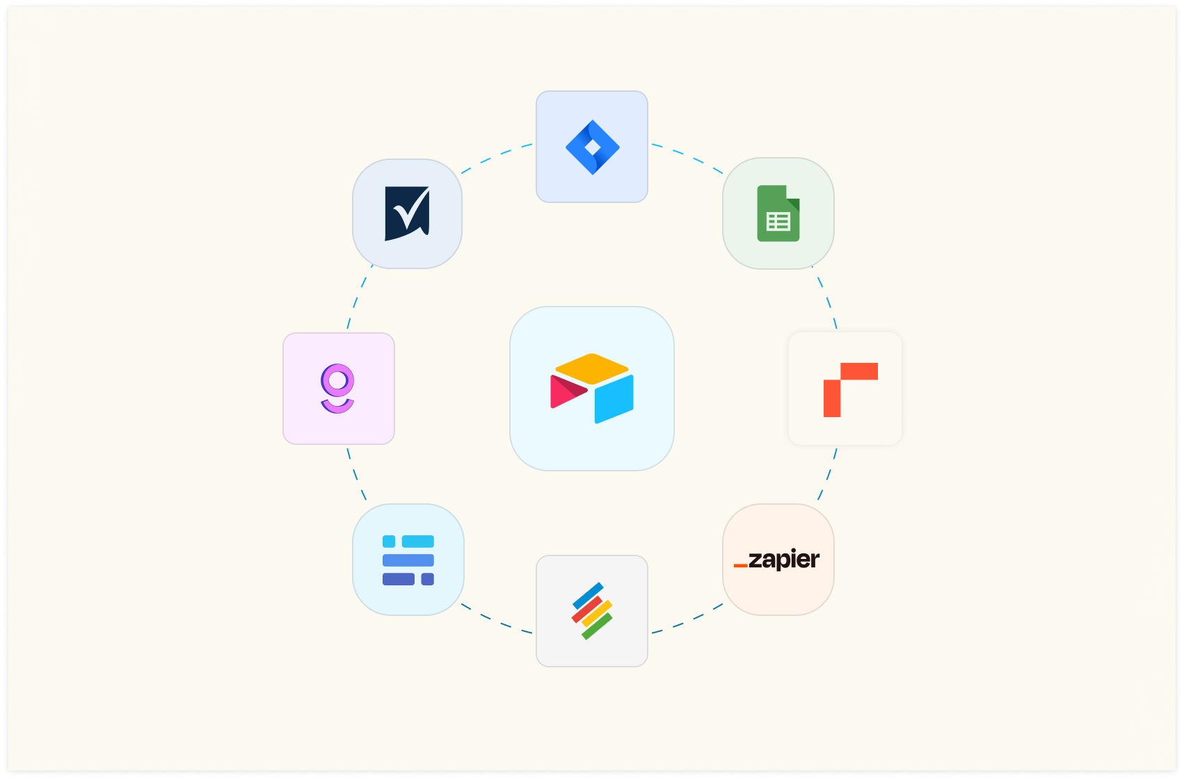
Airtable positions itself as a next-generation app-building platform to transform work processes. It empowers teams with no technical background to develop apps using shared data, streamlining critical workflows.
When you build an app, you usually start with the database: in Airtable, databases are called “base.” They are extremely easy to build: you set up columns, properties, type of data and build relations quickly. And if you want a head start, a gallery of helpful templates comes in handy.
Airtable helps you to solve use cases for which regular spreadsheet software is used improperly (e.g., to build a lightweight CRM or to track progress on a project) either due to the lack of 3rd party integrations or because of missing database-type or workflow-oriented features (such as JOIN or task assignment).
However, Airtable may fall short when you need the flexibility to transform, analyze, and visualize data.
In this article, I will tell you why you need to look for an Airtable alternative and discuss the top alternatives in the market.

Your new AI Data Analyst
Extract from PDFs, import your business data, and analyze it using plain language.
Try Rows (no signup)Why Do You Need An Airtable Alternatives
There are three main reasons why you might be looking for an Airtable alternative:
Airtable can’t transform and analyze data in a flexible way.
Airtable has record count limits.
Airtable has data sharing limitations.
Let’s deep-dive into each of these limitations. 👇
Reason 1. Airtable Can’t Transform and Analyze Data In a Flexible Way
Airtable is great to solve some improper usage of spreadsheets, such as database applications, lightweight CRM, form collection, and more, but it has its limitations when it comes to data analysis and transformation.
The primary reason for this is that Airtable is designed as a database, not as a data analysis tool, which can lead to challenges when attempting to perform complex data transformations or visualizations.
One of the main issues with using Airtable for data analysis is the difficulty in manipulating data across multiple tables.
Airtable's relational structure is a significant advantage for organizing data, but it can make it challenging to perform complex calculations or transformations that involve multiple tables.
Reason 2. Airtable has Record Count Limits
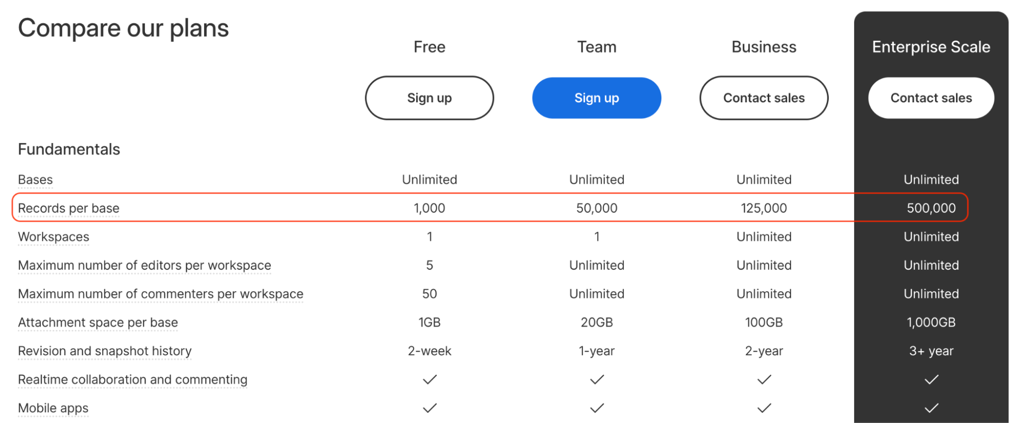
Airtable has a record limit for each table, which varies depending on the subscription plan. For example, the Team Plan has a limit of 50,000 records per base, while the Business Plan allows for 125,000 records per table.
The limitation generates a flexibility issue that forces you to trade off different use cases based on the usage limit. This means that you may have to decide to move some use cases to other tools and keep some in Airtable, and this causes inefficiencies.
If you need to store more data than the limit allows, you must consider an alternative solution or find workarounds to manage your data within the platform.
Reason 3. Airtable has data sharing limitations
When you share access to your Airtable with anyone, you give them full-blown access to your entire base.
What does this mean?
If you have clients, you’re working with and want to share some information with them but don’t want to share everything your database has, or if you have an intern you want to share specific data with, you can’t do it with Airtable.
The most you can do with Airtable is to share the sheet as Read-only, which is good only for seeing what a section of the document has. But the problem here is they can only see and not edit the read-only file.
What are the Best Airtable Alternatives and Competitors
Some of the best alternatives to Airtable are:
Rows – The easiest way to analyze data on a spreadsheet.
Gigasheet – Comprehensive big data spreadsheet software.
Google Sheets – Cloud-based free spreadsheet editor
Zapier Tables – Lets you store, move, and take data-related action.
Spreadsheet.com – A more flexible and familiar alternative to Airtable.
Stackby – Enterprise-grade spreadsheet software.
Smartsheet – A visual and dynamic Airtable alternative.
Jira – Agile project management software that makes it easy to visualize data.
Baserow – Open-source alternative to Airtable
In my research, I found out that users look for Airtable alternatives to solve two different use cases :
Data transformation and analysis
Workflow building
Let’s discuss the tools available in the market for both these categories.
Category 1: Airtable Alternatives for Data transformation
1. Rows
Rows is a spreadsheet software and, as such, it provides extra flexibility when it comes to transforming and visualizing/sharing data.
Like Airtable, Rows adds data connection capabilities to make itself well-integrated with the tools and workflows that modern teams use daily.
Here are some of the features that Rows offers:
Feature 1. Data Integration
Rows seamlessly integrates with over 50 data sources allowing you to import and export live data into or from the spreadsheet with effortless automation for data refresh.
All data connectors in Rows are built-in native features. You don’t need an external add-on to use AI in your analysis.
Curious about how Rows pulls this off?
It handles JSONs in the grid and converts them into table format.
This feature comes in handy and saves time when building recurring reports or handling messy CSVs.
Some examples of data integration in Rows are:
Import Google Analytics 4 data to Rows and get key analytics and reporting. Pick one of the recommended reports or build your own custom view as follows:
Or you can:
Connect your LinkedIn page and track comments to your posts.
Connect Slack to Rows and set alert automation to your #social channel whenever a new comment appears on your social media posts. All from a spreadsheet.
Import a Notion database in Rows with a few clicks, enrich data, and send it back to Notion.
The HTTP source sends GET, POST, PUT, and PATCH requests to any endpoint using basic or API token authentication methods. This helps you retrieve data from tools that aren’t in the Rows catalog.
See how it works in the interactive demo below:
You feel ready to try it yourself?
💡 Try to make a GET request yourself with our HTTP Request Tester: input the endpoint, the headers and params and visualize the content of the response in a cell.
Feature 2. Inbuilt AI to Solve Complex Problems
AI, being a part of Rows, ensures that using spreadsheets and analyzing data becomes easy for non-data-friendly users as well. The platform lets you explain what you want to calculate in plain, simple English rather than formulas.
Also, there’s no need for a third-party plugin to use AI in Row; it’s all built-in.
There are three main AI components you get to use with Rows:
1. AI Functions
Rows comes with 14 proprietary AI functions that automate prompts and address specific types of tasks.
One such function is – EXTRACT_OPENAI, which helps you extract an element from text.
Similarly, you can also execute sentiment analysis on a social media comment or product review using the function – SENTIMENT_ANALYSIS_OPENAI or clean up data using APPLY_TASK_OPENAI.
Discover more about all possible use cases of AI in Rows.
2. AI Analyst
With the AI Analyst, you ask AI to analyze, summarize, transform, and enrich your analysis. Click on the "AI Analyst“ ✨ icon, at the top right corner of any table.
A chat interface will open on the right: you can ask a broad range of questions, from basic spreadsheet commands - plotting a chart or adding or formatting columns - to more complex tasks, such as slicing, pivoting, or computing metrics about your data.
For example, given a dataset with daily revenue and costs of various marketing campaigns, you can ask the Analyst to add a column with the profit margin. Watch the video below:
In addition, our AI Analyst is instructed to use our native OpenAI functions to perform data enrichment or extraction tasks.
For example, you can ask the AI analyst to run a sentiment analysis on a column with product reviews, or add a column that categorizes addresses into regions, see below:
Want to know more about how our Analyst works? Check out our guide or watch our demo.
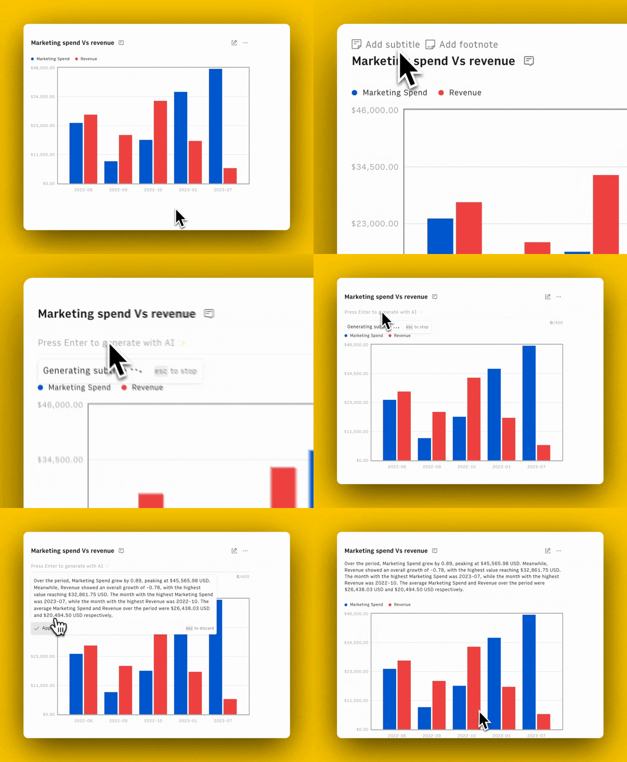
3. AI Subtitles
Ask AI to generate subtitles for your tables and graphs that include key insights from the data displayed.
Feature 3. Embed Tidy Tables and Charts
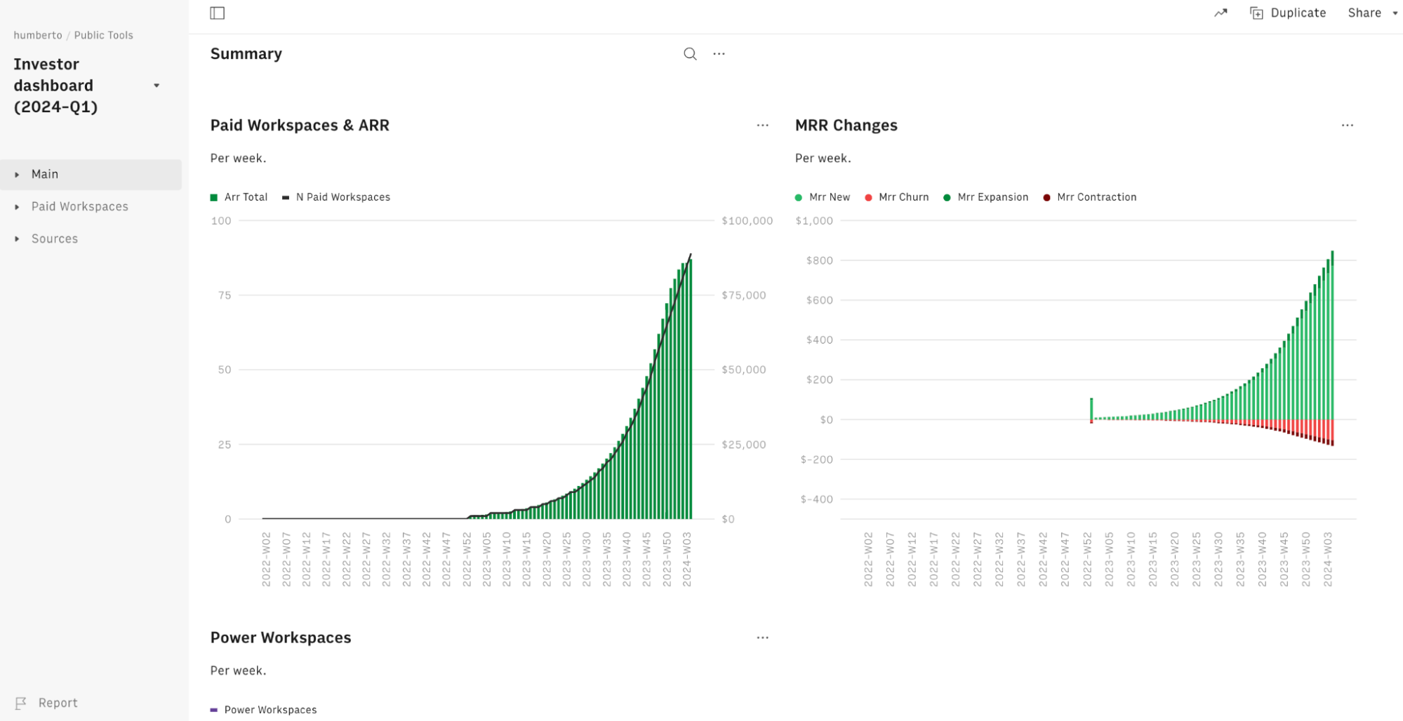
Rows layout lets you create dashboards that bridge the gap with modern data visualization tools but with the ease and flexibility of a spreadsheet.
The example below shows the template of our KPIs dashboard that we are currently using with Rows investors (but with dummy data):
Apart from this, you can also embed tables and charts beautifully on Notion, Confluence, website, wiki, or other internal tools that support iframes with ease.
It’s a simple 4 step process:
Choose Embed from the Settings menu that you see on the right-hand corner of the element you want to embed.
Switch the Share Privately toggle on.
Click <> Copy code. Use the Copy link to paste directly into tools that automatically embed via the link - e.g., Notion.
Paste the embed code on your website, wiki, or destination tool.
Here’s an interactive demo to understand better:
Learn how to use Embed in the most recent documentation tools, like Notion, Confluence, and Slite.
Pricing
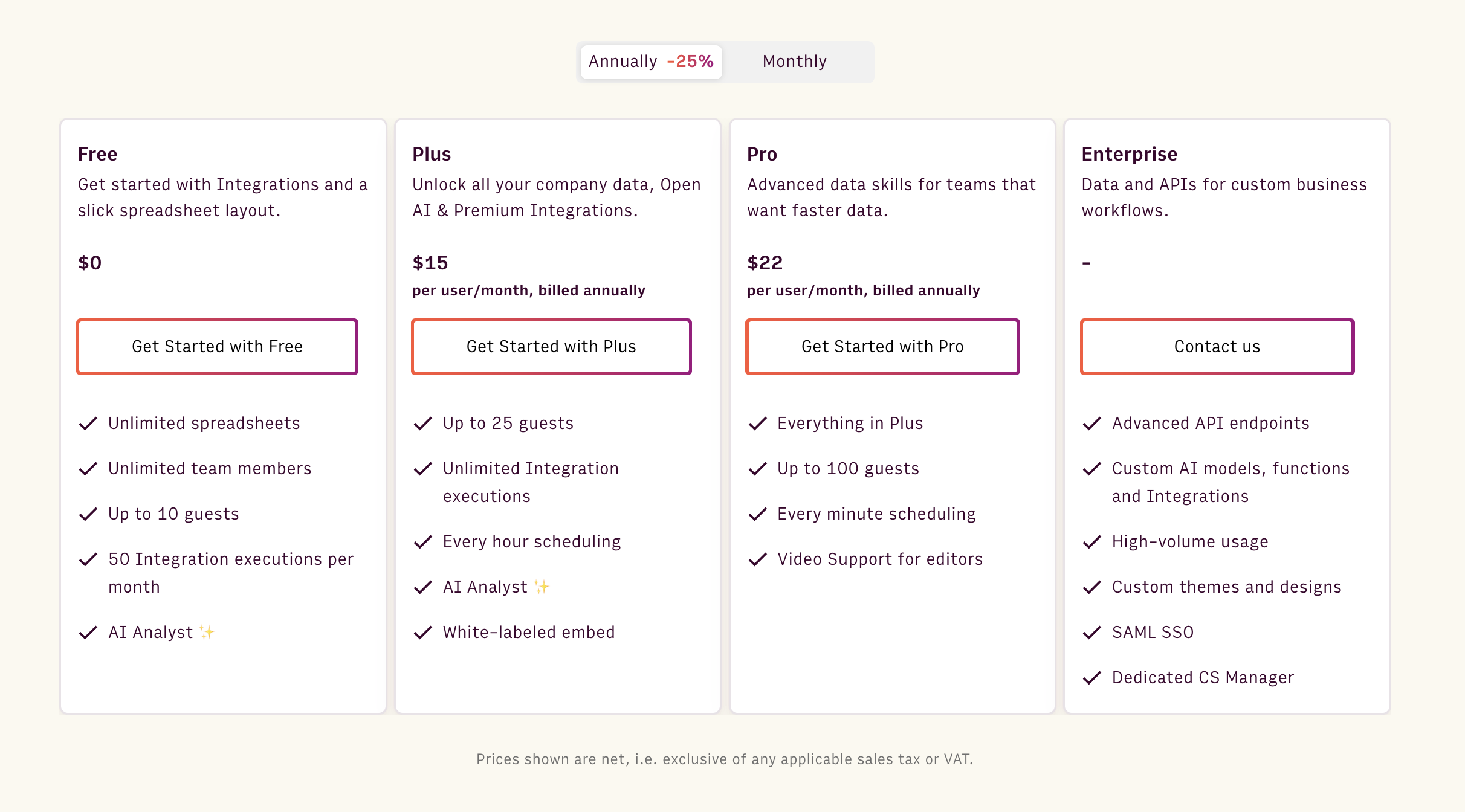
Rows offers a generous free forever plan that:
Lets you onboard unlimited team members
Add up to 10 guests
Create unlimited spreadsheets
Execute 50 integration tasks per month
But if you want to use data integrations at scale, want white-labeled embed, video support, and more, you must upgrade to one of the paid plans Rows offers:
Plus: $15/month/member, up to 25 guests, unlimited integration tasks & daily data refresh.
Pro: $22/month/member, up to 100 guests, unlimited integration tasks & hourly data refresh.
Enterprise: Custom price for advanced API usage and workflows.
How Does Rows Compare to Airtable?
Airtable is a winning solution when it comes to building a relational database (with respective data operations) and building workflows and processes.
Bases are easy to build – you set up columns, properties, and the type of data and build relations quickly. Airtable bases look like spreadsheet grids but are not as flexible and aren’t focused on transforming or summarizing data.
When it comes to data transformation and analysis, Rows is a better tool.
Rows has native integrations to fit modern teams’ tech stack; it uses AI so that anyone can analyze data and lets you display data elegantly with charts and graphs.
All in all, Rows and Airtable are adjacent to each other but don’t overlap completely.
Pros and Cons
✅ AI functions, Analyst, and subtitles make data analytics easy for beginners.
✅ Lets you make spreadsheets interactive using buttons, input fields, and data pickers.
✅ Has easy-to-use API, so you can import data into Rows from anywhere.
❌ Rows does not have a desktop app, which caps its performance with big chunks of data.
Curious to see Rows in action? Get a head start with our Google Analytics templates, such as SEO Backlink Checker or Social media report.
Wanted to try out ChatGPT on the grid? Use one of our templates and explore how to extract, classify, or clean up data using only natural language.

Your new AI Data Analyst
Extract from PDFs, import your business data, and analyze it using plain language.
Try Rows (no signup)2. Gigasheet
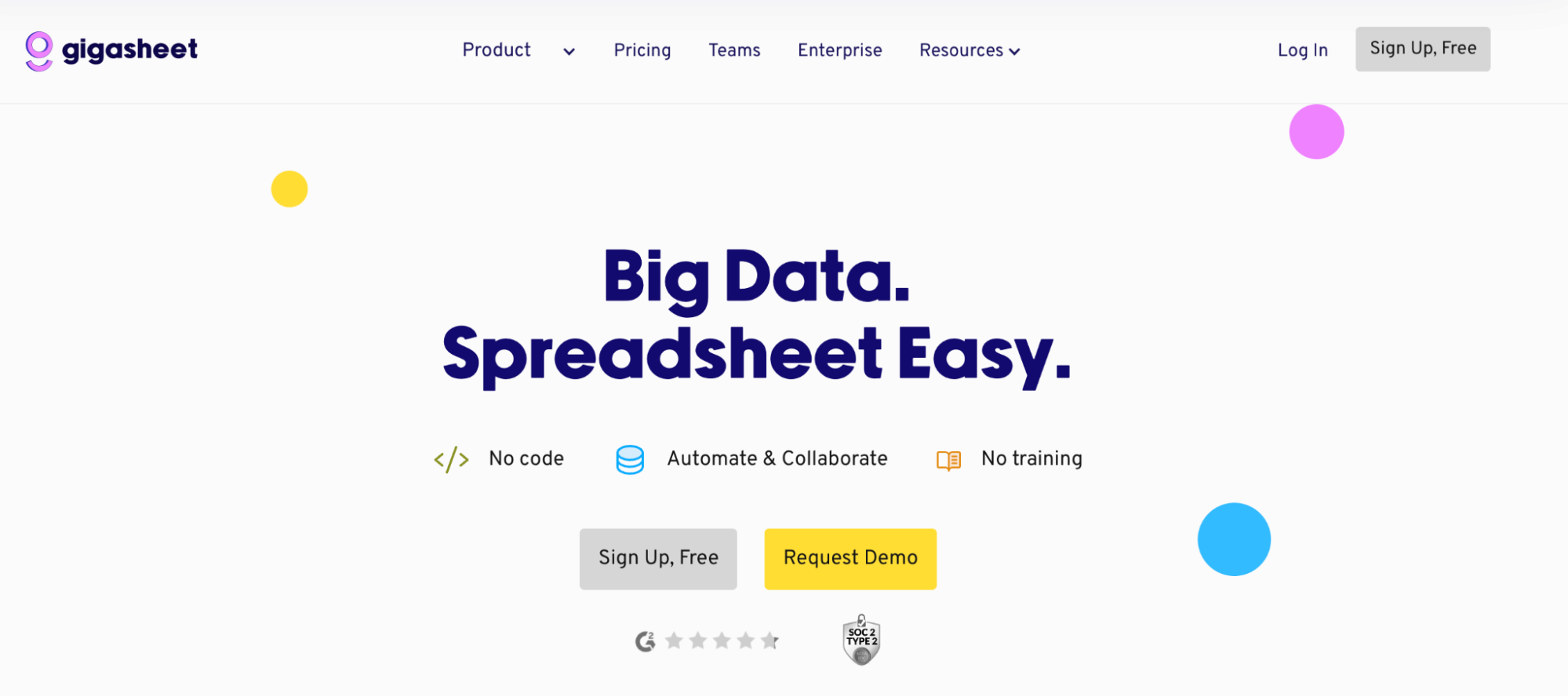
Gigasheet is a comprehensive big data spreadsheet software that can analyze up to a billion rows of datasets via filters, groups, formulas, and AI capabilities.
Features
Offers dedicated tools for data cleanup, ensuring your sheet is thoroughly prepared for in-depth analysis.
The filters and what/if functions allow you to build complex SQL-like queries for data analysis without requiring special syntax.
Gigasheet's AI assistant performs filtering, grouping, and aggregating processes on your request using natural language commands.
Use data enrichment tools to add context to existing data or fetch new data using ChatGPT, ReveneuBase, ScraperAPI, and more; get access to preset enrichment templates for email verifications, LinkedIn, and Geo IP.
Offers data security and version control features, allowing you to review or restore previous versions of your sheets if needed.
Pricing
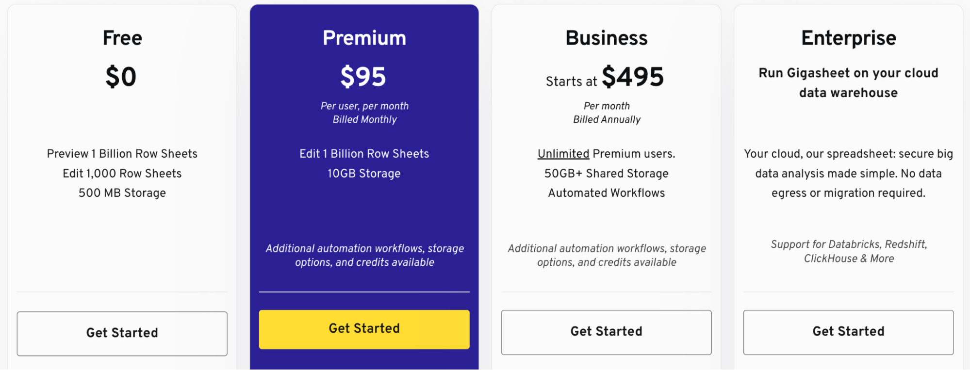
Gigasheet offers a free forever plan with 500 MB of data storage, AI assistance, and basic data analysis features. Apart from the free plan, it also offers three paid plans:
Premium: $95 per month
Business: $495 per month
Enterprise: Custom Pricing
Pros and Cons
✅ Gigasheet is easy to use and a scalable spreadsheet analyzer.
✅ Supports a wide range of file formats, including CSV, JSON, HTML, and more.
❌ Lacks advanced features and formulas for manipulating data..
3. Google Sheets
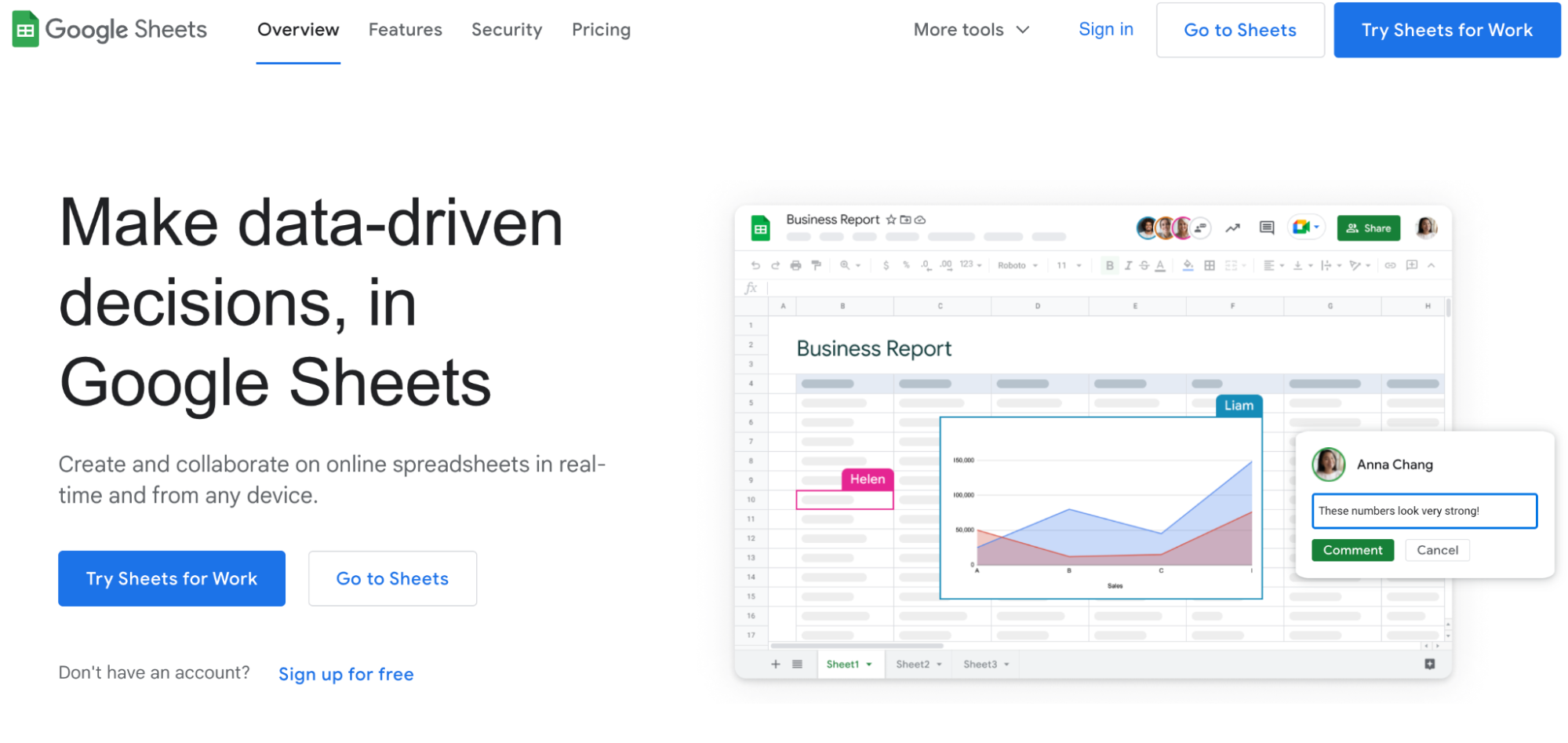
Google Sheets is a cloud-based free spreadsheet editor. It has a typical spreadsheet interface (rows and columns) and makes data analysis easier with pre-built tools, functions, and automation capabilities.
Features
Has data formatting and validation tools with custom rules and criteria to harmonize and prepare collected data for analysis.
Advanced data cleaning features such as cleanup suggestions, automatic duplicate removal, trimming of white spaces, and enhanced sorting options.
It has an autocomplete feature to smart fill cells, does spell check, generates formula suggestions, and auto-corrections, helping with faster data analysis and fewer errors.
Offers an extensive gallery of preset functions and formulas in 20+ languages, allowing teams across different locations to analyze and automate calculations.
Real-time versioning makes it easy to undo, redo, and review data changes in specific cells or entire spreadsheets as they happen.
Pricing
Google Sheets is free and comes with 15 GB drive storage, but it lacks dedicated customer support. It also has a business standard plan available at $12 per user per month.
Pros and Cons
✅ Easy to use with a minimal learning curve for users already familiar with traditional spreadsheet tools like Excel.
✅ Readily accessible on cloud, desktop, mobile, and tablet.
✅ It has enhanced collaboration features like real-time comments, mentions, action items, and role-based control.
❌ When you have a large dataset and multiple people on the sheet, you can experience a serious slowdown.
Related reading: How to use ChatGPT on Google Sheets?
4. Zapier Tables
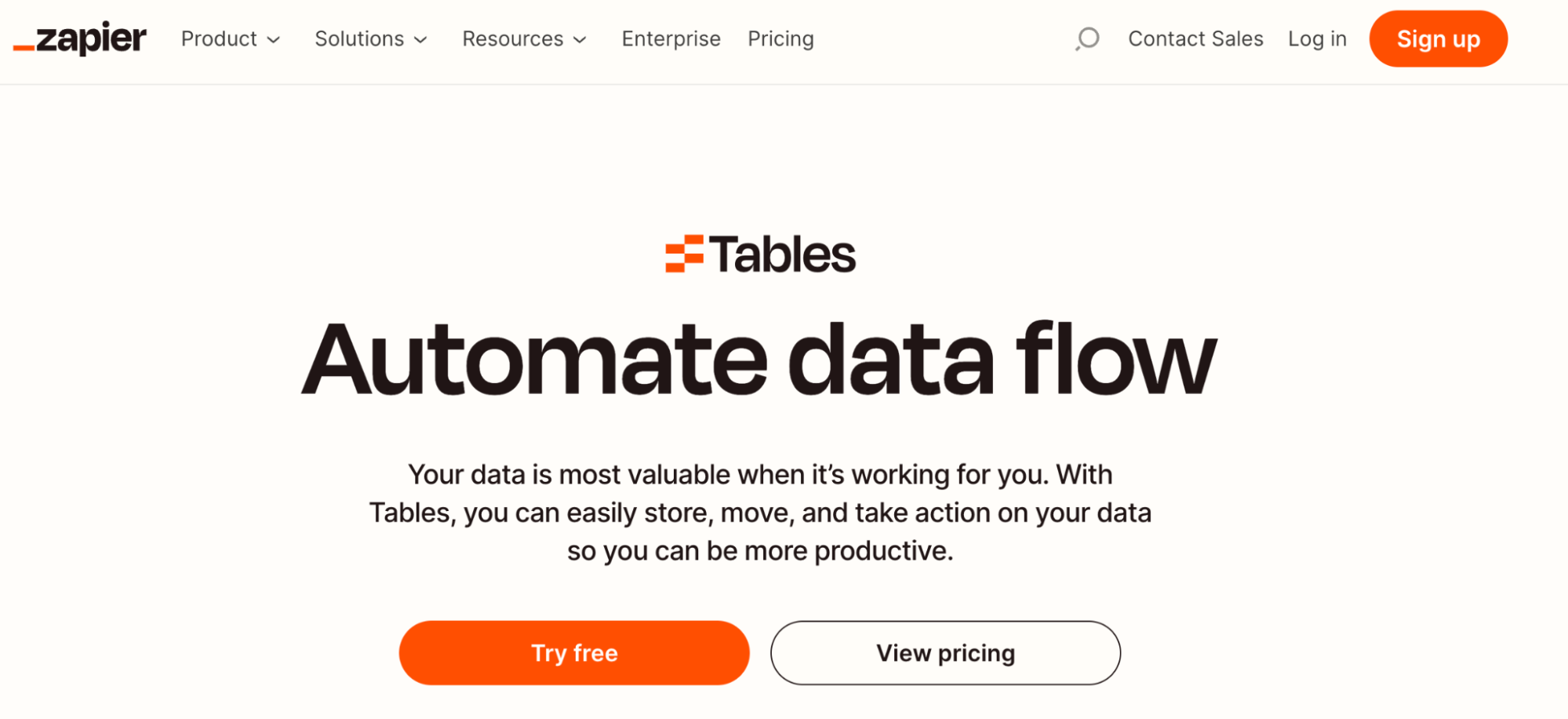
Zapier table lets you store, move, and take data-related action so you can be more productive when analyzing data.
Features
Lets you set up your database in just a few clicks. Import a CSV or build a table from scratch and start collecting data you need immediately.
Decide how and when to follow up with leads. Store these leads in tables, and from there, automatically send them personalized emails.
Lets you set up a seamless approval process in Zapier for anything – expenses, technology access, time off, and more.
Automate personalized tasks and communications to ensure everyone in your team receives a seamless onboarding experience.
Helps you manage projects all from a single table so you can track projects and keep your team informed.
Pricing
Zapier Tables has a Basic plan that’s free. It lets you create 5 tables, 100 fields per table, and 2,500 records per table. To extend these limits, upgrade to one of Zapier Table’s paid plans:
Premium: $20 per month
Advanced: $100 per month

Pros and Cons
✅ With Zapier Tables, you have full visibility over their workflows from start to finish, as your database and Zaps work in sync.
✅ Zapier Tables integrates directly with 6,000+ apps.
❌ Zapier Tables may have a learning curve if you’re not familiar with automation platforms or databases.
5. Spreadsheet.com
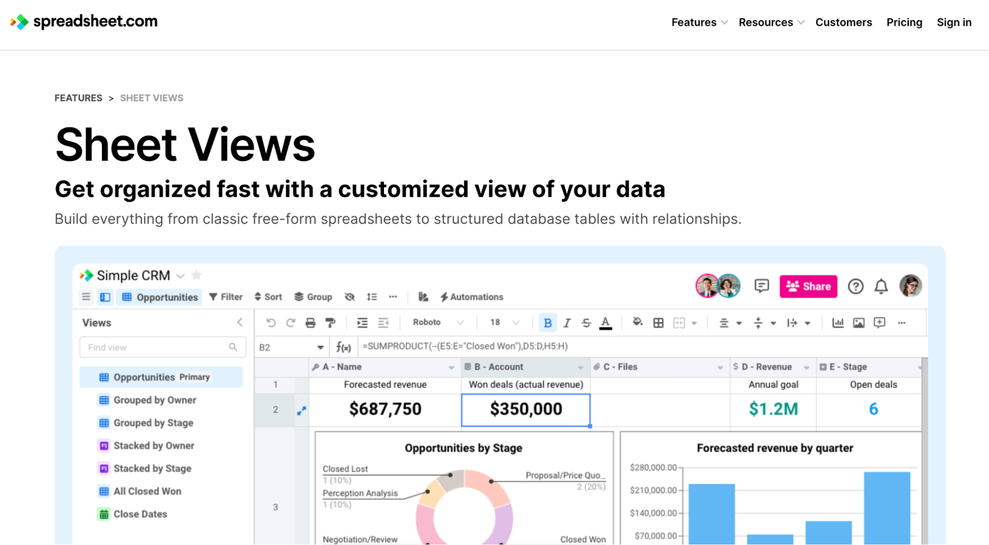
Spreadsheet.com is a more flexible and familiar alternative to Airtable.
Unlike Airtable's modern and somewhat confusing interface for data analysis, Spreadsheet.com provides a familiar spreadsheet interface with a robust toolkit for data analysis, workflow automation, and data management.
Unfortunately, the service does not support new signups at the moment and it's been announced it will discontinued on May 31st, 2024.
Features
Supports traditional spreadsheet functions and features like filtering, sorting, conditional formatting, and grouping tools.
Spreadsheet.com provides different views with 25+ column and cell-level data types to organize data for analysis.
Give context to data cells by attaching files and documents with clickable thumbnails and fully interactive document previews.
Generate formulas using more than 400 preset functions similar to those from Google Sheets and Excel.
Spreadsheet.com’s related rows allow you to interlink different rows between multiple worksheets; you can configure row-linking to establish a one-way or two-way relationship between rows.
Pricing
Spreadsheet.com is a free tool for individual users and small teams. The free plan allows one creator and two editors to analyze datasets with fewer than 1,500 rows. If you want to onboard more members and extend the data limit, choose any one of the paid plans Spreadsheet.com offers:
Standard: $9 per creator per month
Premium: $22 per creator per month
Enterprise: Custom Pricing

Pros and Cons
✅ Offers real-time collaboration using in-app chat, comments, and mentions.
✅ Multiple views and data types for better data organization.
✅ Supports in-cell file attachments for contextual data analysis.
❌ Only support one language (English), making data collaboration difficult for non-native speakers.
Category 2. Airtable Alternatives for Workflow Building
6. Stackby
Stackby is an enterprise-grade spreadsheet software trusted by 20,000 companies in 150+ countries. The platform excels at offering data visualization tools, reports, and dashboards for visualizing spreadsheet data.
Features
Stackby lets you visualize and manage data in six views — Table, Calendar, Kanban, Gallery, Form, and Sheet View.
Build custom reports and dashboards using a variety of customizable charts such as Bar, Pie, Line, Donut, or Radar.
Comes with a dedicated app marketplace with unique widgets and visualization elements, such as a time tracker, URL preview, countdown timer, and more.
Use the stack schema app to visualize relationships and connections across your database tables.
Use the page designer to create custom invoices, catalogs, cards, casting sheets, and more directly from your records.
Offers 300+ reporting and dashboarding templates for various industries and versatile use cases.
Pricing
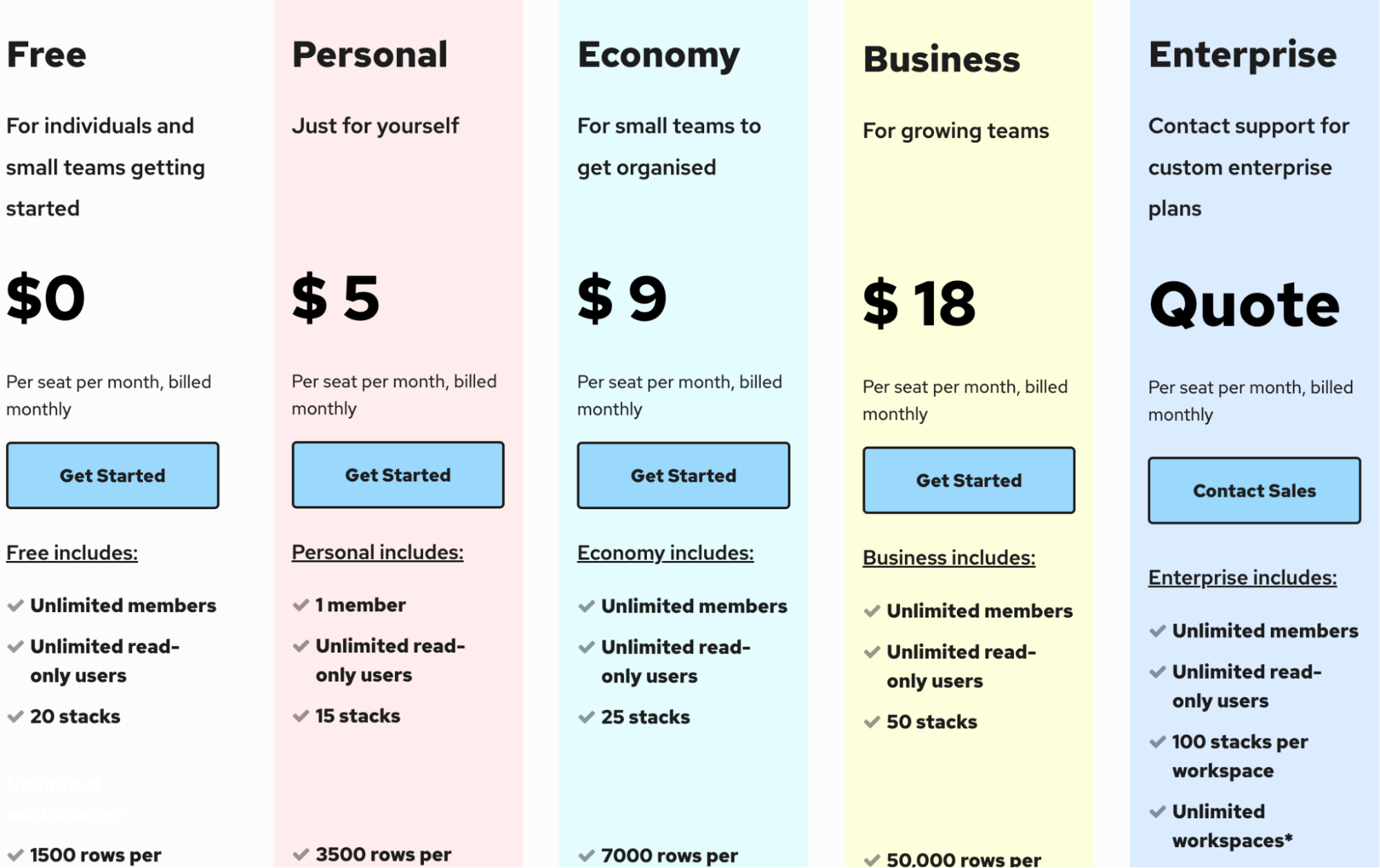
Stackby has a free forever plan, allowing unlimited member access and manual data refreshes. To increase limits and get premium features, select any one of its paid plans:
Personal: $5 per seat per month
Economy: $9 per seat per month
Business: $18 per seat per month
Enterprise: Custom pricing
Pros and Cons
✅ Offers multiple views to organize and visualize data.
✅ Has a wide range of reporting and dashboarding templates.
❌ Stackby can’t cross-reference data from other tables.
7. Smartsheet
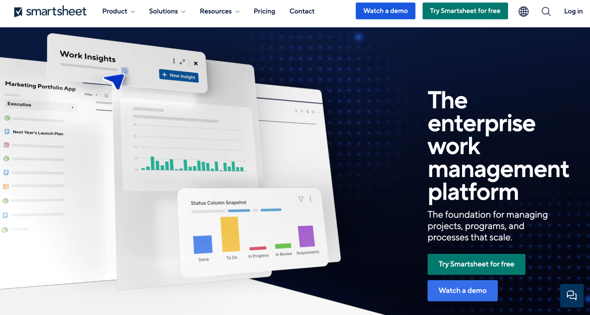
Smartsheet has a spreadsheet-style interface, but it’s more visual and dynamic, ideal for managing, automating, and collaborating on data.
Features
Smartsheet offers dynamic views like Card, Ganntt, Grid, Table, and Calendar to interact with data your way.
Use the Gantt view to visualize tasks or data along a timeline, highlight dependencies, and gauge your team's performance against milestones and deadlines.
Smartsheet has an extensive gallery of dashboard and report templates in eight languages for different industries and purposes.
Choose from preset templates or build custom dashboards from scratch. Integrate live data from sources like Google Docs, Tableau, Power BI, and other visualization tools.
Enhance decision-making with customizable, auto-generated data visualizations, including burndown and time series charts, to reveal clear key data trends.
Pricing
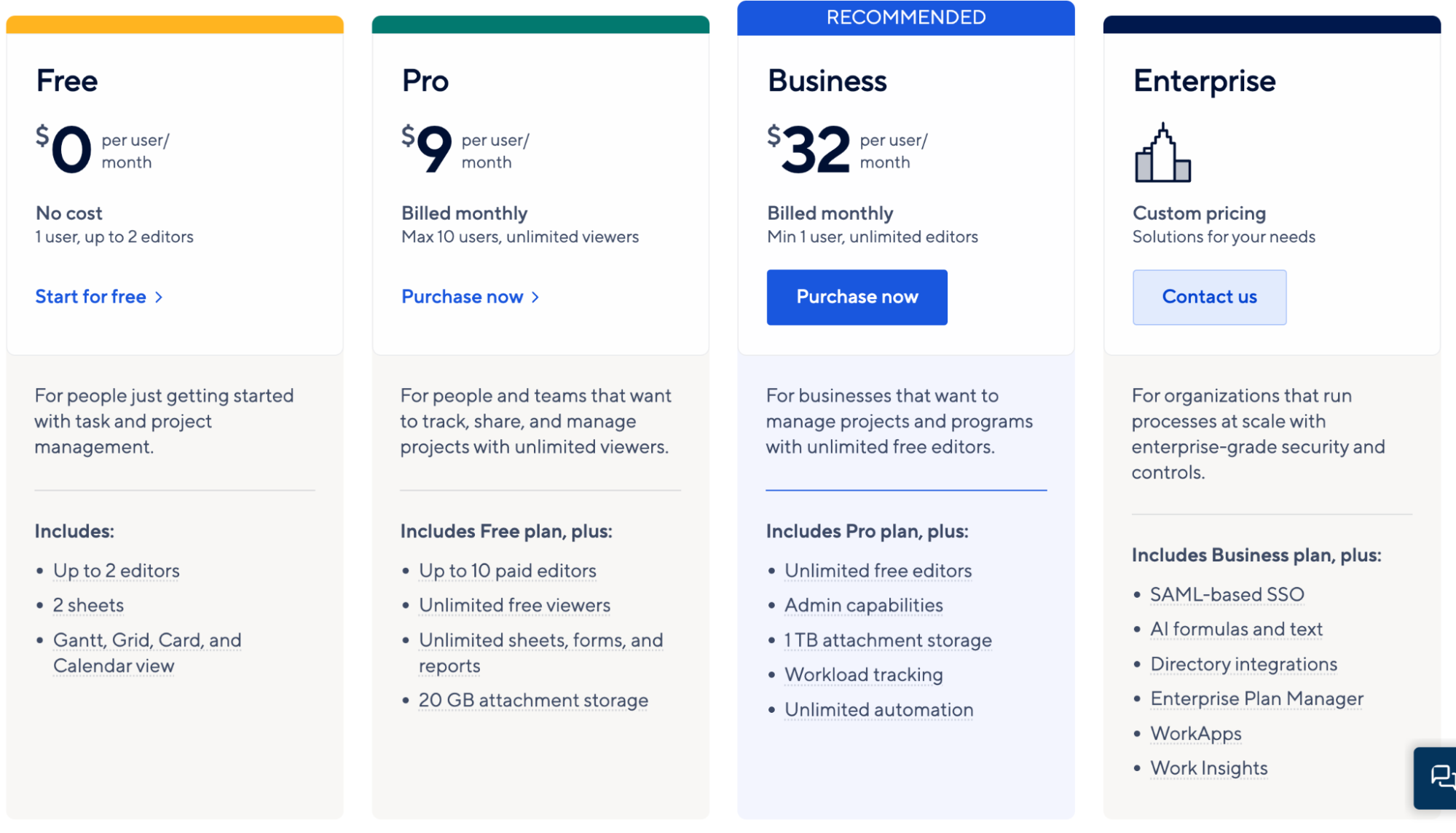
Smartsheet offers a free plan where you can onboard 1 user and up to 2 editors and create 2 sheets. If you want to extend these limits, choose from a paid plan it offers:
Pro: $9 per user per month
Business: $32 per user per month
Enterprise: Custom pricing
Pros and Cons
✅ Smartsheet offers a high degree of flexibility and customization.
✅ Has well-numbered integrations to third-party apps.
✅ You can download charts as PNG images and Microsoft Project.
❌ Smartsheet has an initial learning curve due to the number of features and functions.
❌ Smartsheet can be more expensive than most Airtable alternatives.
8. Jira

Jira is an agile project management software that makes it easy to visualize data and track workflows between your IT, design, marketing, and software development teams. The software is popular among brands like Canva, Dominos, Ford, and more.
Features
Jira comes with agile boards, Scrum, and Kanban, allowing agile teams and DevOps to visualize team and data workflows.
Has intuitive Gantt charts to gauge team progress, map dependencies, and stay ahead of risks.
Jira offers various reporting options, including sprint reports, burndown charts, velocity charts, and control charts.
Build customizable dashboards by choosing various built-in widgets and visualization elements.
Has high-end data visualization elements like cumulative flow diagrams and control charts to predict future performance and spot bottlenecks.
Integrates with various data visualization and BI tools like Tableau, Power BI, BigQuery, SAP, and SQL Server, offering advanced data visualization capabilities.
Pricing
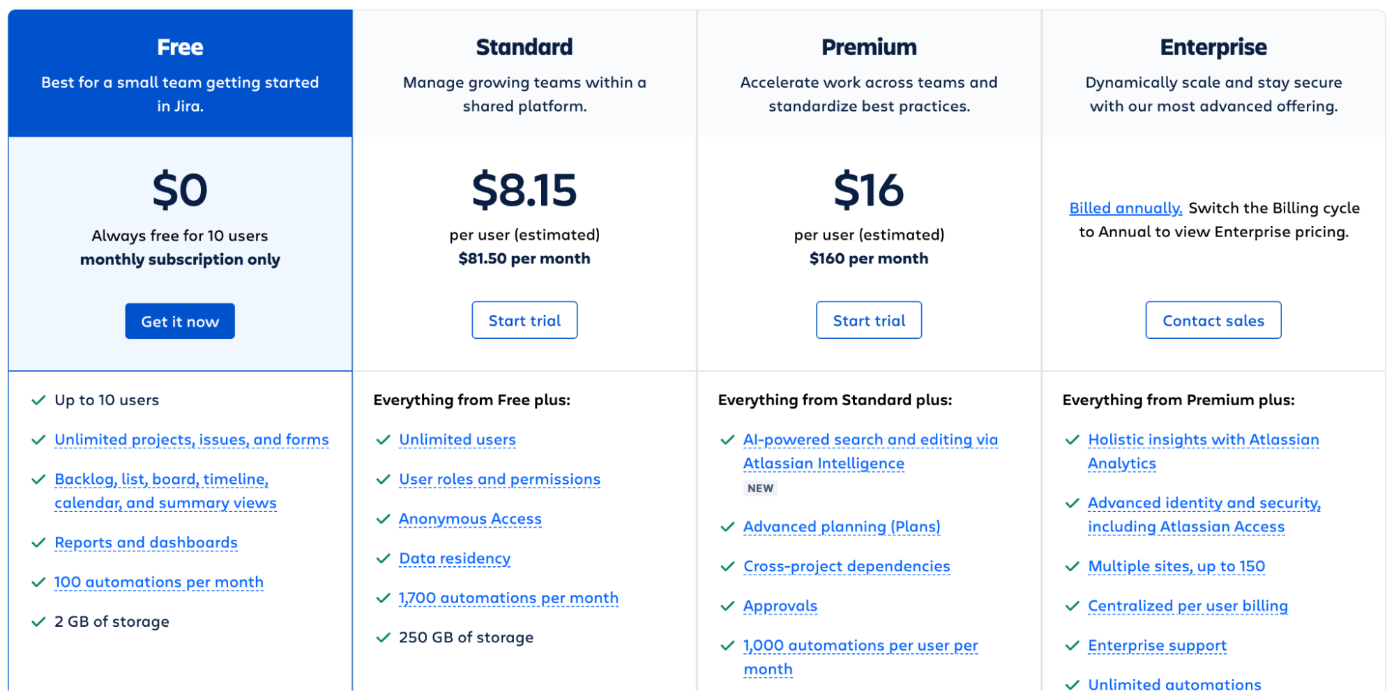
Jira offers a free plan for small teams to get started. The free plan allows 10 users, unlimited projects, reports, and dashboard creation. Other than that, Jira provides three paid plans you can choose from:
Standard: $8.15 per user per month
Premium: $16 per user per month
Enterprise: Custom pricing
Pros and Cons
✅ Jira offers a wide range of customization options and chart types.
✅ Has a dedicated marketplace for apps, interactive widgets, and visualization elements.
❌ Jira can be expensive mainly because of its user-based pricing.
9. Baserow
Baserow is an open-source alternative to Airtable. Its clean and user-friendly interface is similar to Airtable's, but it offers more flexibility and freedom to transform raw data into stunning visuals.
Features
Baserow supports traditional spreadsheet tools and visualization elements like charts, graphs, filters, and sorting options.
Offers an extensive gallery of highly customizable dashboard and report templates for different industries and versatile purposes.
Baserow has six different views to organize, manipulate, and display data at your convenience.
Use the gallery view to add context to data, such as descriptions, images, color coding, and more.
Offers a visual workflow builder to create database automation using Zapier, n8n, and Make.
Pricing
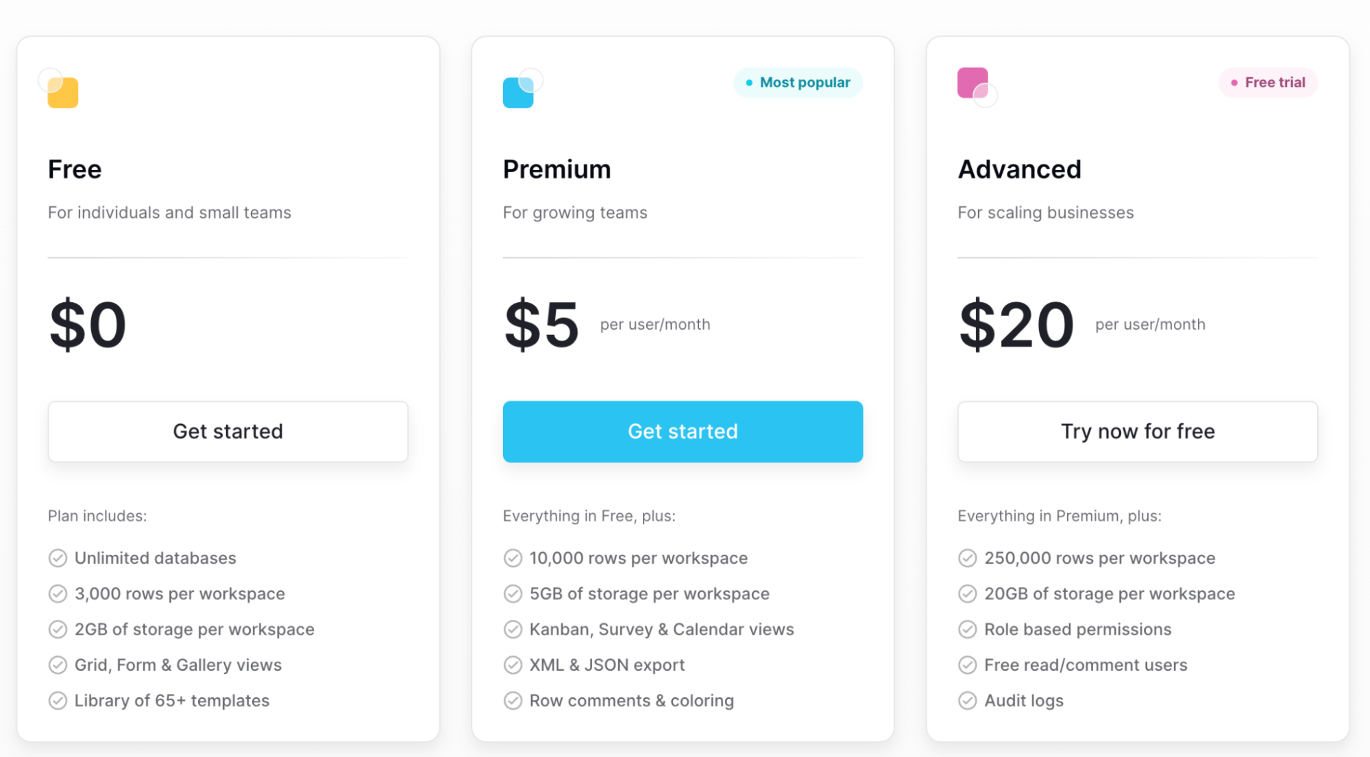
Baserow offers a free forever plan with unlimited databases, custom views, and a library of 65+ templates. Apart from the free plan, to get more premium features, it has two paid plans:
Premium: $5 per user per month
Advanced: $20 per user per month
Pros and Cons
✅ Baserow has an easy-to-use interface (compared to Airtable).
✅ Robust API documentation enables easy integrations with front-end and back-end tools.
✅ Baserow's gallery view helps visualize data using images and color-coding.
❌ Baserow has a user-based pricing model that becomes costly as your team grows.

Your new AI Data Analyst
Extract from PDFs, import your business data, and analyze it using plain language.
Try Rows (no signup)Automate Data Analysis with Rows
All the tools mentioned above are great alternatives to Airtable and successfully alleviate Airtable’s drawbacks. Data analysis and visualization are among the most important processes of any growing business.
But how do you find out which Airtable alternative is right for you?
Well, there’s no better way than signing up for free trials and judging products for yourself.
If you or your team don’t have the time to try every product on our list, go to Rows.com, import data, automate your report, and see if it's the right match!
Related reading:
