5 ways to create Notion Charts [2025]

🎉 New! You can import your Notion databases directly to Rows using the new Notion integration so that you can add beautiful charts to your reports, seamlessly connected to your Notion database.
Notion is a project management suite for individuals and teams. It’s the preferred tool for thousands of individuals and businesses to manage their day-to-day work. Depending on the goal, Notion can be a company wiki, a CRM for Sales, a study planner or anything in between.
As more teams understand the importance of data and flock to Notion, we’ve seen in countless forum posts, subreddits and Discord communities questions about how to add charts to Notion. This article answers those questions. We'll show you about 5 methods to add beautiful, interactive charts to Notion. Let’s dive in.
Factors to consider before choosing a Notion chart editor
The following factors should be taken into consideration before choosing a chart editor in Notion to get the desired output:
Data manipulation flexibility
Although Notion tables can be manipulated quite easily, spreadsheets are almost unrivaled for tasks such as sorting, slicing and pivoting. This flexibility reflects on the charts as well, with aggregation. It is important to consider these capabilities according to your needs when selecting a chart editor.
Data ingestion automation
Given the frequent data updates, it's a significant advantage if the data that backs your chart can have some automation, ensuring that the charts are constantly updated with minimal manual intervention.
Customization
To enhance the visual appeal of your charts, it is essential to review features such as color customization, label editing, and the selection of different chart types. These adjustments allow for personalization and contribute to a more aesthetically pleasing presentation.
Mobile responsiveness
Ensure charts are effectively displayed and functional on desktops, tablets, and smartphones by verifying readability, interaction capabilities, and responsiveness across various screen sizes and orientations. Evaluate how well chart elements like legends and labels adapt to smaller screens, ensuring they remain user-friendly on touch devices. Additionally, confirm that charts maintain consistent performance and quick load times across different devices and network conditions.

The spreadsheet for modern teams
Save hours on data import, surface insights by asking, and share beautiful, ready-to-use dashboards.
Get Started (free)5 methods to create charts in Notion in 2025
1. Rows
Rows is the next-generation spreadsheet editor. It combines a modern spreadsheet editor, data integrations (e.g. Social media, Google Analytics, Salesforce, Stripe) and a novel sharing experience that turns any spreadsheet into a website in one-click.
Follow the steps below to create an interactive chart in Notion using Rows:
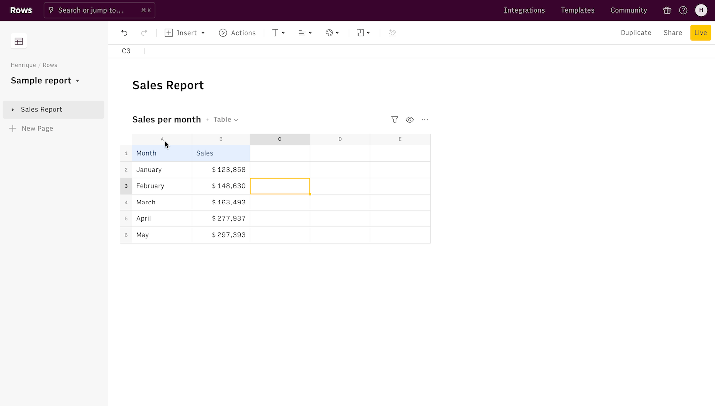
If you haven't signed up for Rows, do that here and login to your account.
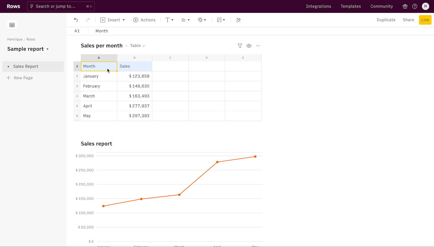
Create a spreadsheet. Do this by clicking on the “Create Spreadsheet” button.
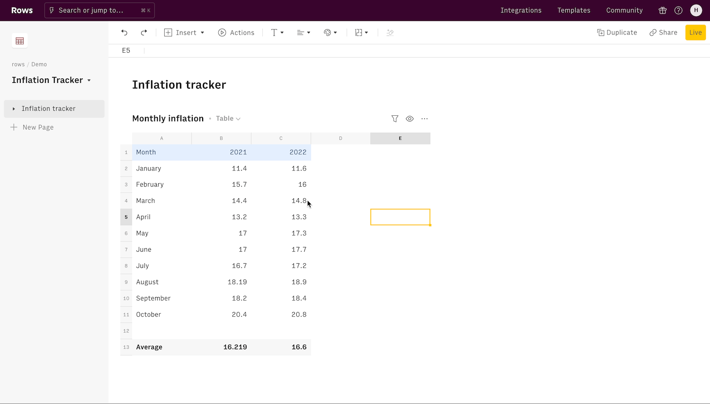
Fill in the table with the data that will be used to create the chart. You can add your data manually, import a file or connect your spreadsheet directly to a Notion database using the Rows Notion integration. See the tutorial below:
4. Once your data is ready, highlight all the data you want to use and click the Insert button on the top of the page. From the dropdown options, select Chart.
5. Once a Chart is generated, you can customize it using the Chart sidebar. This is where you can pick between chart types, add names to the axis, pick the chart series, among others.
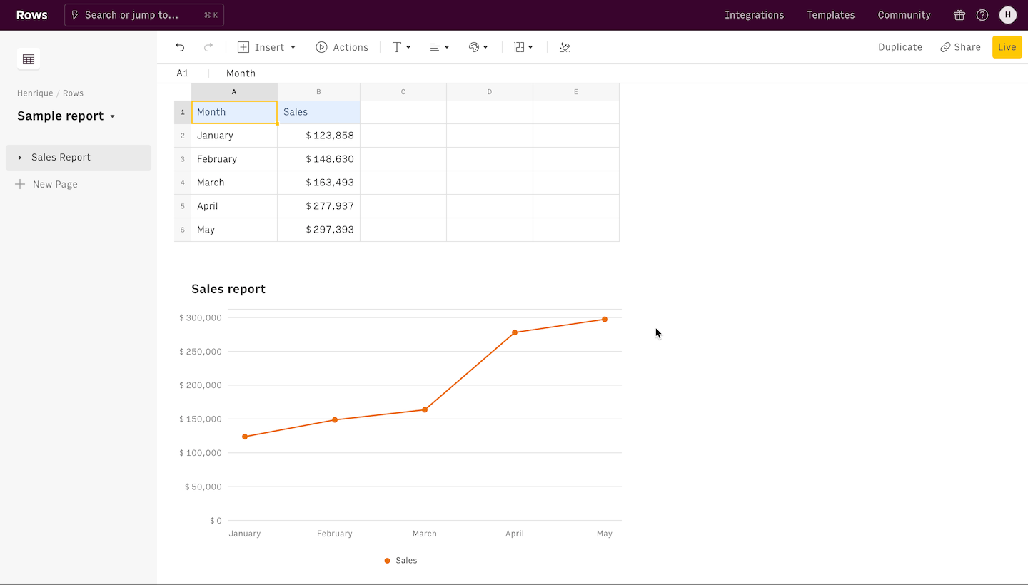
6. The last prerequisite for getting your embed link is to turn on “Share privately with the link” on the spreadsheet. Do this by clicking on the Share button on the toolbar on the top right corner, next to the Live button.
 Enable Share privately with the link before embedding
7. Click on the chart you want to add to Notion, and click on the “..” options menu on the top right corner of the chart. Click on the three dots and from the dropdown and select Embed. From the popup, select Copy URL to copy the link for Notion embed.
8. Finally, go into your Notion document. Simply paste the Notion embed link copied and choose the Create embed option. Adjust the size of your Notion chart to your taste.
 Embed charts in Notion in one click
Now that the chart is embedded in Notion, it has a live connection to the underlying data source. If the table with the data is updated on Rows, so is the chart.
There are plenty of other ways to use Rows to make your Notion documents stand out. Learn more about it here or see our pre-built Notion templates for a Paid Marketing Report, a Website Traffic Overview Report, a Growth Experiments Report, and for your Weekly Team Sync Notes.
Are you a marketer? Learn more about:
Other relevant articles:
The spreadsheet for modern teams
Save hours on data import, surface insights by asking, and share beautiful, ready-to-use dashboards.
Get Started (free)2. Notion
Notion now offers native charting capabilities. With recent updates, users can easily convert any database into a visually appealing chart. Follow these steps to create professional charts in Notion:
1. Insert a chart
Start inserting a chart anywhere in your document by typing "/chart".

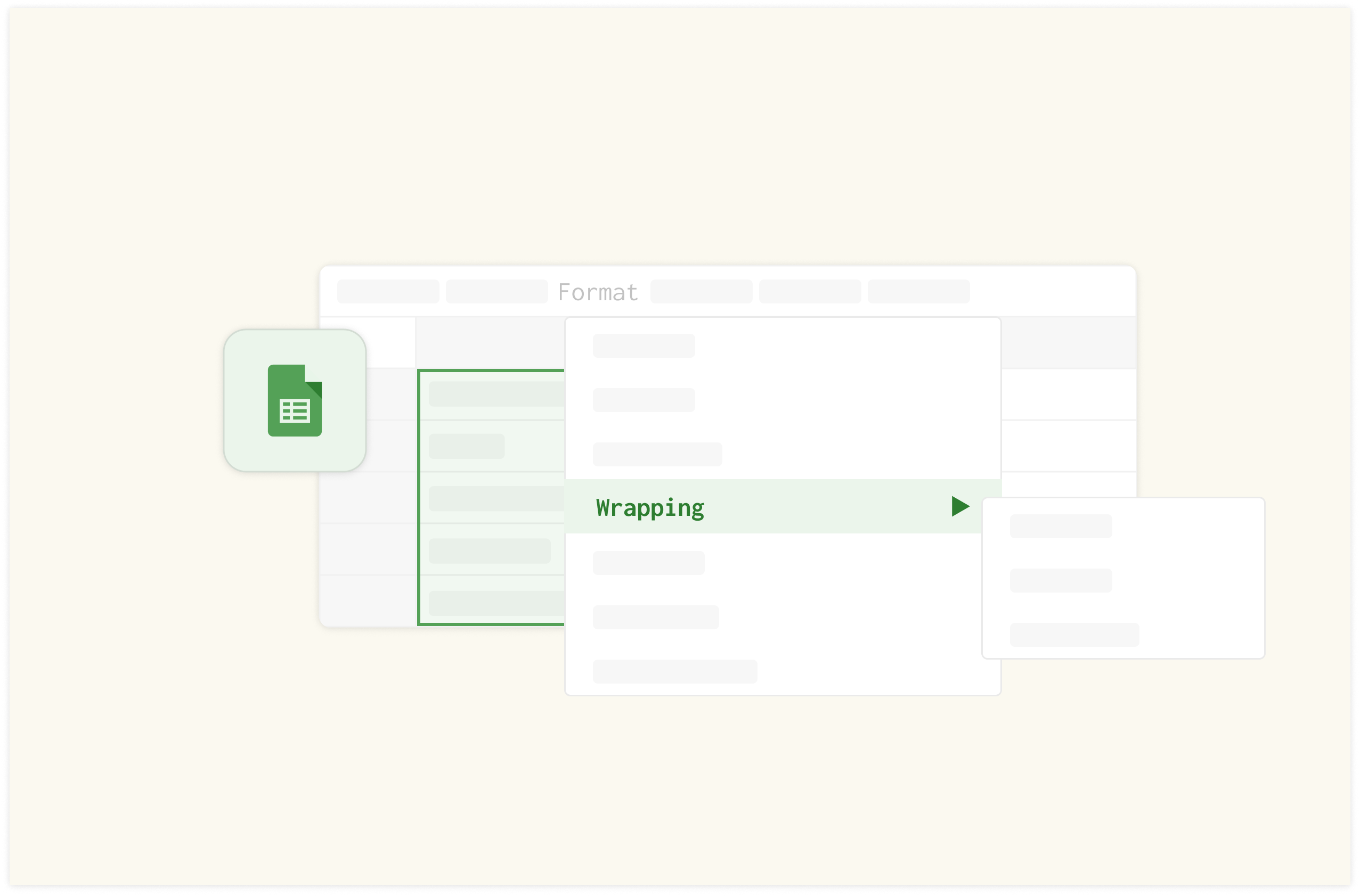
2. Pick a type chart
You can choose from four chart types:
Vertical: A chart where the bars are plotted vertically along the Y-axis.
Horizontal: A chart in the form of rectangular bars usually useful for long category labels.
Line: A chart using points connected by line segments to demonstrate different values.
Donut: A variant of pie chart with a hole in center, shaped like donut that displays categories as arcs.
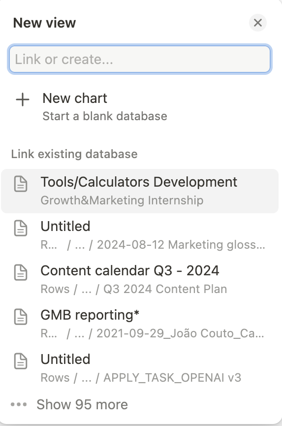
3. Choose a data source
Once picked the chart type, Notion offers you to add a data source, i.e. either build a database from scratch or to link one of the existing database from a dropdown list, as follows:
4. Customization Options
To customize your chart, you can adjust various elements:
Color palettes: Choose from a wide selection of colors available or simply set to auto mode.
Axis names: Select this option to display the names like X-axis and Y-axis.
Data labels: Turn on this option if you wish to display data labels like names and values in simple or percentage format.
Chart height: Set the height to small, medium, large, or extra large as per your requirement.
Gridlines: Select the choice of your gridline as horizontal, vertical, or both to make your charts visually appealing.

5. Visualize Data
Utilize the "What to Show" option to highlight specific factors like draft, due date, title, status, customize both X-axis and Y-axis or group selected fields for enhanced output

6. Sort and filter your data
Use the "Sort By" option to organize data:
Manual sorting
Categorical sorting (ascending or descending)
Count-based sorting (low to high or high to low)
Use "Filter" exclude or include specific data points, and the "Omit Zero Values" feature to remove values that don't display occcurencies.

7. Export Options
You can download the charts as PNG or SVG files.

8. Dashboard Creation
Use the drag and drop option to get a custom layout by having multiple charts on a single page. By following these steps, you can create professional, informative charts that enhance your Notion workspace and improve data visualization.
3. NoChart
NoChart is third-party solution that uses your existing Notion databases as the source to create the chart. Here’s how to add a NoChart to Notion:
After signin up, click the ‘Create your first draft’ button on your dashboard.
On the next page, click the ‘Connect to Notion’ button at the top left corner of that page.
A permissions popup will be opened on a new page. There, you have to select a Notion page and give NoChart access to the tables on that page.
A settings section will be rendered on the left side of the page where you can customize the elements of your chart. This includes the Chart type (Line, Bar, Pie, KPI), basic color formatting, and filters to only show chart values based on certain conditions
A chart will be created on the right side of the page and more customization can be done to get the chart to meet your taste.
Finally, click the “Save” button. Copy the resulting url, paste it to Notion and click to “Create embed”.
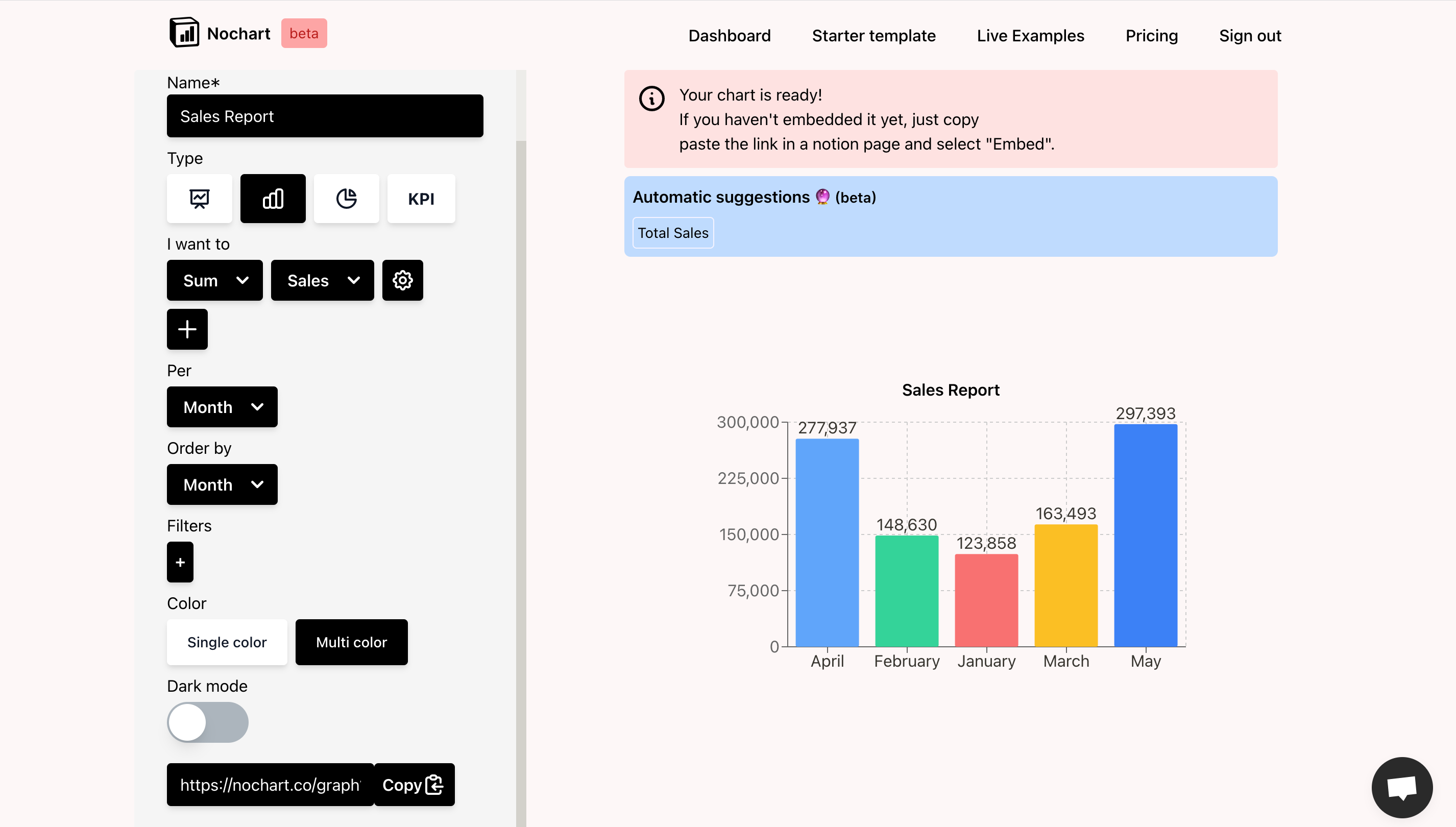 NoChart interface to create chart
4. NotionVIP
NotionVIP is a website that showcases tips, templates, videos and dozens of other resources on Notion. It also boasts its own chart building tool. But unlike the previously discussed tools, creating your Notion chart on Notion VIP can be done right from their homepage and does not require any additional setup.
Take a look at their demo data and in google spreadsheets, create your data in the same structure.
Once your data is ready, copy the share url. On their homepage, scroll down to the ‘Connect your Google Sheet’ section and paste the copied url into the first input field.
Give your sheet a name and select the range that your data falls within on your sheet
You can also customize your chart by selecting the type, theme, colors and formatting the axes.
Next, click the ‘Make magic’ button to render the chart embed url.
Finally, click the ‘Copy your Url’ button and paste anywhere in your Notion sheet to render your chart.
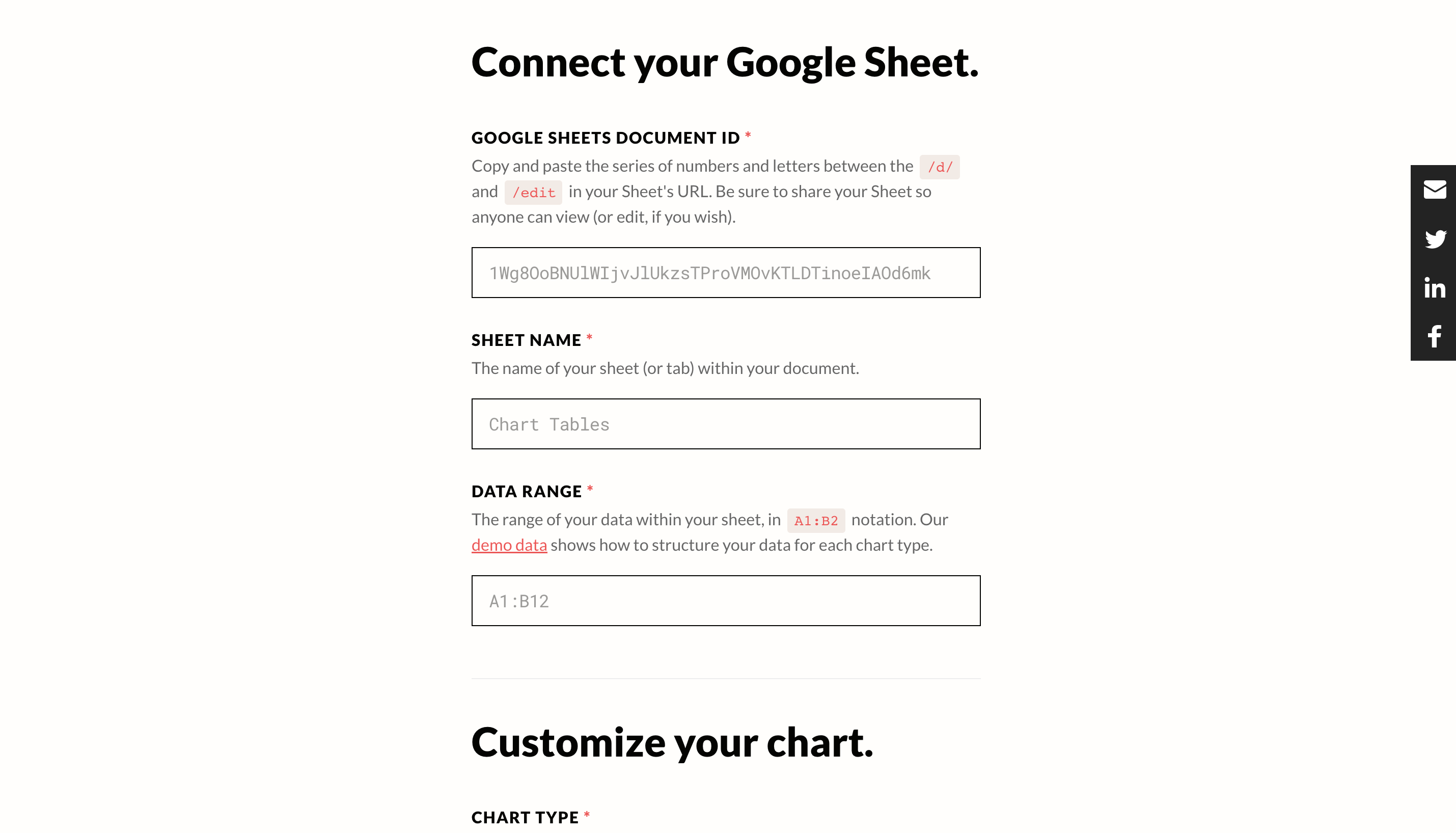 Use the NotionVIP builder to generate the chart
Note: The chart does not refresh automatically in case you add or update the database. To update the chart click on the refresh icon on the top left corner of the embedded chart.
5. Data Jumbo
Creating charts in Data Jumbo requires that you first connect the two accounts. To ensure that you can access your Notion database on your Data Jumbo dashboard.
On your dashboard, click the ‘Create A New Chart’ button at the top right corner.
In the popup, select a Notion database for your chart and then the ‘Build my chart’ button to confirm.
The data from the selected database is made available in a sidebar at the left side of the page. Pick the data to be visualized
A chart will be generated and you can customize the type, color and values
When done, click the ‘Add to Notion’ button at the top right corner of the page
From the popup, click the copy icon by the embed url and paste anywhere within your Notion document.
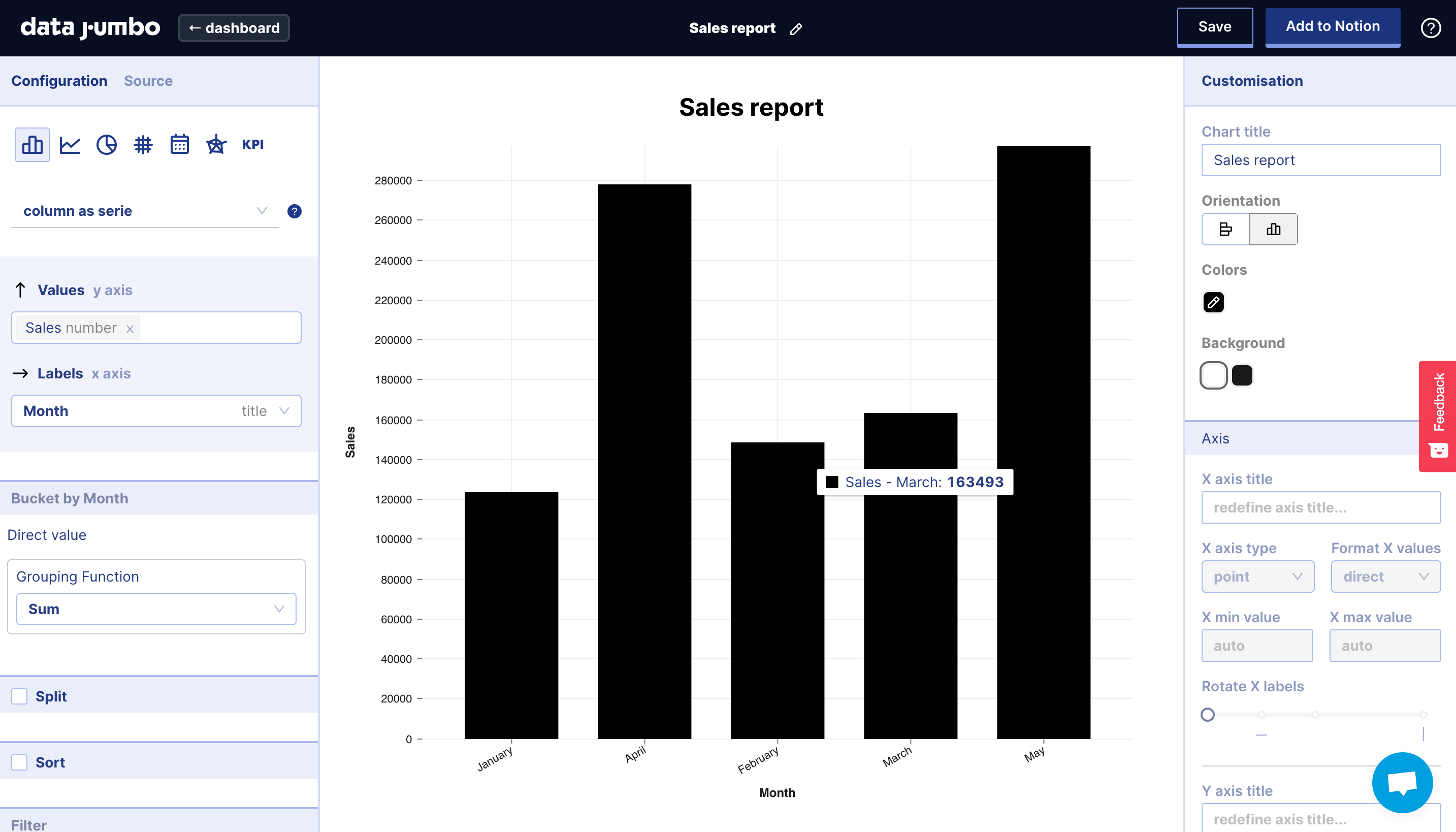 The Data Jumbo interface to create the chart
Note: The chart does not refresh automatically in case you add or update the database. To update the chart click on refresh icon on the top left corner of the embedded chart.
The spreadsheet for modern teams
Save hours on data import, surface insights by asking, and share beautiful, ready-to-use dashboards.
Get Started (free)Conclusions
It’s impressive to see Notion evolve from being a niche product for individuals to the de facto wiki of fast-moving companies. As people collaborate within it and it becomes the central hub for a team’s documentation, it becomes essential to bring data visualization to the mix.
Despite the recent update, Rows is - all in all - the simplest, most flexible way to add charts in Notion. It’s the spreadsheet of choice for modern teams that believe high-quality documentation is key to success. It has many customizable chart options, its chart data refreshes in real-time and it can be used for more than charts (e.g. embed large tables of data, embed calculators).
Try Rows today to enjoy all these features and many more. If there are any tools we left out, share with us on Twitter.