9 Best Coefficient Alternatives & Competitors in 2025

Coefficient is a connector that allows you to import live data into Google Sheets and Excel from 40+ different data sources.
The top reasons why you might be using Coefficient are:
It has a zero learning curve. Coefficient makes a tool that you are already familiar with ready-to-accept data and streamlines recurring reports. As a result, the platform doesn’t change anything about your current setup.
It has a vast catalog of templates (called dashboards) that give users a head start.
With Coefficient, you can trigger Slack and email alerts when cells change values or conditions, notifying chosen recipients instantly when key data changes.
But here’s the problem with the software.
As a plug-and-play data connector, its focus is pretty narrow. Its main focus is on data extraction; thus, features like data analysis and visualization are left to current Excel and Google Sheets capabilities.
In this article, I will tell you why you may want to try an alternative to Coefficient and discuss the top ones in the market.

Your new AI Data Analyst
Extract from PDFs, import your business data, and analyze it using plain language.
Try Rows (no signup)Why Do You Need a Coefficient Alternative?
Here are the three major reasons why you might need a Coefficient alternative:
Coefficient doesn’t come with good data visualization options
Coefficient has slower data extraction speed
Coefficient offers fewer integrations and is expensive
Reason 1. Coefficient Doesn’t Come with Good Data Visualization Options
Visualizing data is crucial for gaining insights and making data-driven decisions.
Coefficient doesn’t come with proprietary charts or visualization options (dashboards), leaving you to use regular spreadsheet visualization options, which are hard to navigate and share. These also don’t fit modern documentation platforms, like Notion, Confluence, Miro, etc.
While Coefficient allows you to blend data from multiple sources, the lack of good visualization tools makes it harder to explore and analyze data effectively.
Reason 2. Slower Data Extraction Speed
Time is a crucial factor in reporting and decision-making. Coefficient is slow at extracting large datasets, leading to delays in the reporting process. This leads to decisions being made based on outdated information.
Reason 3. Coefficient Offers Fewer Integrations and Is Expensive
Coefficient can pull data from 40+ integrations, but you won’t get access to all of them in any of the plans (except the Enterprise plan).
The platform offers two paid plans:
Starter plan gives you access to 3 data sources at $59 per month
Pro plan gives you access to 6 data sources at $119 per month
When we compare this pricing with a competitor like Rows.com, you get unlimited integrations at $20 per month.
What are the Best Coefficient Alternatives and Competitors
Some of the best alternatives to Coefficient are:
Rows – Free data visualization tool launched by Google.
Supermetrics – Cloud-based data integration platform.
Metabase – Open-source alternative to Coefficient.
Zapier – Free, no-code automation builder.
Make – No-code automation builder that lets you connect business apps and spreadsheets.
Looker – Data visualization Software owned by Google.
Coupler.io – Popular Coefficient alternative because of its data ingestion capabilities.
Equals – An advanced spreadsheet editor.
Funnel – Marketing data hub and automation tool.
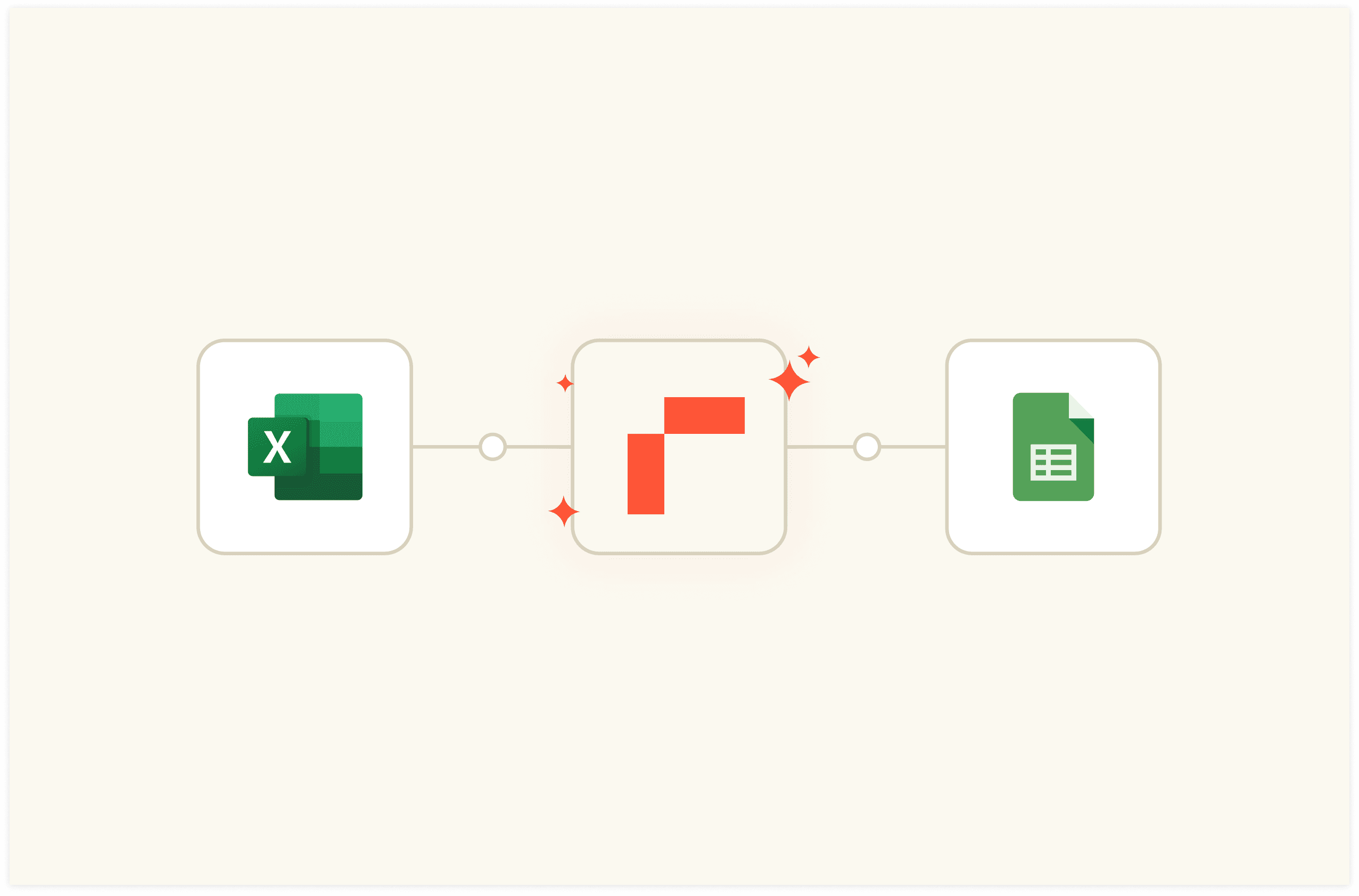
1. Rows
Rows is a comprehensive spreadsheet for modern teams that offers better UX for data ingestion and has native AI capabilities (AI analyst, AI-generated subtitles, native AI functions) that Coefficient lacks.
The software makes it super easy for you to import data directly from tools like databases and ad platforms to a spreadsheet.
Feature 1. Data Ingestion
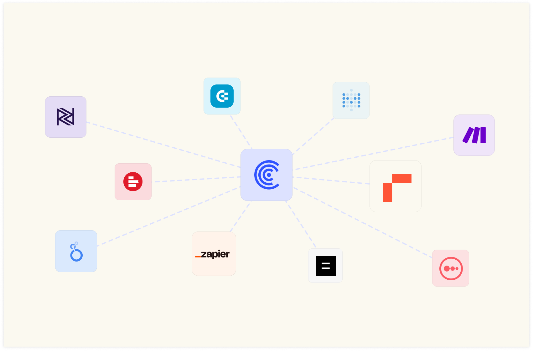
With Rows, it’s easy to get your data into a spreadsheet in just a few clicks. It integrates with 50 data sources, so you can pull data from all major sources.
The good thing about Rows data connectors is that all of them are built-in native features. You don’t need an external add-on to use AI in your analysis.
Curious about how Rows does it?
It handles JSONs in the grid and converts them into table format.
This feature helps you save time when building recurring reports or handling messy CSVs.
Some examples of data integration in Rows are:
Import Google Analytics 4 data to Rows and get key analytics and reporting. Pick one of the recommended reports or build your own custom view as follows:
Or you can:
Connect your LinkedIn page and track comments to your posts.
Connect Slack to Rows and set alert automation to your #social channel whenever a new comment appears on your social media posts. All from a spreadsheet.
Import a Notion database in Rows with a few clicks, enrich data, and send it back to Notion. Try it in the following interactive demo:
When the tool you’re working with isn’t listed in our catalog, you can always make GET, POST, PATCH, and PUT requests to any endpoint using basic or API token authentication methods.
Use the following interactive demo to simulate a simple GET request:
💡 Try it yourself with our HTTP Tester.
Feature 2. Inbuilt AI to Solve Complex Problems
By integrating AI into its system, Rows has made data analysis comparatively easy, even for non-data-friendly users. The software lets you get answers to complex problems using natural language rather than formulas.
Also, you don’t need to install any third-party plugin to use AI in the process. Everything is in-built, leading to a seamless user experience.
When we talk about AI, Rows has three main components:
1. AI Functions
Rows integrates with Open AI for its 14 proprietary functions that automate prompts and address specific types of tasks.
Here’s one of the use cases of AI functions – EXTRACT_OPENAI in action:
Similarly, you can also execute sentiment analysis on a social media comment or product review using the function – SENTIMENT_ANALYSIS_OPENAI or clean up data using APPLY_TASK_OPENAI.
Discover more about all possible use cases of AI in Rows.
💡 Or try it yourself with our Sentiment Analysis tool
2. AI Analyst
Use natural language to ask data-related questions to our Analyst. It will do all the calculations for you, including descriptive statistics, data summarization, transformation and pivoting. Check out our guide or watch our demo.
3. AI Subtitles
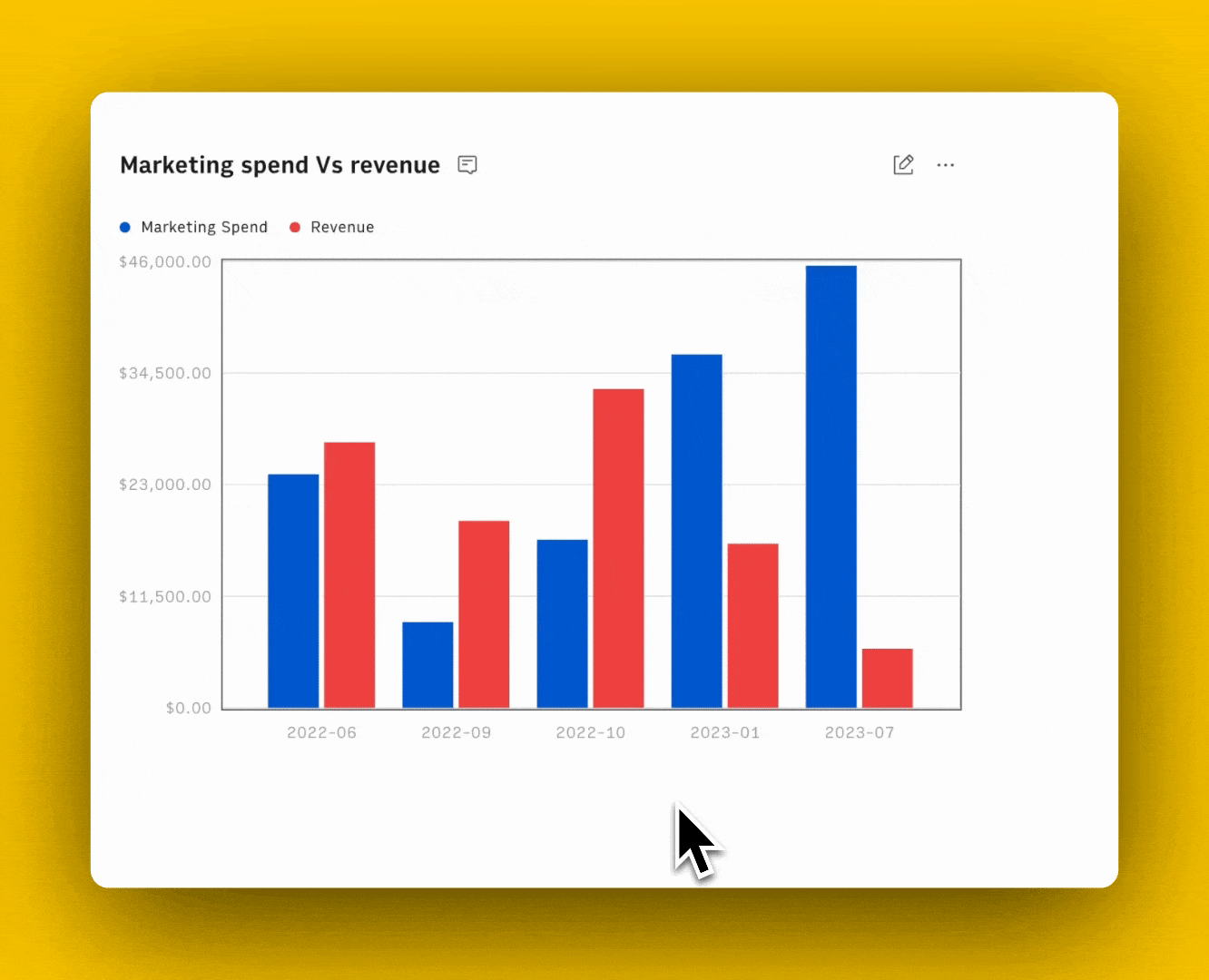
Ask AI to generate subtitles for your tables and graphs that include key insights from the data displayed.
Feature 3. Embed Feature
Rows lets you embed tables and charts on a website, wiki, or other internal tools with ease.
It’s a simple 4 step process:
Choose Embed in the settings menu located in the right-hand corner of the element you want to embed.
Click the Share Privately toggle.
Click <> Copy code. You can use the Copy link to paste directly into tools that automatically embed via the link - e.g., Notion.
Paste the embed code on your website, wiki, or destination tool.
Learn how to use Embed in all the most recent documentation tools, like Notion, Confluence, and Slite, or try it yourself in the following interactive demo:
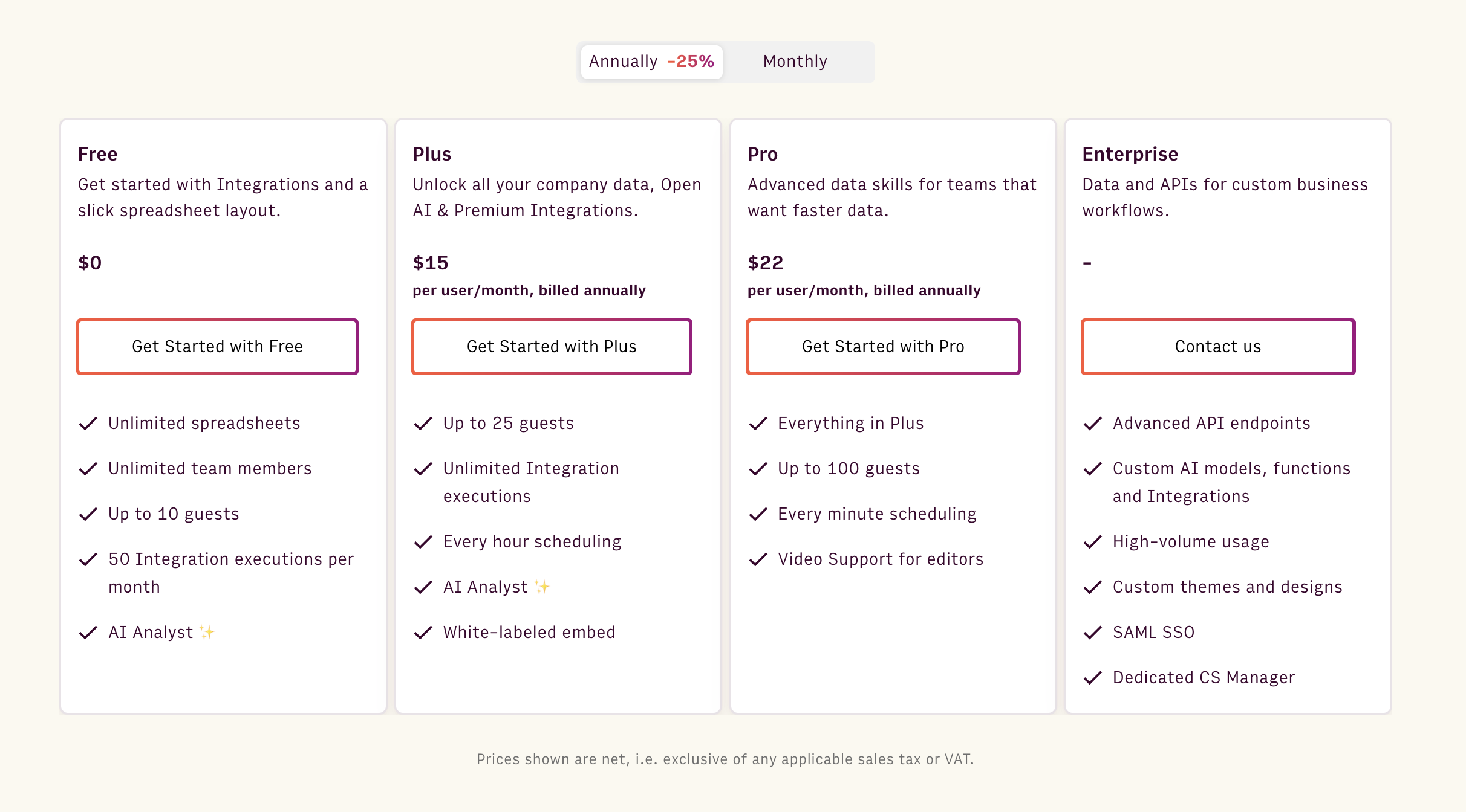
Pricing
Rows offers a free forever plan that’s quite generous. It lets you onboard unlimited members, up to 10 guests, and execute up to 50 integration tasks per month.
If you want to get rid of these limits and want access to more premium features, Rows has three paid plans to choose from:
Plus: $15/month/member, up to 25 guests, unlimited integration tasks & daily data refresh.
Pro: $22/month/member, up to 100 guests, unlimited integration tasks & hourly data refresh.
Enterprise: Custom price for advanced API usage and workflows.
How Does Rows Compare to Coefficient?
Coefficient solves only one of Rows' key value propositions – data ingestion, enabling familiar tools (Google Sheets and Excel) to ingest data.
By their choice, Coefficient chose not to evolve the spreadsheet experience along dimensions like data transformation and analysis, document-live UI, and sharing or visualization experience.
With respect to AI, Rows and Coefficient are neck to neck.
Coefficient leverages AI in two ways:
With GPT-powered functions added to the current Sheets and Excel catalog to perform common classification, extraction and clean up tasks
With Copilot-like capabilities to run common spreadsheet commands (e.g. add a chart)
Rows started with native, fully built-in functions, which have better UX, but is catching up on the copilot side. Soon, Rows’ AI Analyst will be able to execute common spreadsheet commands, like adding a chart, formatting data, or adding a column.
Coefficient is a great tool for sourcing data from multiple sources but lacks visualization capabilities, which are essential for modern data analysis teams.
Your new AI Data Analyst
Extract from PDFs, import your business data, and analyze it using plain language.
Try Rows (no signup)2. Supermetrics

Supermetrics is a cloud-based data integration platform and an ideal alternative to Coefficient. It lets you collect, store, and analyze data from multiple data sources directly into your Google and Excel spreadsheets.
Features
Supermetrics is available as an add-on for Google Sheets and Excel. It allows you to ingest data from 150+ email, social, and marketing platforms directly into your spreadsheet app.
Harmonize collected data using present data enrichments, automated data normalization, custom fields, and cross-platform data blending tools.
Has an extensive gallery of exclusive charts and 60+ reporting templates to help you visualize data into digestible formats.
Supermetrics AI, a GPT-4 powered AI assistant, helps you analyze marketing results and campaigns using plain-text commands and queries.
Pricing
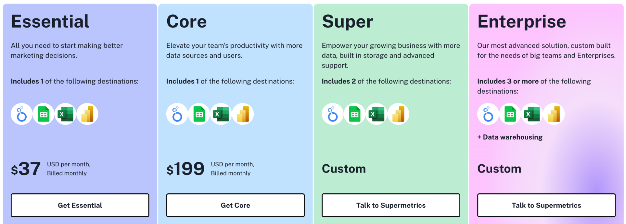
Supermetrics offers a 14-day free trial and has four paid plans to choose from:
Essential: $37 per month
Core: $199 per month
Super: Custom pricing
Enterprise: Custom pricing
Pros and Cons
✅ It has real-time email alerts to notify you when a particular metric changes.
✅ Comes with an integrated AI assistant for quicker data analysis.
✅ Supports extensive data sources, including popular advertising and social platforms.
❌ Supermetrics doesn't offer real-time data refreshes.
3. Metabase
Metabase is an open-source alternative to Coefficient.
Its no-code interface makes it easy to analyze, explore, and drill through data for meaningful insights without any SQL prerequisite.
Metabase is trusted by more than 50,000 businesses, including Dribble, Calendar, Angellist, etc.
Features
Metabase supports 25+ data connectors for third-party databases and data warehouses, and it allows for CSV file uploading.
Use the drag-and-drop query builder to automatically clean, combine, summarize, format, or ask questions to your database.
Visualize data using interactive dashboards and 15+ stunning visualization types such as charts, bars, graphs, and more.
Use drill-through features for granular data analysis, such as zooming in charts for details, breaking down data into categories, applying X-rays, and auto-generating reports.
Use the data sandbox to control access to data, content, and features with group permissions.
Pricing
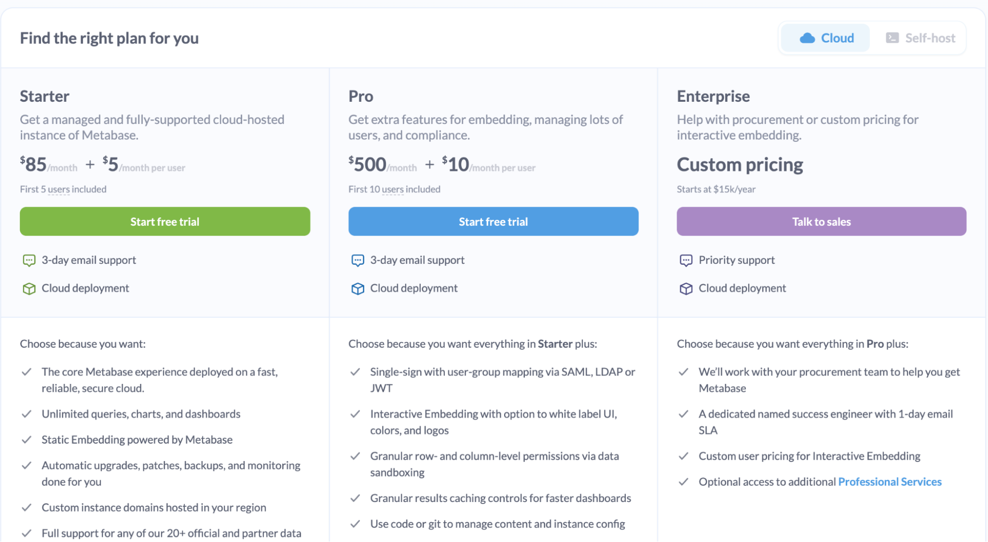
Metabase offers two pricing categories: cloud-based and self-hosted. It has a free self-hosted open-source plan with unlimited charts and dashboards. And a 14-day free trial for other paid plans. Apart from these free offerings, it has three paid plans to choose from:
Starter (Cloud-based): $85 per month ($5 per user after 5 users)
Pro: $500 per month ($10 per user after 10 users)
Enterprise: Custom pricing
Pros and Cons
✅ Supports CSV file uploads.
✅ A flexible tool with no-code and low-code ways to query databases.
❌ Has limited data connectors.
4. Zapier
Zapier is a free, no-code automation builder.
Compared to other Coefficient alternatives, Zapier is focused on automating spreadsheet processes – from basic data entry to end-to-end processes in Excel or Google Sheets.
Features
Zapier integrates with 6,000+ third-party apps, including HubSpot, Typeform, Mailchimp, Shopify, and more, allowing you to extract and ingest data directly into Excel or Google Sheets.
Use Zapier's drag-and-drop automation builder to create custom zaps (automation) using triggers, if-else conditions, and action elements to harmonize data collection or auto-update cells when data changes.
Has an extensive library of automation templates, triggers, and action elements supported for creating workflows in Excel and Google Sheets.
Zapier's conversational AI lets you build automation simply by describing what you want to automate in simple language.
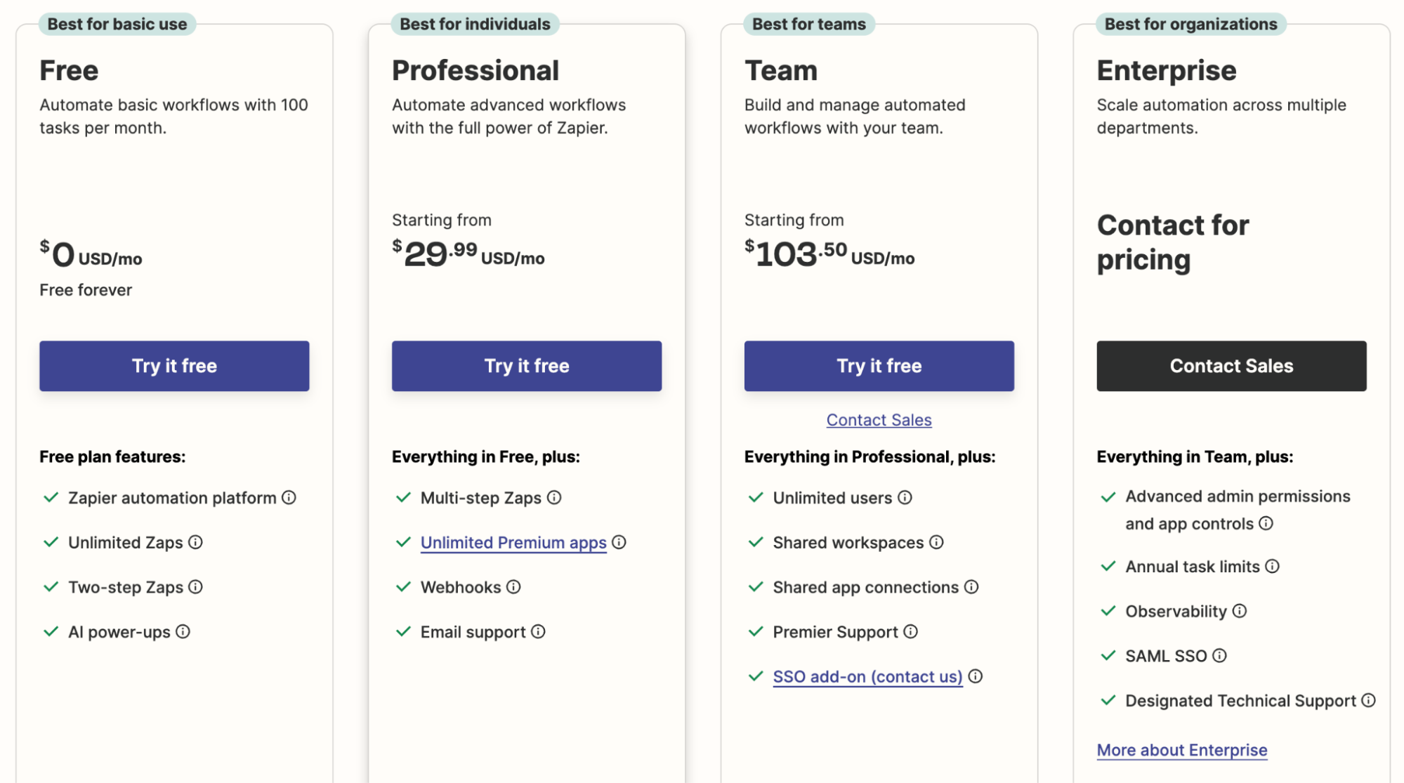
Pricing
For sourcing data to spreadsheets and creating automations, Zapier offers a free forever plan and five paid plans:
Basic: Free forever
Starter: $29.99 per month
Professional: $73.50 per month
Team: $103.50 per month
Company: Custom pricing
Pros and Cons
✅ Zapier lets you do more than just connect data. It lets you build workflows and automate processes.
✅ Offers a variety of pre-built automations for Google Sheets and Excel.
❌ Not usable for data analysis and visualization directly.
5. Make
Make is yet another no-code automation builder that lets you connect business apps and spreadsheets for easy data flow and management. It's trusted by companies like Spotify, Meta, Personio, and others.
Features
Make lets you ingest data from 1,700+ data sources, including databases, APIs, and web forms, directly into spreadsheet apps like Google Sheets and Excel.
Make's no-code workflow builder lets you drag and drop apps, triggers, and action elements to create one-off or multi-step workflows between your spreadsheet and other essential apps.
Has thousands of pre-built automation templates for collecting data from Shopify, analyzing customer comments using ChatGPT, extracting contact information from Gmail, and more.
Use custom workflows or Regular Expressions (Regex) to validate incoming data from apps like NeverBounce and Twilio before storing it in your spreadsheet.
Access advanced data management features like data manipulations, filtering, workflow control, error handling, and more.
Pricing
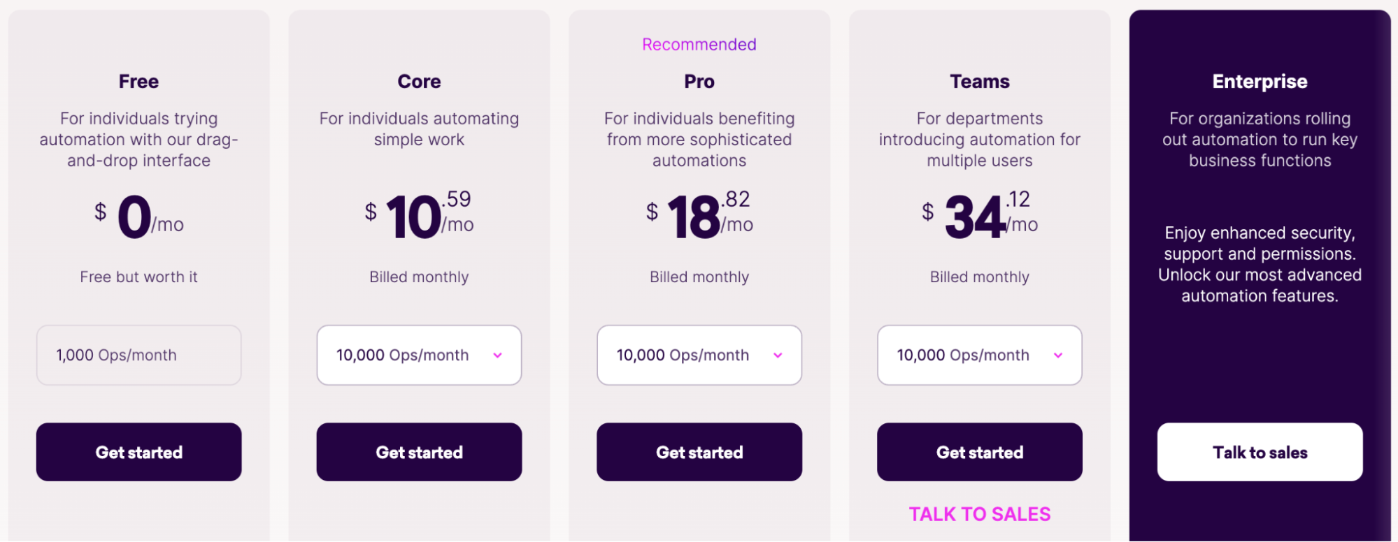
Make offers a free plan limited to 1,000 monthly ops. Other than that, it has four paid plans:
Core: $10.59 per month
Pro: $18.82 per month
Team: $34.12 per month
Enterprise: Custom pricing
Pros and Cons
✅ Make offers a large number of data connectors.
✅ Has an easy-to-use workflow builder to automate processes between spreadsheets and apps.
✅ Supports unlimited users with all plans.
❌ Has a steep learning curve for beginners.
6. Looker

Looker, formerly Google Data Studio, is a data visualization service from Google.
Looker is not a direct alternative to Coefficient. However, it's a viable tool for visualizing spreadsheet data.
Features
Has Google and partner data connectors to facilitate data collection from 1,000+ data sources, including cloud storage, advertising, marketing, and e-commerce apps.
Looker Studio's extension for Google Sheets lets you visualize worksheet data and create reports without juggling between apps.
Offers a vast gallery of customizable dashboard templates with 40+ preset data visualization elements, such as graphs, heatmaps, pivot tables, and more.
Looker's in-app collaboration features enable teams to share data, reports, and insights easily.
Pricing
Looker Studio has a free version with self-service BI. A pro version is available on a project-based subscription, but you must contact sales for pricing.
Pros and Cons
✅ Looker Studio is better than Coefficient in data visualization.
✅ Rich embedding and API features for developers.
❌ Looker is complicated to set up and maintain.
❌ Lacks data harmonization and analysis.
7. Coupler.io
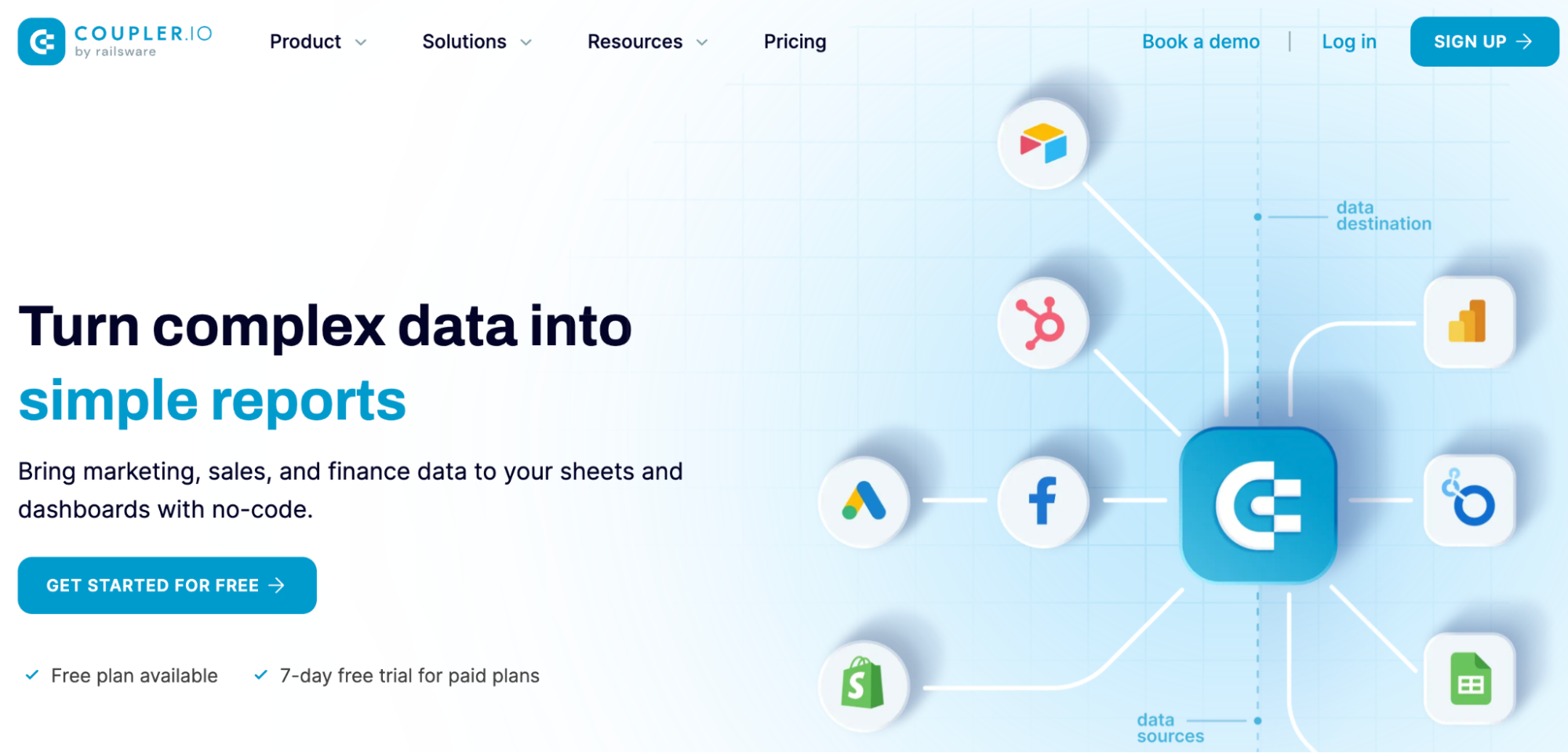
Coupler.io is a popular alternative to Coefficient because of its data ingestion capabilities and user-friendly interface. This no-code data analytics tool is trusted by 700K+ users, including Uber, Mailtrap, Bolt, and similar brands.
Features
Coupler.io allows data import from 500+ third-party apps and data sources directly into Excel and Google Sheets.
Has a library of 35+ ready-to-use dashboard and report templates for different purposes, such as PPC ads, multi-channel reports, Shopify dashboards, and more.
Use Coupler.io's transform modules on top of your cloud systems to make real-time adjustments, apply advanced filters, and perform calculations to harmonize data collection before sending it to your spreadsheet.
Integrate Coupler.io with your webhooks to automate workflows and trigger actions such as getting notifications for execution status, refreshing data in your apps, or automatically launching data imports.
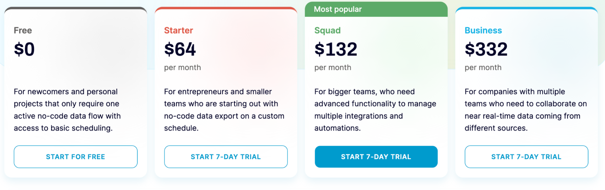
Pricing
Coupler.io has a free forever plan for beginners with one active no-code data flow, access to basic scheduling but no webhooks for automation. Other than that, Coupler.io has three paid plans:
Starter: $64 per month
Squad: $132 per month
Business: $332 per month
Pros and Cons
✅ Coupler.io has a large number of data connectors for Excel and Google Sheets.
✅ Offers extensive report and dashboard templates.
❌ Poor customer support (only via email).
8. Equals
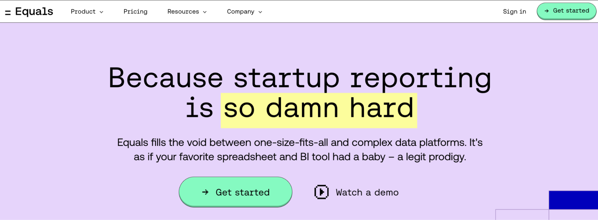
Equals is an advanced spreadsheet editor that combines the data management capabilities of a spreadsheet with the user experience you always wanted in a BI tool.
Features
Equals connects directly to PostgreSQL, Snowflake, Stripe, QuickBooks, and 20+ other data sources.
Use the no-code query builder to create complex queries without SQL knowledge; schedule queries to automatically update data at regular intervals.
Lets you track, understand, and restore past queries using detailed version history.
Offers core spreadsheet functions like Excel formulas and shortcuts, pivot tables, a formula editor, calculated columns, and more for in-depth data analysis.
Visualize data using 10+ chart types, including Line, Area, Scatter, Column, Bar, and Pie charts, and instantly turn spreadsheets into tables.
The conversational AI assistant allows you to generate formulas, customize charts, auto-organize, and harmonize data via text-based commands.
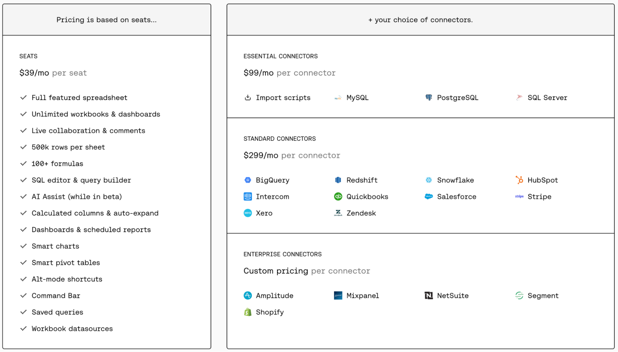
Pricing
Equals offers seat-based pricing at $39 per month per seat. In addition, it has three other connector plans to choose from:
Essential: $99 per connector
Standard: $299 per connector
Enterprise: Custom pricing
Pros and Cons
✅ Has integrated AI capabilities.
✅ Offers core Excel formulas and functions for in-depth data analysis.
✅ A vast gallery of customizable charts and other data visualization elements.
❌ All essential connectors are a part of Equals' paid plan.
9. Funnel

Funnel is a marketing data hub and automation tool that lets you connect, store, organize, and share data. It's trusted by 2,000+ data-driven marketers and brands, including Trivago, Samsung, SuperDry, and more.
Features
Funnel is available as an add-on for Google Sheets and Excel, allowing you to extract relevant data from 500+ third-party sources directly into your spreadsheet.
Offers no-code data transformations like automatic data grouping and currency conversion, reducing manual efforts.
Has a visual automation builder with pre-built rules and logic to combine, segment, clean, and harmonize data as it arrives.
Use Funnel AI to automate data analysis, perform ad hoc analysis, get suggestions for fields, ask questions about data, write field descriptions, and more.
Pricing
Funnel offers a free forever plan with up to 5 data connectors and three data destinations, including Google Sheets and Excel. Other than that, Funnel has three paid plans:
Starter: $120 - $1320 per month
Business: $1100 - $2585 per month
Enterprise: Custom pricing

Pros and Cons
✅ Offers a user-friendly interface that enhances user experience.
✅ The setup process for Funnel is straightforward and hassle-free.
❌ Funnel lacks a white-label solution, limiting customization options for branding.
Your new AI Data Analyst
Extract from PDFs, import your business data, and analyze it using plain language.
Try Rows (no signup)Automate Data Analysis with Rows
All the tools mentioned above are great alternatives to Coefficient and successfully alleviate its drawbacks.
I get it, data analysis and visualization are among the most important processes of any growing business.
Unfortunately, Coefficient relies on the data visualization capabilities of Google Sheets and Excel, which lack modern features, which is the main reason people opt for an alternative.
But how do you find out which Coefficient alternative is right for you?
Well, there’s no better way than signing up for free trials and judging products for yourself.
If you or your team don’t have the time to try every product on our list, go to Rows.com, import data, automate your report, and see if it's the right match!