The Four Types of Exploratory Data Analysis and When to Use Each One


Exploratory Data Analysis (EDA) is the process of summarizing and visualizing data to spot patterns, detect anomalies, and test assumptions before diving into formal modeling.
Developed by statistician John Tukey in his 1977 book, [object Object], EDA is technically detective work for data. Instead of forcing your numbers into a predetermined framework, you let the data speak for itself. While Confirmatory Data Analysis (CDA) tests specific hypotheses and generates p-values, EDA asks the more open-ended question: "What's actually happening here?"
The technique breaks down into four distinct types based on two factors:
You're analyzing one variable or multiple variables;
You're using visuals or statistics.
Once you understand this framework, choosing the right approach for your data becomes straightforward, and that's what we'll walk through in this guide.
What is exploratory data analysis (EDA) and why does it matter?
Exploratory Data Analysis is an iterative loop. You start with a question about your data, search for answers by creating visualizations and running calculations, then use what you find to refine your original questions or generate new ones entirely.
Tukey emphasized that EDA requires both analytical methods and a spirit of skepticism. You're not trying to prove something; you're trying to understand what's there. This often yields better results and richer data you can actually work with. Trying to prove a hypothesis can result in you only chasing the data and answers that support what you’re trying to prove.
What's changed is that AI has made this investigative process accessible to anyone who can ask a question. You no longer need to know which formula calculates a median or how to code a correlation matrix – you can simply ask "what's the relationship between these variables?" and get the analysis instantly. The detective work remains the same; the barrier to entry has dropped dramatically
The business payoff shows up in three ways:
Better models later: Understanding your data's actual distribution means smarter feature selection when you move to prediction or testing.
Catching errors early: EDA surfaces data quality problems – improper coding, duplicates, impossible values – before they corrupt your analysis.
Finding the unexpected: The trends you discover often matter more than the ones you went looking for.
The benefits are real, but you’ll need to know how to apply EDA techniques. For that, you’ll need to understand the different types of EDA and how they apply to different datasets.
The four types of EDA
All EDA techniques fall into a simple matrix based on two questions: Are you examining one variable or multiple variables? Are you using numbers or charts?
This creates four distinct categories:
Univariate non-graphical
Univariate graphical
Multivariate non-graphical
Multivariate graphical.
Think of these as your navigation system. Begin with univariate non-graphical summaries to catch data quality issues, add visuals, and then explore relationships between variables. This progression prevents you from building elaborate analyses on top of fundamentally broken data.
💡A note on terminology: This four-type framework is a data science methodology, not to be confused with the Business Intelligence quadrant of descriptive, diagnostic, predictive, and prescriptive analysis. Those categories describe business outcomes; these four types describe investigation methods.
Univariate non-graphical
This is your starting point, describing a single variable without charts.
The five-number summary is what Tukey built his reputation on: Minimum, first quartile (Q1), median, third quartile (Q3), and maximum. He preferred these over mean and standard deviation because they proved to be more robust to outliers. This means that a single extreme value wouldn’t distort your understanding of what's typical.
And for categorical data, frequency tables show you the count and percentage of each category. If 95% of your customers fall into one segment, you'll know immediately instead of discovering it three analyses later.
When to use this: Before you make a single chart. Run these summaries first to catch impossible values like negative prices, ages over 150, or even dates from the future. These numbers are your data-quality checkpoints, and they take seconds to generate.
Univariate graphical
Now you can add visuals to see the shape of your data, not just its center and spread.
Histograms
Histograms reveal distribution patterns at a glance. Is your data skewed left or right? Does it have multiple peaks suggesting different subgroups? These questions are nearly impossible to answer from summary statistics alone.

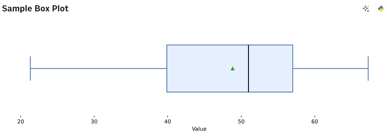
Box plots
Box plots translate that five-number summary into a visual. The box shows the middle 50% of your data (Q1 to Q3), with a line at the median. The "whiskers" extend to show the range, and any points beyond them flag potential outliers.
Q-Q plots
Q-Q plots check if your data follows a normal distribution. Points should fall along a diagonal line. If they curve into an S-shape or peel away, your data isn't normal – which matters because many statistical tests assume it is.

Not to brag, but we created those graphs within a comically short amount of time. That’s because we used Rows AI Analyst to create sample data, and then asked it to formulate each of these rows. It did all of this in under 30 seconds for each prompt.

Exploratory data analysis made simple
Ask Rows' AI Analyst to create histograms, spot outliers, or check distributions in plain English. Connect your data sources and start exploring.
Start today (no sign-up)Multivariate non-graphical
Now you're quantifying relationships between variables using numbers instead of visuals. Let’s have a look at the methods:
Method | Data types | What it reveals | When to use it |
|---|---|---|---|
Cross-tabulation | Categorical + Categorical | Shows how often each combination appears (e.g., Marketing Channel vs. Conversion Status) | When you need to see if certain categories associate with others, do specific channels convert better? |
Correlation matrix | Continuous + Continuous | Strength and direction of relationships, from -1 to +1. Close to +1 | When you want to know which variables move together before visualizing. A 0.85 correlation between ad spend and revenue implies a positive relationship; 0.12 shows no relationship. -0.85 shows a relationship moving in opposite directions. |
Grouped summaries | Categorical + Continuous | How averages differ across categories (e.g., mean revenue by region) | When you need the hard numbers before creating charts – establishes whether differences are worth visualizing |
Why this matters: Think of these methods as your scouting report. They tell you where to look next without requiring you to create dozens of visualizations, hoping something interesting appears.
Multivariate graphical
This is where you visualize relationships between variables, revealing patterns that numbers alone can't show.
Scatterplots
Scatterplots are your default for two continuous variables. They instantly reveal whether relationships are linear, curved, clustered, or nonexistent. One glance tells you more than staring at a correlation coefficient.

Side-by-side box plots
Side-by-side box plots compare a continuous outcome across categories—sales performance across product lines, for instance. You see not just average differences but the full distribution, including outliers that simple bar charts of averages would hide.

Heatmaps
Heatmaps turn correlation matrices or cross-tabulations into color-coded grids. Hot spots jump out immediately, making it easy to identify clusters and strong relationships in datasets with dozens of variables.

💡Quick note on scatterplots. You’ll need to be careful you don’t overplot, especially if you’re working with enormous datasets. With thousands of data points, scatterplots become useless blobs.
Solutions do exist, however. You can add transparency to your plots by changing the alpha parameter, create 2D histograms, or use hexagonal binning (a mix of plotting and heatmaps) to show density within clusters.
How to choose the right type for your data
Here's your practical decision tree for picking techniques based on what you're actually looking at.
The "one variable" rule: Single continuous variable? Start with a histogram to check the shape. If it's heavily skewed, report the median instead of the mean. Averages lie when distributions aren't symmetric.
The "relationship" rule: Two continuous variables call for a scatterplot. But if you've got more than 1,000 points, add transparency or switch to hexagonal binning. Otherwise, you're staring at an ink blob that hides the actual density patterns.
The "comparison" rule: Comparing categories against numbers? Side-by-side box plots show you the spread and outliers that bar charts of averages completely miss.
The golden sequence: Always profile individual variables before checking relationships. Dirty data in one column creates phantom patterns when you start looking at correlations.
What are the steps of exploratory data analysis?
EDA isn't a single pass through your data. It's an iterative process where each step informs what you do next. Have a look:
Data collection and integration: Collect data from your sources, from CRMs, advertising platforms, SQL databases, spreadsheets, into one environment where you can actually work with it.
Initial inspection and cleaning: Handle missing values, remove duplicates, and verify data types are correct. Is that date column actually formatted as dates, or is it text that just looks like dates?
Univariate analysis: Run summaries and distributions for every single column. This catches quality issues before you waste time analyzing relationships built on broken data.
Multivariate analysis: Map relationships between variables. Which factors actually drive the outcomes you care about?
Insight synthesis: Translate what you found into what you should do next. This is where exploration becomes action.
Looks relatively simple, right? Well, for the most part. But you’ll still need to make checks to ensure the accuracy of your data.
Data quality checks you should do during EDA
Quality issues will derail your data analysis if you don't catch them early. But, you’ll have to go through your data with a fine-tooth comb, rather than just standardize your whole dataset without thinking.
For instance, let’s start with data outliers, which require judgment, not automatic deletion. Is that customer who spent $50,000 an error in data entry, or your most valuable account? Some outliers are flukes to remove; others are the most interesting part of your dataset.
Then we move on to missing values. Are they missing completely at random, or does the emptiness itself signal something? Customers who didn't finish a form might be fundamentally different from those who did. It could reveal hurdles in a particular process or a specific piece of information in that process that is turning customers off, all of which is good to know!
And finally, integrity checks. This is where you verify basic logic. Does "Total Revenue" actually equal the sum of "Product Revenue"? Do dates fall within possible ranges? This is where you grab your figurative mop and clean up the data. Not as interesting as the other quality checks, maybe, but just as crucial.
Tools and software for EDA: Where to go next
Okay, so you know what exploratory data analysis is, and the different types for each dataset. But to carry it out properly, you’re either going to need good knowledge of Python or AI software that can help you out. What do those pathways look like, however?
The code path (Python/R) gives you unlimited flexibility and access to cutting-edge methods. Libraries like Pandas, Matplotlib, and Seaborn in Python – or ggplot2 and dplyr in R – handle everything from basic summaries to complex statistical models. Choose this route if you need full control, work with massive datasets, or require reproducible scripts for regulated environments. The trade-off is a steep learning curve and significant setup time.
The [object Object] path removes the coding barrier entirely. For business analysts who need sophisticated exploration without writing formulas, exploratory data analysis tools like Rows let you perform EDA through natural language:
Connect directly to 50+ data sources (GA4, Facebook Ads, Stripe, Salesforce).
Ask the AI Analyst questions like "Show me revenue distribution by product category" or "What correlates with customer churn?"
Generate charts like the ones we did above, run statistical analysis, and even execute Python-powered predictions without writing code.
Automate workflows so your exploratory documents stay updated with live data.
Plus, we know that spreadsheets are still the gold standard for EDA. Thankfully, if you’re used to working in Excel or Google Sheets, you won’t have to change your workflow too much. Rows uses the same spreadsheet format. So, you can import CSVs, PDFs, and more, and see it formatted in a way that’ll immediately make sense.
The difference now is that with AI integrated, business decisions can be made much more quickly, especially as the technical side is handled for you. If you need fast execution on live business data without SQL or Python knowledge, Rows' AI Analyst handles the technical complexity while you focus on asking the right questions.
Turn questions into insights without the code
Connect your business tools to Rows and explore data through conversation. Get Python-powered analysis, live charts, and statistical summaries—all in plain English.
Get started (no sign-up)

