Your Complete Spreadsheet Data Analysis Workflow Made Easy


Spreadsheet data analysis involves using built-in tools like formulas, pivot tables, and charts to clean, organize, and interpret your data, enabling you to spot trends and make decisions.
Seems simple, but we all know that spreadsheets can fight you every step of the way, especially if you’re not a syntax specialist. You know the drill. Hours lost to #REF! errors, copying data between five different CSVs, and rebuilding the same monthly report because nothing stays up to date.
Thankfully, modern analysis isn't about memorizing VLOOKUP variations or becoming a formula expert. It's about asking the right business questions and letting AI handle the mechanics.
And in this guide, we’re going to show you how to do just that. We’ll walk you through a practical, seven-step workflow to turn your raw data into something actionable. We’ll start by covering the foundational concepts you need to navigate any spreadsheet, then move to the latest tools that automate the tedious parts while keeping you in control of what matters: Understanding what your data actually means.
The 7-step data analysis process
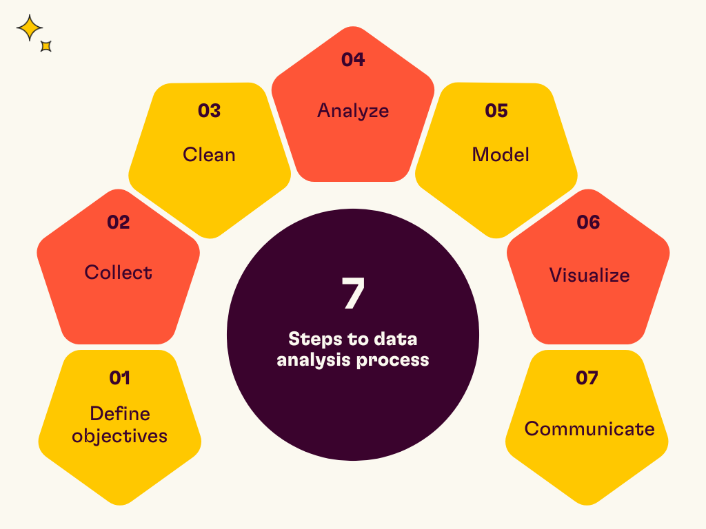
Now, let’s take a look at the traditional way that data analysis is handled. Before we start, this method requires expertise. Generally, data analysts are needed throughout the process, which can create bottlenecks because department-critical information isn’t readily available without assistance.
Here's the standard process:
Define objectives: What problem are you solving? Start with a specific question like "Why did revenue drop in Q3?" rather than "Let's look at sales data."
Collect: Gather data from multiple sources. This might mean pulling from your CRM, advertising platforms, bank exports, and spreadsheets.
Clean: Handle missing values, remove duplicates, fix errors. This step typically eats 60-80% of your time in traditional workflows.
Analyze: Use statistical techniques to find patterns. Group by category, calculate averages, and identify correlations.
Model: Use data to make predictions. Forecast next quarter's revenue based on current trends or evaluate the statistical significance of an experiment.
Visualize: Create charts and dashboards that make complex information instantly understandable.
Communicate: Share insights with stakeholders in a format they can actually use.
The four types of analysis you'll encounter:
Descriptive: What happened? (Total sales by region)
Diagnostic: Why did it happen? (Revenue dropped because of pricing changes)
Predictive: What will happen? (Q3 forecast based on historical patterns)
Prescriptive: What should we do? (Recommend pricing adjustments to hit targets)
Now, it’s important to mention that AI data analysis doesn't replace this framework. It accelerates it by automating the mechanical parts so you can focus on interpretation and decision-making.
Oh, and this isn’t a crusade against data analysts (we still love you guys!). They’re still an important part of this process, as they’re still needed to ensure clean, accurate data is used. Plus, it’s always helpful to ensure that AI analysis remains accurate and that inferences make sense.
Core techniques: The foundation of spreadsheet data analysis
Now, while you don’t need to be a spreadsheet wizard, it’s still useful to understand some of the core techniques. Not because you’ll need to use them, quite the opposite, actually; it’s just so you’ll know what your AI assistant is capable of.
Sorting and filtering organize your data so you can spot patterns and errors before calculating anything. Sort alphabetically to catch duplicate entries, or filter to view only rows that meet specific criteria.
Conditional formatting automatically flags outliers with visual cues. Apply a heatmap to highlight your highest and lowest values without building a chart.
Formulas and functions power the calculations:
SUM adds up ranges.
AVERAGE finds means.
VLOOKUP (or its successor XLOOKUP) pulls matching data from other tables.
Pivot tables summarize large datasets by grouping and aggregating. They're perfect for breaking down sales by region, expenses by category, or any "show me totals by X" question.
Charts and graphs translate numbers into visuals:
Column charts compare categories.
Line graphs show trends over time.
Pie charts display composition.
Traditionally, using any of these core techniques required knowledge and practice. You’d have to know the syntax, understand the steps needed to move raw data to pivot tables, and then to charts, and much more. That’s difficult for anyone… and that’s before you consider how prone these techniques are to user error.
This is where AI is, as cliché as it sounds, a real game-changer. It doesn’t replace these concepts; it just lets you describe the outcome you want, rather than memorizing the steps to get there. You can just ask in plain language what you want, and it’ll do it for you. Clean up data in seconds, create pivot tables and charts in moments, and use advanced calculations without the syntax.
Advanced built-in tools: Moving beyond formulas
While we do believe that traditional spreadsheet data analysis has a considerable learning curve, that’s not to say there aren’t plugins or add-ons that make it slightly easier. For instance, you have:
Analysis ToolPak is an Excel add-in that provides statistical functions, such as regression analysis and correlation tests.
Analyze Data lets you ask questions in natural language and get instant insights. Type "show me sales trends by month," and it generates charts without formulas.
Granted, in order for these extensions to work, you’ll need clean data to work from. That means simple spreadsheets with clear headings.
This can be an issue if you’re using traditional spreadsheets, because they trap you in manual exports. Download a CSV from Google Analytics, another from your ad platform, rebuild formulas, and save as "Q4_Report_Final_v3.xlsx."
Next month? Repeat everything. There's no live connectivity, which means your data goes stale the moment you export it. And unlike stale bread, there’s not much you can do with stale data.
That static limitation is what makes AI-powered spreadsheets a practical godsend.
The AI-first workflow: How to analyze data with Rows
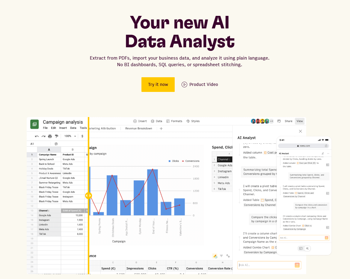
Okay, we’ve been teasing how good AI is throughout this article, so let’s get to the show-and-tell section. We’ll use Rows to demonstrate just how powerful AI data analysis tools are.
Instead of inputting formulas and building static reports, you describe what you need, and the AI handles the execution. The AI Analyst lives inside your spreadsheet as a conversational copilot. Ask it to "show me total sales by region" or "why did costs spike in November?" and it builds the analysis, creates the charts, and explains the insights.
It almost sounds too good to be true, doesn’t it? Well, hand on our robotic heart, we swear to tell the whole truth. Take a look for yourself.

Your new AI Data Analyst
Extract from PDFs, import your business data, and analyze it using plain language.
Try Rows (no signup)1. Connecting live data sources (skip the CSV export)
Instead of downloading CSVs and stitching them together manually, Rows connects directly to your business tools and pulls live data into tables.
Marketing: Google Ads, Google Analytics 4, Facebook Ads, LinkedIn Ads, Instagram.
Finance: Stripe, QuickBooks, bank accounts.
Sales & CRM: HubSpot, Salesforce, Pipedrive.
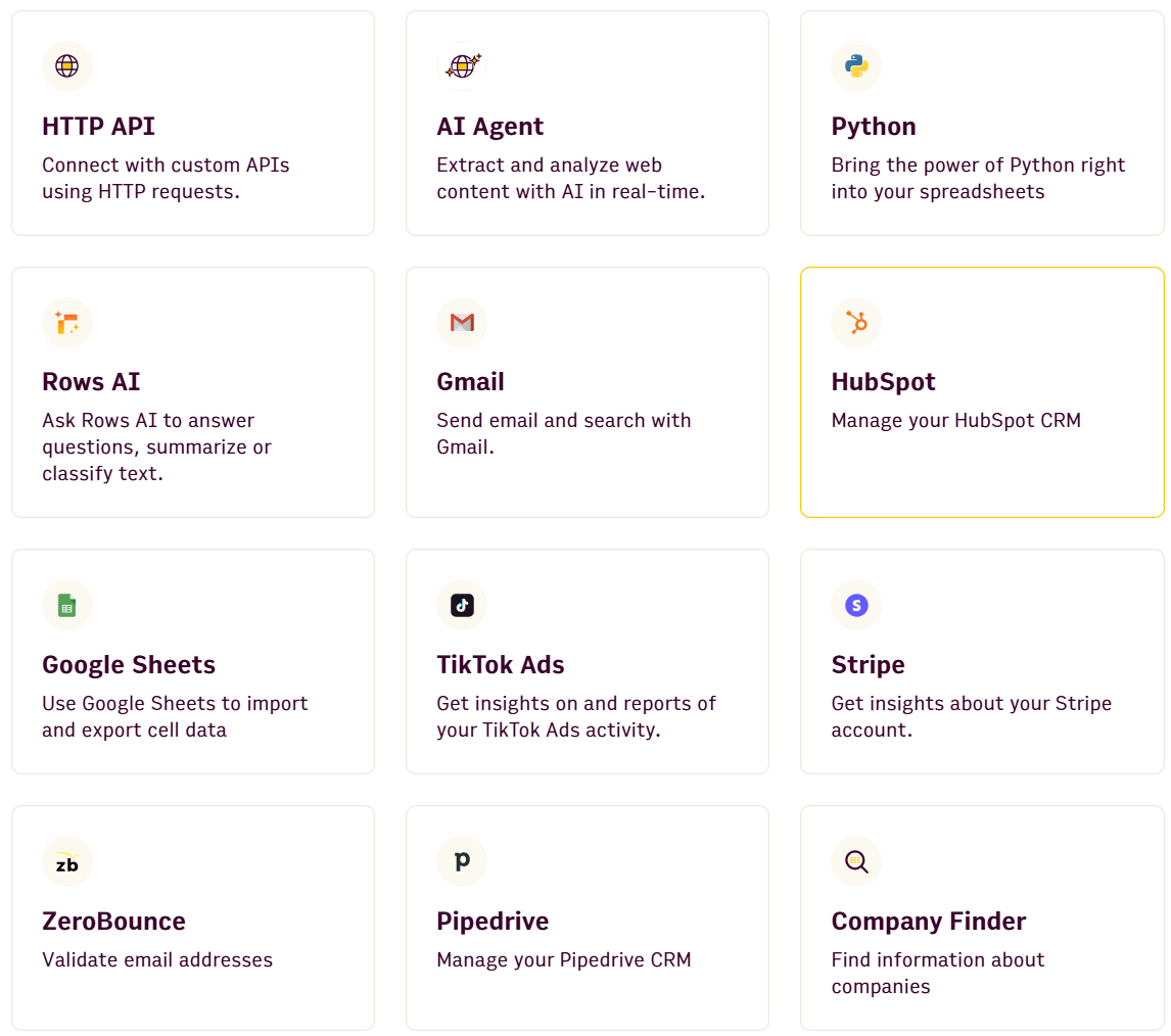
That’s not all, either, because you can set up integrations with all 50+ integrations using plain language to ask AI. No having to shuffle between code blocks or building APIs.
You can try prompts like:
Pull performance of organic unbranded keywords from Search Console in the last 90days. My brand is 'rows'.
Create a website traffic dashboard from Google Analytics. My brand is ‘rows’.
Pull likes and comments from 20 of my most recent Facebook posts.
Ask the AI Analyst to "refresh this Google Ads data every morning at 9am," and it handles the scheduling automatically (or use the SCHEDULE() and REFRESH() functions to keep reports updated). No manual exports, no rebuilding formulas, no "Report_v2_Final_ACTUAL.xlsx" files.
Your dashboard stays up to date without you having to touch it.
Bonus: If you’re looking for more prompt info, take a look at our vibe analytics for CFOs and vibe analytics for CMOs guides.
2. Cleaning and preparing data with AI
Messy data kills productivity. Inconsistent formatting, duplicate entries, missing values – the stuff that traditionally requires careful manual review or complex nested IF statements.
AI-powered data extraction pulls tables directly from PDFs, screenshots, and scanned documents. Upload an invoice, a bank statement PDF, or even a photo of a printed report, and the AI converts it into editable spreadsheet data. No more retyping numbers from documents.
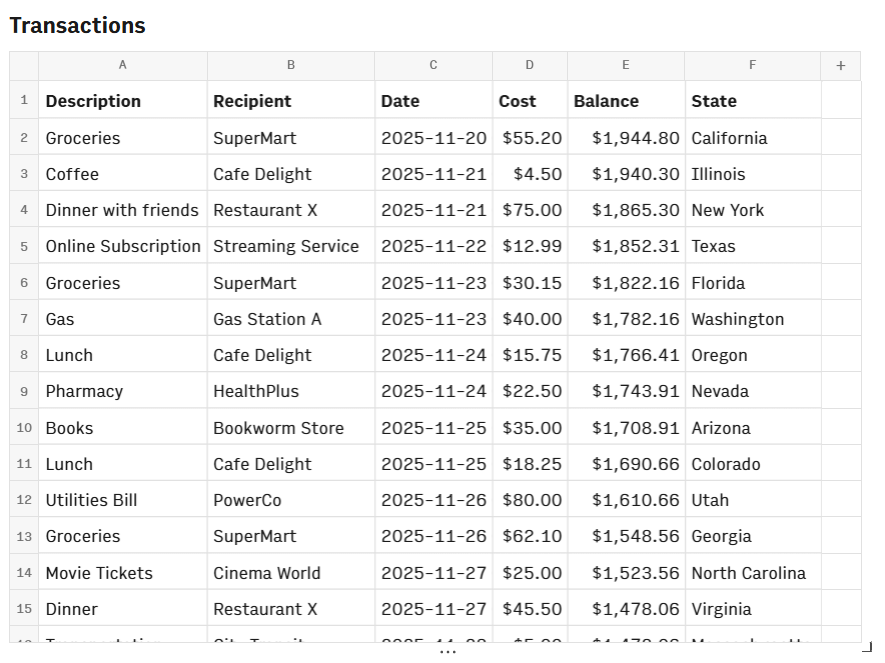
Curious how that looks? Check out our example below with a simple cash flow doc, which you can import in seconds, or try the cash flow template for yourself.
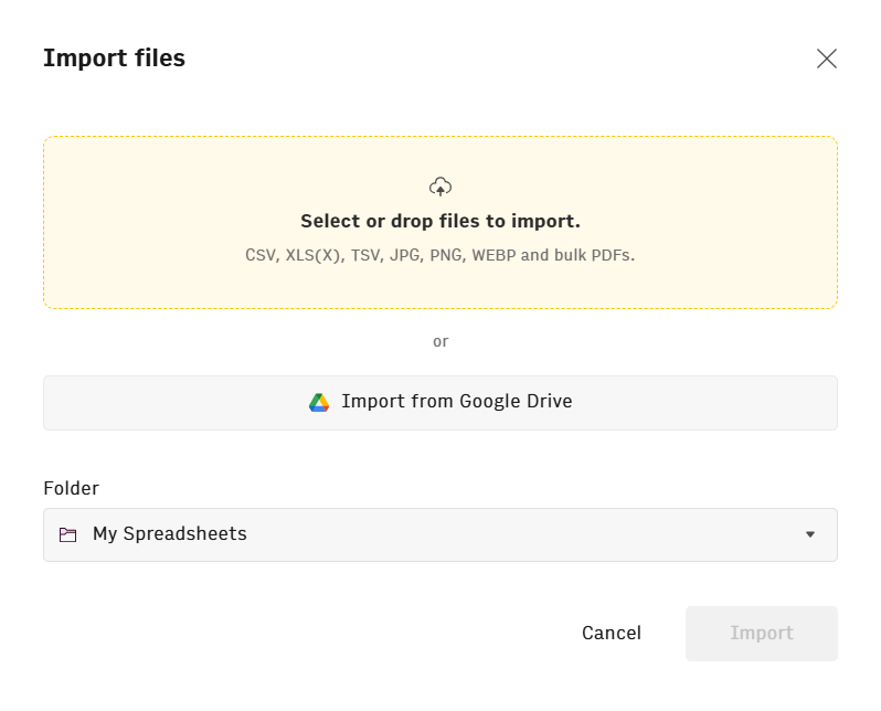
You will now see your data as a standard spreadsheet.
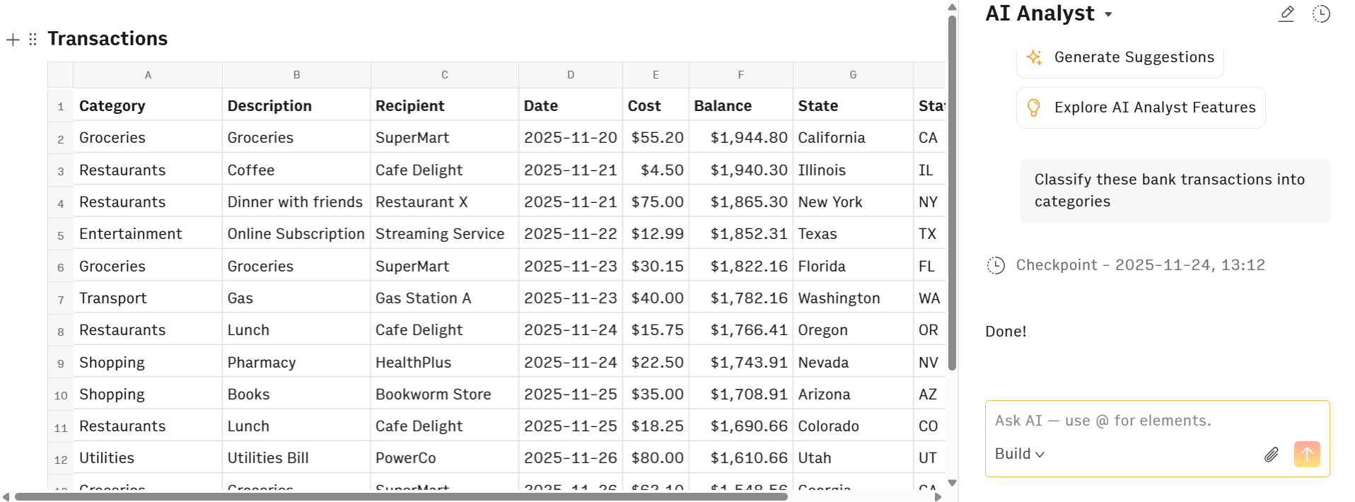
The difference with Rows is, however, that you can now transform this data to whatever you need just by asking in plain English. Here are some examples:
"Classify these bank transactions into categories" (automatically tags expenses as entertainment, restaurants, utilities, etc.)"
"Highlight transactions for X" allows you to color cells that include specific information"
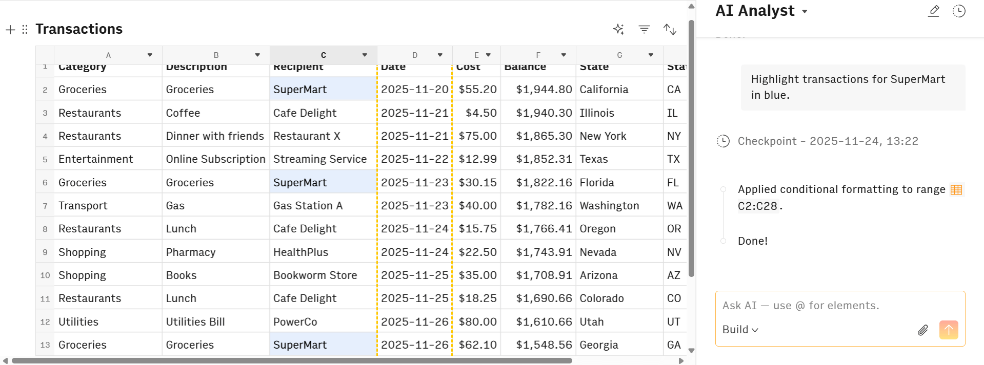
As you can see, you simply describe what you want fixed. The AI handles the execution. This eliminates the tedious data preparation work that usually consumes 60-80% of analysis time, letting you jump straight to finding insights.
3. Asking questions instead of writing formulas
You’ve already seen how our AI Analyst is a conversational copilot that fixes things for you. Instead of googling "how to calculate year-over-year growth" or debugging #VALUE! errors, you just ask.
It goes far beyond just fixing and cleaning data, however. We’ll show you how with our transaction table that we created above. Keep in mind, this will apply to any type of data, whether you’re working with sales figures, marketing budgets, or just looking to convert finance files.
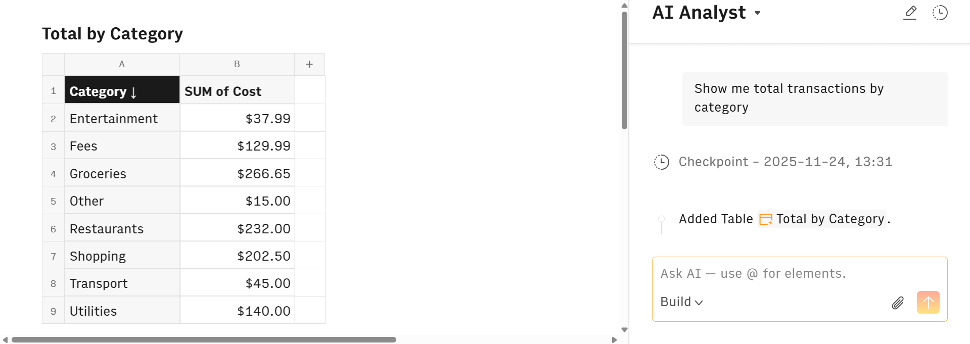
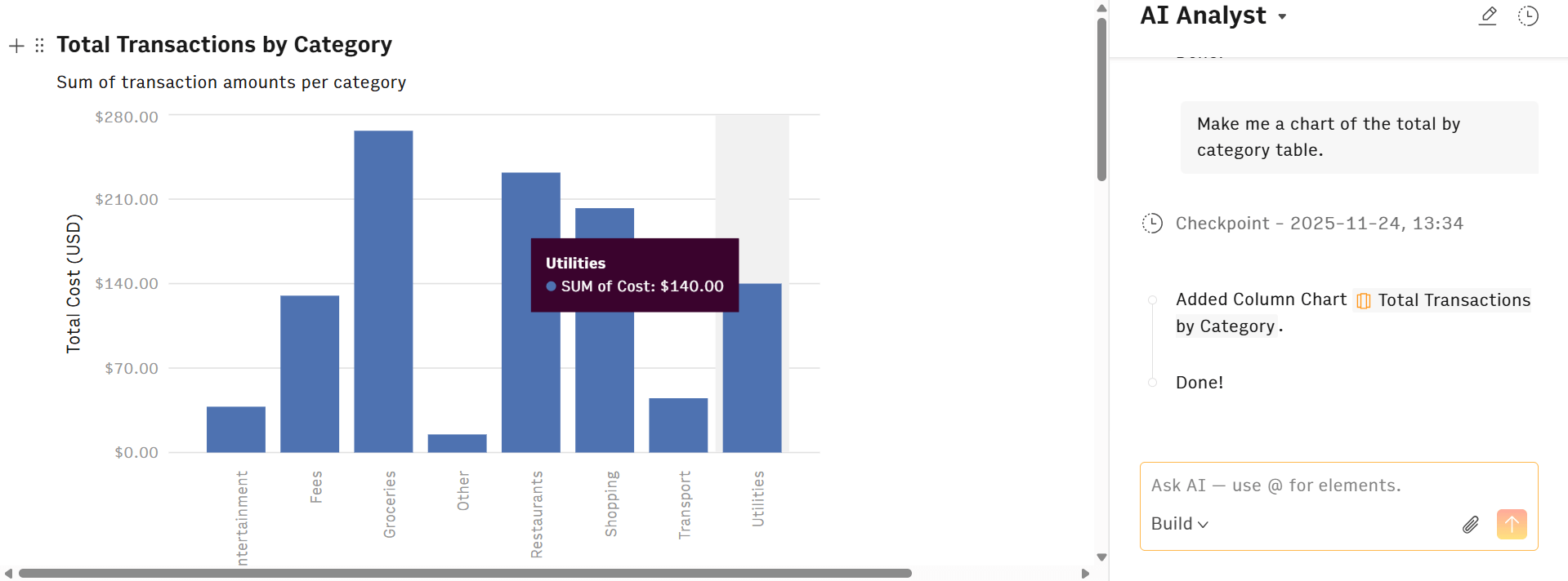
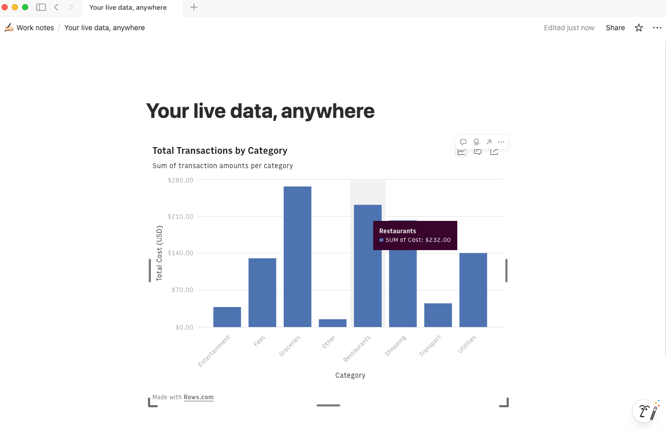
Descriptive analysis: "Show me total transactions by category." The AI creates a summary table and groups your data. Then, you can ask it to build a chart, and you’ve got a great visual, no pivot table clicking required.
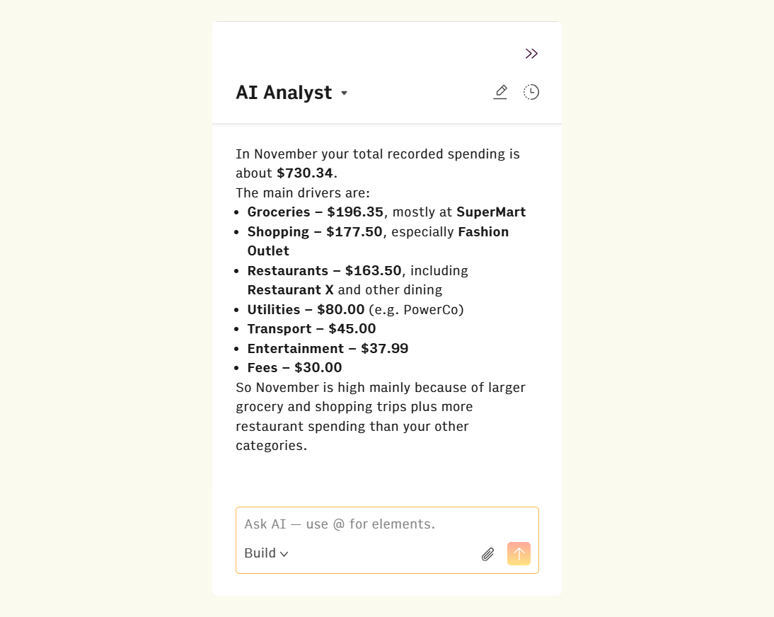
Diagnostic analysis: "Why was my spending so high in November?" It analyzes patterns, flags outliers, and identifies which expense categories drove the increase.
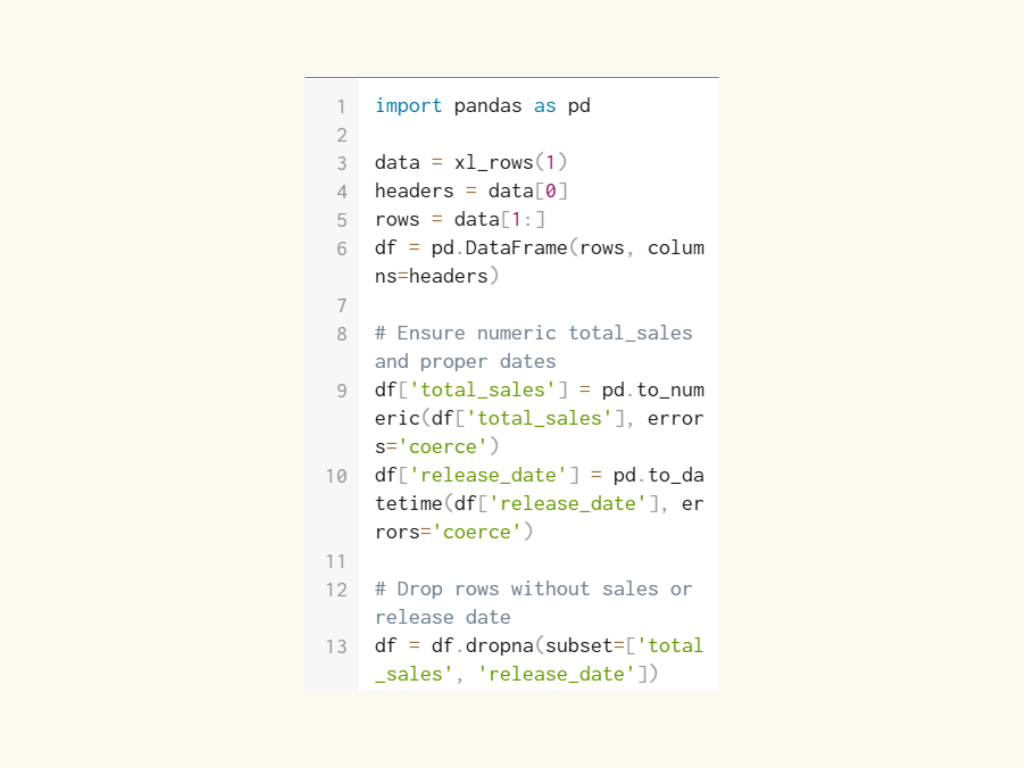
Predictive analysis: Leveraging built-in Python integration, the AI runs forecasting models without you writing a single line of code. Our Python integration is powered by multiple analysis, statistical, and ML libraries, including specific libraries for more exotic charts that you won’t find anywhere else!
So now, you don’t even have to be technically advanced to take advantage of Python and SQL powers. Finance analysts can run regression analysis, marketing managers can perform sentiment classification, and your operations teams can build predictive models with ease. You don't need to become a data scientist. You just need to know what questions to ask with Rows AI functions:
Run k-means clustering and describe the characteristics of each cluster.
Perform a PCA and explain which components explain most of the variance.
Calculate the correlation matrix and highlight the strongest relationships.
Run a significance test to compare these two groups.
Oh, and as an added bonus, there’s no need to worry about how your prompt is worded (for the most part, anyways). Rows runs a prompt enhancer in the background, which adapts vague and imprecise prompts into ideal versions for our models. As long as your prompt makes a modicum of sense, we’ll transform it into something our AI can work with.
4. Presenting insights through an interactive dashboard
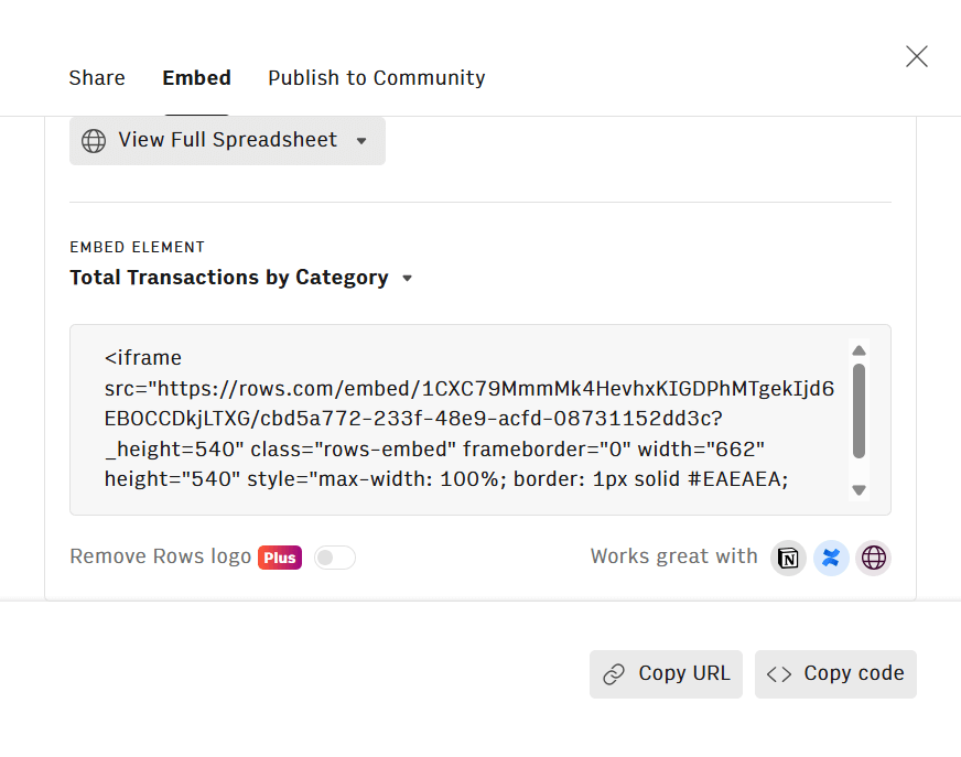
Rows has a mode that turns your spreadsheet into a standalone, dynamic dashboard you can embed in Notion, Confluence, wikis, or websites. Instead of static and outdated screenshots, your team sees polished, interactive charts.
The best thing? Live data keeps dashboards current automatically.
Because you connected live sources in Step 1, the charts update automatically. This ends the "Monthly_Report_v2_Final_ACTUAL.xlsx" cycle. Share the link once, and the data updates forever.
Why AI in a spreadsheet beats AI chatbots
Sure, you could paste your data into ChatGPT or Julius AI and ask questions, but doing so creates a black box where you lose control of the source. Especially when there are better options.
For one, you're never quite sure what to ask or how to phrase it. Even when you do ask a question, there’s no way to know whether you’re going to get the results you need.
That’s why it’s always better to stick with specialized software. Especially when you’re just going to be working from functional spreadsheets anyway.
As the Marketing Strategies podcast with Henrique Cruz notes, "Most potential users are already familiar with the concept of spreadsheets. Allowing direct access lets them immediately understand Rows' enhanced capabilities without barriers."
A grid gives you structure. You see your data organized, which naturally suggests what questions to ask. Plus, that’s only scratching the surface of the advantages:
Context and continuity: Standalone chatbots are one-off sessions. Upload a CSV, ask questions, and then the data disappears into chat history. A spreadsheet in Rows is a persistent workspace where data stays live and iterative.
Transparency: In a spreadsheet, you see the source data cell right next to the AI's output. It's verifiable, not a "black box." When AI classifies bank transactions as Marketing or flags duplicate invoices, you can spot-check the logic immediately.
Shareability: A chat log is a private workspace, without any options for team collaboration. With Rows, a spreadsheet becomes an interactive dashboard you can embed in Notion, share with your team, or publish for stakeholders.
Trust through accuracy: Rows maintains a 90+% accuracy pass rate on AI outputs, and only the minimum necessary data is sent for processing. Your full dataset never trains external models.
Your new AI Data Analyst
Extract from PDFs, import your business data, and analyze it using plain language.
Try Rows (no signup)A smarter approach to spreadsheet data analysis
You no longer need to be a formula wizard to be a data expert. You just need to know the right questions to ask.
With AI, you can connect, clean, and then ask questions about your data that get answered in seconds, not weeks. Plus, you can publish dashboards automatically on collaborative platforms to fully democratize the entire data analysis process.
We’re all about faster access to insights, which is why Rows built a loginless experience. You can try the platform immediately without hitting a signup wall.
Ready to see it in action?
Upload a spreadsheet or connect an integration, then ask the AI Analyst a question. Watch it build the analysis in seconds.