Intro
The idea of growth hacking became very popular in Silicon Valley in the early 2010s. The term appeared to be coined by Sam Ellis, one of the early marketers at Dropbox, to describe a new way to do marketing. Tired of jargon-laden marketing speak, Sean wanted to envision a scalable data-driven framework to grow digital businesses.
Since then, this umbrella term has been widely used to cover a broad range of tactics and strategies aimed at finding the right way to conduct your business towards a consistent and stable scale path. It involves a broad set of skills and professionals, from creatives and designers to product managers and marketers, and uses the so-called 'growth experiments' as building blocks.
Growth experiments are systematic processes directed at introducing a new feature or amending current ones, collecting data, and formulating strategic decisions that could impact the evolution of the business.
Within these processes, a quantitative approach is essential: from setting the right goal and the corresponding metrics, to collecting and investigating data.
In this short guide, we’ll walk you through everything you need to create a dynamic report that pulls data from Google Analytics directly to your spreadsheet, allowing you to investigate and test the outcomes of specific growth experiments.
Here’s a sneak peek at what you will get:
Using Google Analytics to measure growth experiments
Google Analytics is the web analytics tool offered by Google, that allows marketing and product managers to map the flow of visitors to a set of specific funnel steps that result in conversions or signups. Along this flow, many KPIs can be evaluated to infer how your users used or perceived specific parts of their journey.
Its flexibility makes it a great companion for investigating and testing the results of growth experiments: you changed a product tour, or the label of a button, and through Analytics you can check the impact on users' behaviour, including conversion, time spent on page, or exit rate.
Despite being a powerful dashboard, every time you need the flexibility of a spreadsheet, for example, to visualize data in a chart, you find yourself exporting/importing .csv files. That's where Rows gets you covered.
Let's go!
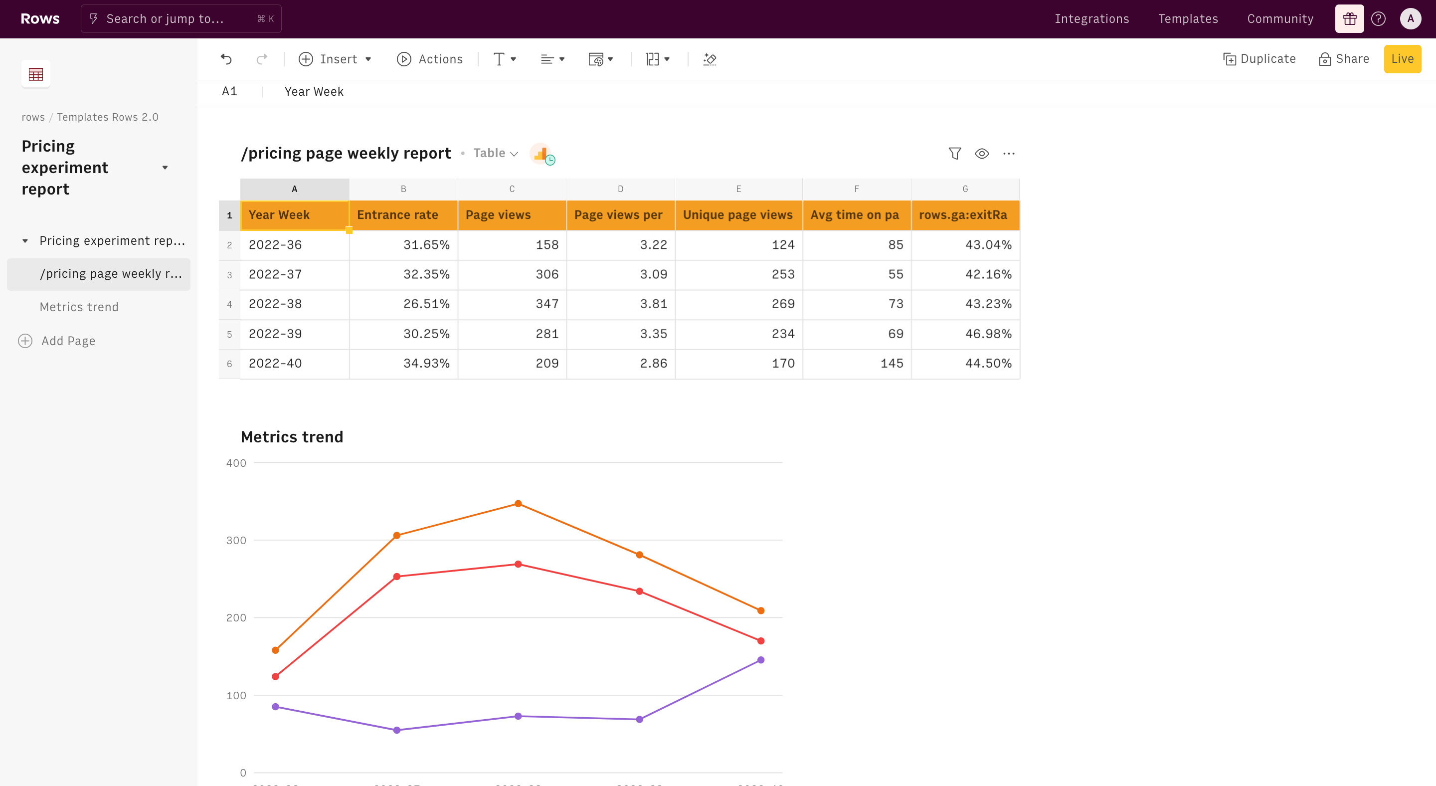
Let's suppose we are running an experiment on our /pricing page: in particular, we want to add one intermediate subscription tier to acquire prosumer customers. What we may want to check metric-wise is the visitors' interest and ultimately their conversion rate on the page.
Let's start step by step. First of all, you need to enable the Google Analytics integration.
Click on the Connect button and follow the instructions. The Google Auth page will open: enter your Google credentials and authorize Rows to retrieve your data.
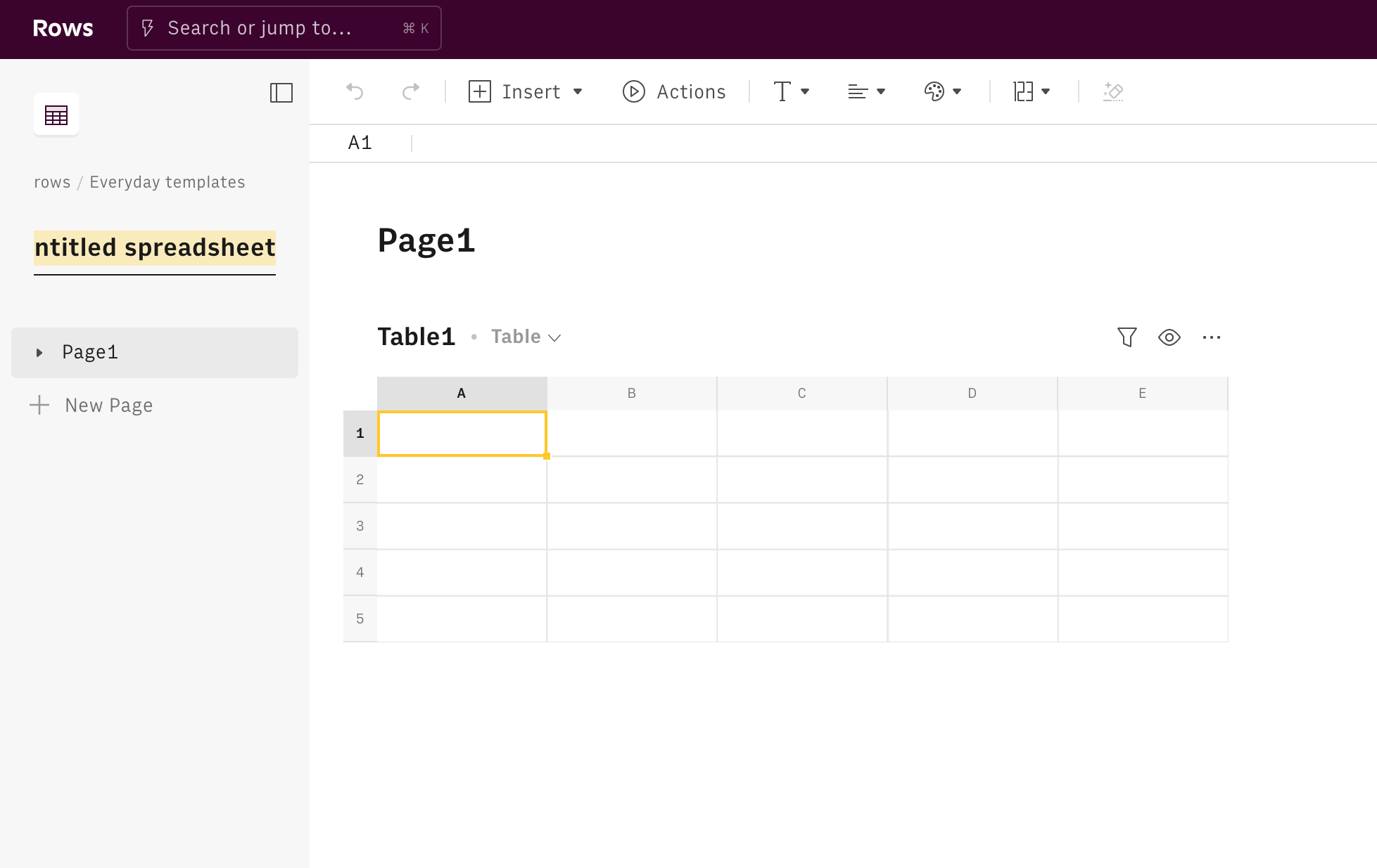
Now you are ready to build your report. Click on the Create spreadsheet button at the top of your dashboard.
Once you land on your spreadsheet, first of all, rename it: click on its title in the top left corner and type the new title. It'll be easier to find it later on.
Rows allows you to have multiple tables on the same page, giving you a neat view of your data. Hit Actions in the toolbar. Look for our Google Analytics functions: many are available, depending on your ultimate goal, such as:
Get a report with custom Google Analytics metrics,
Get page metrics,
Get session metrics,
Get insights about search queries on Google Ads.

For the purpose of this guide, we choose to retrieve data using Rows' Get page metrics and build a simple view to compare the main metrics on the page, before and after the launch of the experiment.
On the right-hand side of your display, the function wizard shows up. At the top, you can see the name of the integration you turned on in the first steps of this guide. Let's go through all the fields together:
- Id. Pick here your profile Id from the drop down list
- Date range. Use it to filter your data within the specified timeframe. In this specific case, choose a broad time window that includes your experiment launch and be careful of any seasonality or other concomitant effects that may be in place, to have consistent and statistically sound results, such as
LASTXMONTHS(2) - Metrics. These are the key metrics you want to display in your report. For the purpose of our experiment, it may be useful to include:
ga:avgTimeOnPage,ga:bounceRate,ga:exitRateand, as proxy for interest, a custom metric that tracks clicks on the 'Sign-up' button. If you haven't yet, learn how to set up custom metrics on Google Analytics here - Set page path. Use it to filter your data for the specific page where you run the experiment, here /pricing
- Set dimensions. Use it to break down your data according to some specific variable, i.e. time, browser, location. Here pick a time parameters, such as
ga:yearWeek - Set sort. Use it to sort your data asc or desc
- Set segment. Use it to filter your data for a specific segment of users, if any.
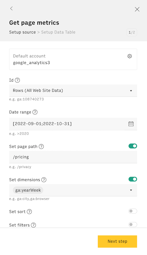
Clicking on the button Next step, Rows will guide you through the creation of the output table, to display all data retrieved from the integration.
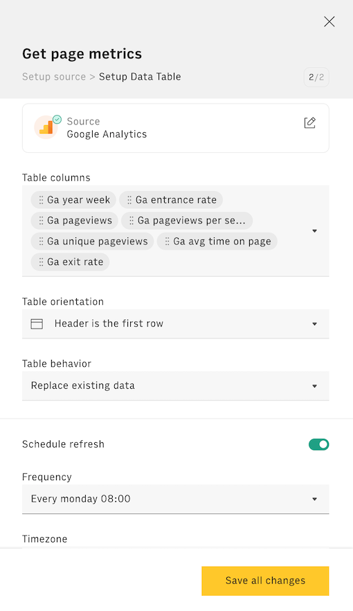
The first drop down will display the table's columns, based on the standard metrics available through Google Analytics. You can also set a refresh schedule to make your table fetch new data at a given frequency. If you chose YearWeek as dimension in the previous step, pick a weekly schedule ('Every Monday 08:00'). Once done, hit Create Data Table.
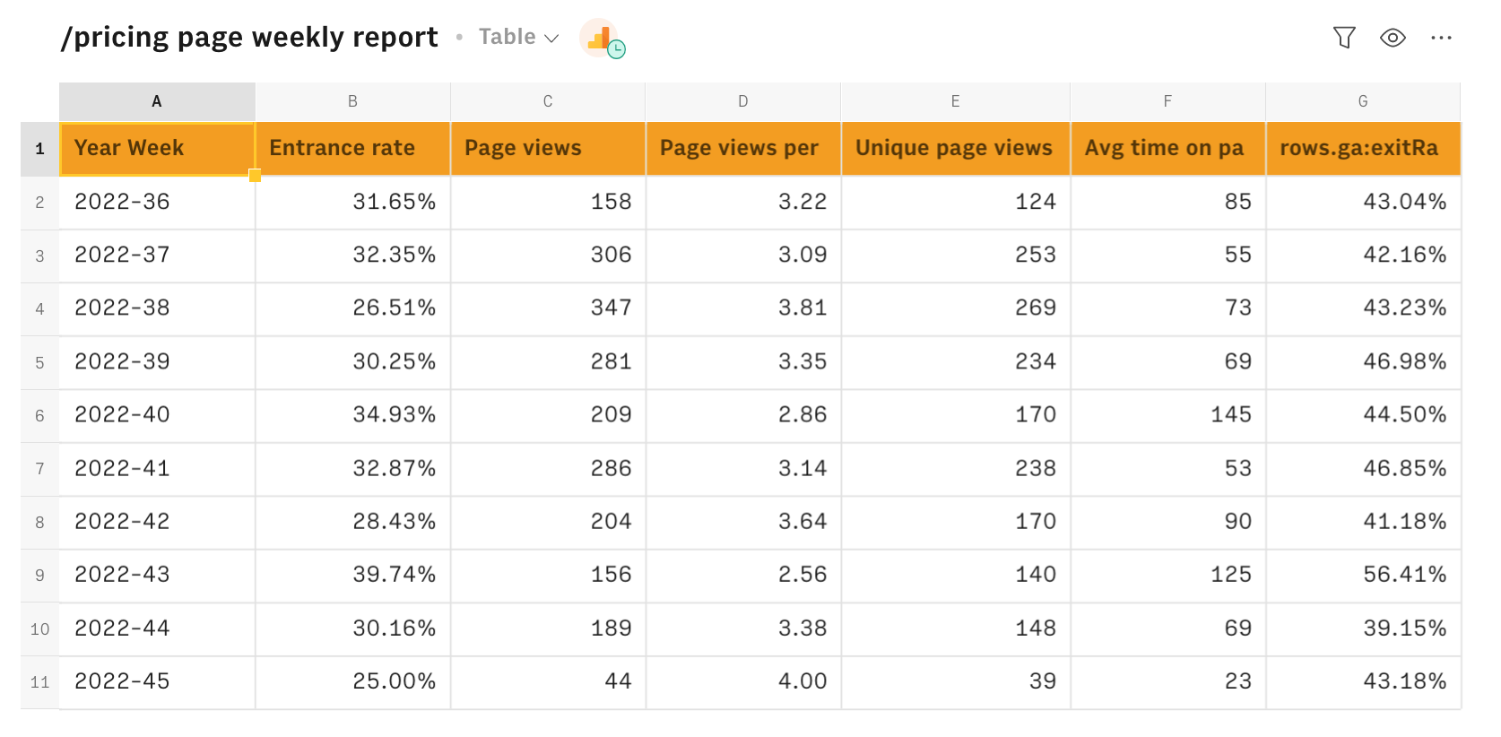
You may want to highlight in red the week in which the experiment was launched, to ease the before/after comparison. Also, you can rename the table's columns by directly editing its header.
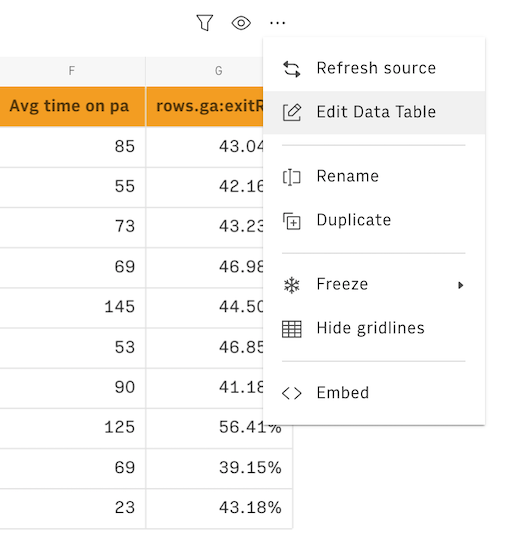
If you followed all the above points, you now have a summary table showing the /pricing page metrics for each week in the selected time frame. Of course, you can choose to further break down per country -, the goal being to understand how users react to the price change in different countries. All you need to do is to go back to your data table and click on the ... icon and then Edit Data Table.
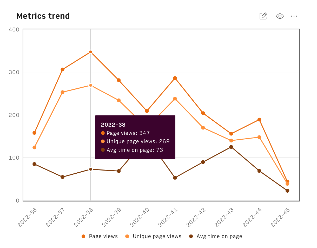
Adding a chart
Add a line Chart from the Insert menu in the toolbar to help you visualize the trend.
You might also like
Check also
Interested in Growth marketing? Discover other guides:
Discover our Marketing playbook.