9 Best Metabase Alternatives & Competitors in 2025

Metabase is a business intelligence (BI) suite that offers a friendly UX for visualizing data coming from ~20 sources, including data warehouses and databases like SQL, BigQuery, Amazon Redshift, etc.
It has a proper data visualization dashboard builder and is an effective tool for BI teams and data experts.
Some of the key features of Metabase that BI teams and data experts leverage are:
Spreadsheet-like commands, like sort, filter, etc.
Friendly query builder
Interactive and explorable dashboards with drag-drop editor, date picker, zoom-on charts, notification system, etc
Row-level permission
However, despite its attempt to be a friendly self-service software, the tool isn’t perfect. It takes time to set up, doesn’t come with AI capabilities, and lacks features that its competitors offer.
In this article, I will tell you why you should try an alternative to Metabase and discuss the best ones in the market.

Your new AI Data Analyst
Extract from PDFs, import your business data, and analyze it using plain language.
Try Rows (no signup)Why Do You Need a Metabase Alternative?
There are three main Metabase drawbacks for which you might look for other alternatives in the market:
Metabase doesn’t have AI capabilities
It lacks data governance
Misses true spreadsheet flexibility and usability
Reason 1. Doesn’t Have AI Capabilities
Artificial intelligence plays a crucial role in enhancing data insights and decision-making processes. Most data analysis and visualization platforms have successfully embedded AI to plot graphs, analyze data, and more.
Unfortunately, Metabase doesn’t let you use AI to analyze and visualize data.
So, if you want to use AI to identify patterns, trends, and anomalies in data, you must look for a Metabase alternative.
Reason 2. Lacks Data Governance
Metabase lacks advanced data governance features that the majority of its competitors have.
Without strong data governance features, there’s a risk of data breaches, unauthorized access, and data manipulation.
Proper data governance ensures that data is accurate, secure, and only accessible to authorized users. This is crucial for maintaining the integrity of analysis and visualization outcomes.

Reason 3. Misses True Spreadsheet Flexibility and Usability
Metabase has fewer customization options compared to other business intelligence tools. This makes it challenging for you to modify certain aspects of visualization or perform complex calculations.
Another issue with Metabase is – to create a close-knit report, Metabase executes queries on one data source at a time, which means it’s not possible to merge data from various sources.
💡 With Rows you can pull live data from +50 sources, manipulate it with all the familiar features of a spreadsheet (plus AI) and visualize it in a dashboard. Build a Google Analytics report, or a marketing dashboard combining Search Console, Facebook Ads and LinkedIn Ads. Try it now.
What are the Best Metabase Alternatives and Competitors
Some of the best alternatives to Metabase are:
Looker Studio – Free data visualization tool launched by Google.
Microsoft Power BI – Legacy data analytics and visualization software.
Qlik Sense – AI-powered data analytics and visualization tool.
Tableau – AI-powered BI and analytics software.
Mode Analytics – Modern BI and data exploration software.
Rows – Spreadsheet software that makes it easy for you to transform and visualize data.
Equals – AI-powered spreadsheet editor.
Coefficient – A data connector extension for Google Sheets and Excel.
Zoho Sheet – Online spreadsheet software that helps organize, manage, and analyze data.
Metabase Alternatives for Data Visualization
To visualize your data in a better, modern way, here are some of the best software in the market.
1. Looker Studio (Formerly Google Data Studio)

Looker Studio is a free data visualization tool launched by Google. It allows you to connect, visualize, and share data via intuitive dashboards, reports, and visualization elements.
Features
Offers a visual canvas to create customized dashboards based on relevant data sources, followed by spot-on visualization and metrics.
Looker Studio provides 1,000+ data connectors to facilitate data import from advertising, marketing, and social platforms.
Has a library of 40+ visualization elements, including graphs, charts, pivot tables, heatmaps, and widgets like star ratings, funnels, gauges, and scorecards.
Lookers Studio lets you build custom visualizations using Javascript, CSS, and style elements.
Pricing
Looker Studio has a free version with self-service business intelligence. Looker Studio Pro is available on a project-based subscription but doesn't reveal its pricing online.
Pros and Cons
✅ A variety of native and partner data connectors.
✅ Has a gallery of data visualization elements and reporting templates.
✅ Supports real-time collaboration.
❌ Doesn't offer direct integration with MS Excel.
❌ Hard to set up and maintain.
2. Microsoft Power BI

Microsoft Power BI is a legacy data analytics and visualization software. It offers a user-friendly report-creation tool with integrated AI capabilities and interactive data visualization elements, making it an excellent Metabase alternative for data visualization.
Features
Power BI displays Microsoft's classic ribbon-style toolbar for creating reports, which makes creating reports as easy as working with MS Office suite apps.
The Power BI Apps Marketplace has hundreds of pre-built data visualization elements and widgets, such as animated charts, maps, and funnels.
Power BI lets you visualize your data using different visuals. For instance, use the Key Influencers visual to identify factors influencing your revenue, the Decomposition Tree to break down events and perform root cause analysis, and more.
Use the Q&A visual in Power BI to ask questions about the data using natural language and receive answers in a visual form.
Power BI lets you generate personalized custom reports using variables such as country and data sources.
Pricing
Microsoft Power BI offers a free plan with a Microsoft Fabric account. The free plan lets you create rich, interactive reports with visual analytics within MS Fabric. Other than that, it has two individual plans:
Power BI Pro: $10 per user per month
Power BI Premium: $20 per user per month

Pros and Cons
✅ Easy to use with a familiar interface for MS Office suite users.
✅ Integrated AI capabilities for quicker visualizations.
✅ Fully responsive mobile app.
❌ Higher learning curve for beginners.
3. Qlik Sense

Qlik Sense is an AI-powered data analytics and visualization tool trusted by 40,000 users, including top companies like Deloitte, Ford, Paypal, and Samsung.
Compared to Metabase, Qlik Sense offers robust data visualization and reporting features coupled with generative AI capabilities.
Features
Qlik Sense offers interactive data visualization elements, such as graphs, tables, histograms, treemaps, combo charts, and more, that auto-update with each action.
Use Insight Advisor, an AI-powered search-based visual discovery tool, to auto-generate impactful analyses coupled with visuals on simple natural language questions and commands.
Qlik Sense lets you create on-brand, highly formatted XLS reporting templates with common reporting requirements, such as interactive visuals, metrics, and more.
Has integrations to hundreds of third-party cloud warehouses, analytics, and accounting tools, making it easy to collect and visualize data under one roof.
Pricing
Qlik Sense Cloud Analytics platform offers a 30-day free trial with data visualization and generative AI capabilities. Other than that, it has three paid plans:
Standard: $825 per user per month
Premium: $2700 per month
Enterprise: Custom pricing

Pros and Cons
✅ Guided customer onboarding process.
✅ An active community of 235K+ members.
✅ AI-assisted instant visualizations.
❌ No free plan is available.
4. Tableau

Tableau is an AI-powered BI and analytics software that offers cloud and on-premise services to collect, analyze, and visualize data using a centralized dashboard.
Features
Tableau's intuitive drag-and-drop interface allows users to easily create and customize an entire dashboard or one-off visuals – no SQL or programming required.
Offers extensive visualization options, including bar charts, line charts, scatter plots, heat maps, and more, enabling users to effectively present their data.
Tableau AI lets you drill through insights by asking questions in natural language and getting dynamic visualizations as responses.
Tableau's mapping capabilities offer real-world maps with pre-installed information, such as cities, postal codes, and administrative boundaries, allowing users to create detailed and informative geographic visualizations.
Pricing
Tableau has four paid plans to choose from:
Creator
Explorer
Viewer
Enterprise
To know more about their pricing, contact Tableau’s sales team.

Pros and Cons
✅ Real-time collaboration and alerts.
✅ Offers mobile-friendly visualizations.
✅ Allows downloading visuals as PDF or .PNG files.
❌ Higher learning curve for non-tech users.
❌An unintuitive UI overloaded with features.
5. Mode Analytics

Mode Analytics is modern BI and data exploration software. It offers comprehensive tools and interactive ways to create dashboards, reports, and visualizations for your data.
Features
Has a drag-and-drop report builder with pre-built blocks for visuals, data tables, and custom JavaScript or HTML supporting blocks.
Mode's quick chart feature lets you iterate through as many versions of the chart as you like for a specific dataset with a click.
Supports the ability to customize its native visualizations or add custom visualizations to a report using the HTML editor.
Mode's visual explorer offers 100+ visualization elements ranging from simple bar graphs to multifaceted combo charts.
Mode allows customizing visuals using colors, labels, styling, and formatting options.
Use version history to see how reports looked before a change happened at any point in time.
Pricing
Mode Analytics is free to get started, with an upper cap on the number of visualizations and user limits. If not enough, choose from its paid plans – Studio, Pro, and Enterprise.

Pros and Cons
✅ Has an intuitive drag-and-drop builder with custom building blocks.
✅ Offers extensive customization options.
✅ Supports custom visualizations.
❌ Limited charting options.
Metabase Alternatives for Data Integration and Analysis
Data integration and analysis features in any tool help you collect data, do calculations, and make data-driven decisions.
6. Rows
Rows is a great Metabase alternative that offers the flexibility of a spreadsheet and helps you build charts, pivot tables, carry out calculations, and more.
Let’s discuss some features that make Rows a perfect alternative to Metabase.
Feature 1. Data Integration
Data integration is the first step in analyzing and visualizing data effectively.
Rows integrates with 50+ data sources, including Google Analytics, Notion, Instagram, and more. You can import data from these connectors with just a few clicks.
All data connectors in Rows are built-in native features, so you don’t have to rely on external add-ons to use AI in your analysis.
How can Rows do this?
It handles JSONs in the grid and is able to convert them into table format.
Some examples of data integration in Rows are:
Import Google Analytics 4 data to Rows and get key analytics and reporting. Pick one of the recommended reports or build your own custom view as follows:
Or you can:
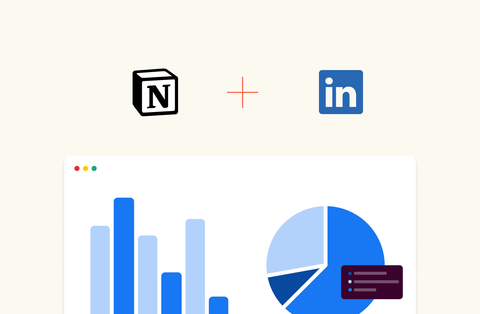
Connect your LinkedIn page and track your posts' performance.
Connect Slack to Rows and set alert automation to your #social channel whenever a new comment appears on your social media posts. All from a spreadsheet.
Import a Notion database in Rows with a few clicks, enrich data, and send it back to Notion.
When the tool you’re working with isn’t listed in our catalog, use our HTTP tool to make GET, POST, PATCH, and PUT requests to any endpoint using basic or API token authentication methods.
See how it works in the interactive demo below:
You feel ready to try it yourself?
💡 Try to make a GET request yourself with our HTTP Request Tester: input the endpoint, the headers and params and visualize the content of the response in a cell.
Feature 2. Build-in AI to Answer All Your Data-Related Questions
Rows integrates with AI and makes data analysis easy for you, even if you’re a non-data-friendly person.
You can ask data analysis-related questions to the AI in simple language. The AI will help you solve complex issues like doing sentiment analysis, cleaning up data, building charts, and more.
Rows has three AI components:
1. AI Functions
Rows integrates with Open AI for its 14 proprietary functions that automate prompts and address specific types of tasks.
Here’s one of the use cases of AI functions – EXTRACT_OPENAI in action:
Similarly, you can also execute sentiment analysis on a social media comment or product review using the function – SENTIMENT_ANALYSIS_OPENAI or clean up data using APPLY_TASK_OPENAI.
Discover more about all possible use cases of AI in Rows.
2. AI Analyst
Use natural language to ask data-related questions to our Analyst. It will do all the calculations for you, including descriptive statistics, data summarization, transformation and pivoting. Check out our guide or watch our demo.
3. AI-generated Subtitles
Ask AI to generate subtitles for your tables and graphs that include key insights from the data displayed.
Feature 3. Build Layouts That are Delightful to Share
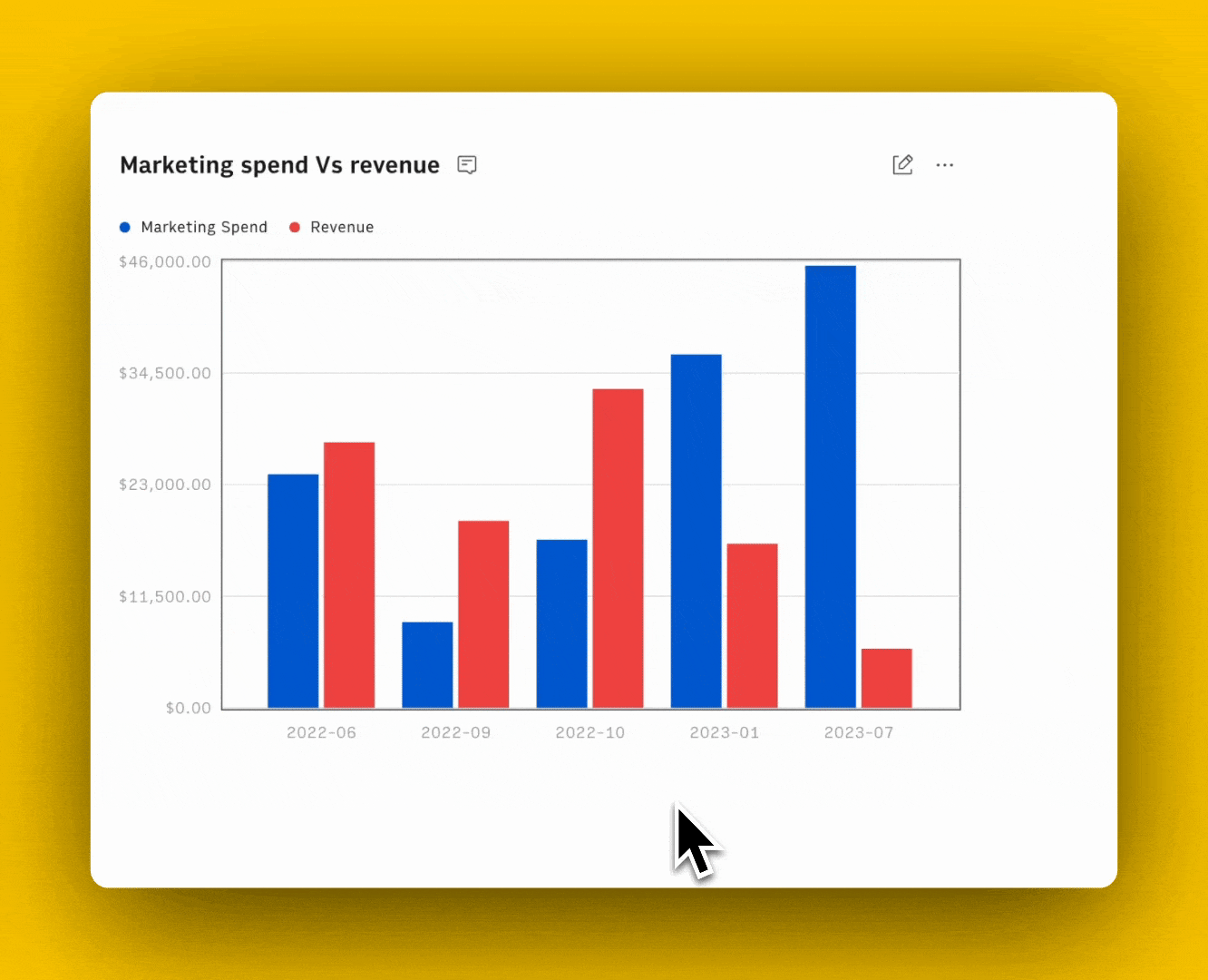
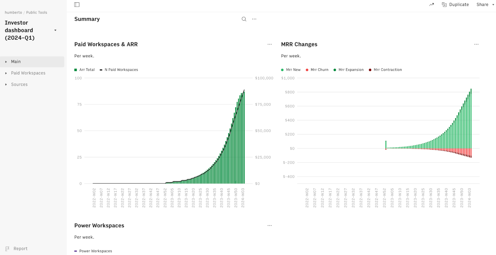
With Rows, you can build elegant dashboards and share them with your team and clients.
Here’s an example of our investor dashboard (numbers are dummy).
Apart from this, you can also embed tables and charts beautifully on Notion, Confluence, website, wiki, or other internal tools that support iframes with ease.
It’s a simple 4 step process:
Choose Embed in the settings menu located in the right-hand corner of the element you want to embed.
Click the Share Privately toggle.
Click <> Copy code. You can use the Copy link to paste directly into tools that automatically embed via the link - e.g., Notion.
Paste the embed code on your website, wiki, or destination tool.
See for yourself in the following interactive demo:
Learn how to use Embed in the most recent documentation tools, like Notion, Confluence, and Slite.
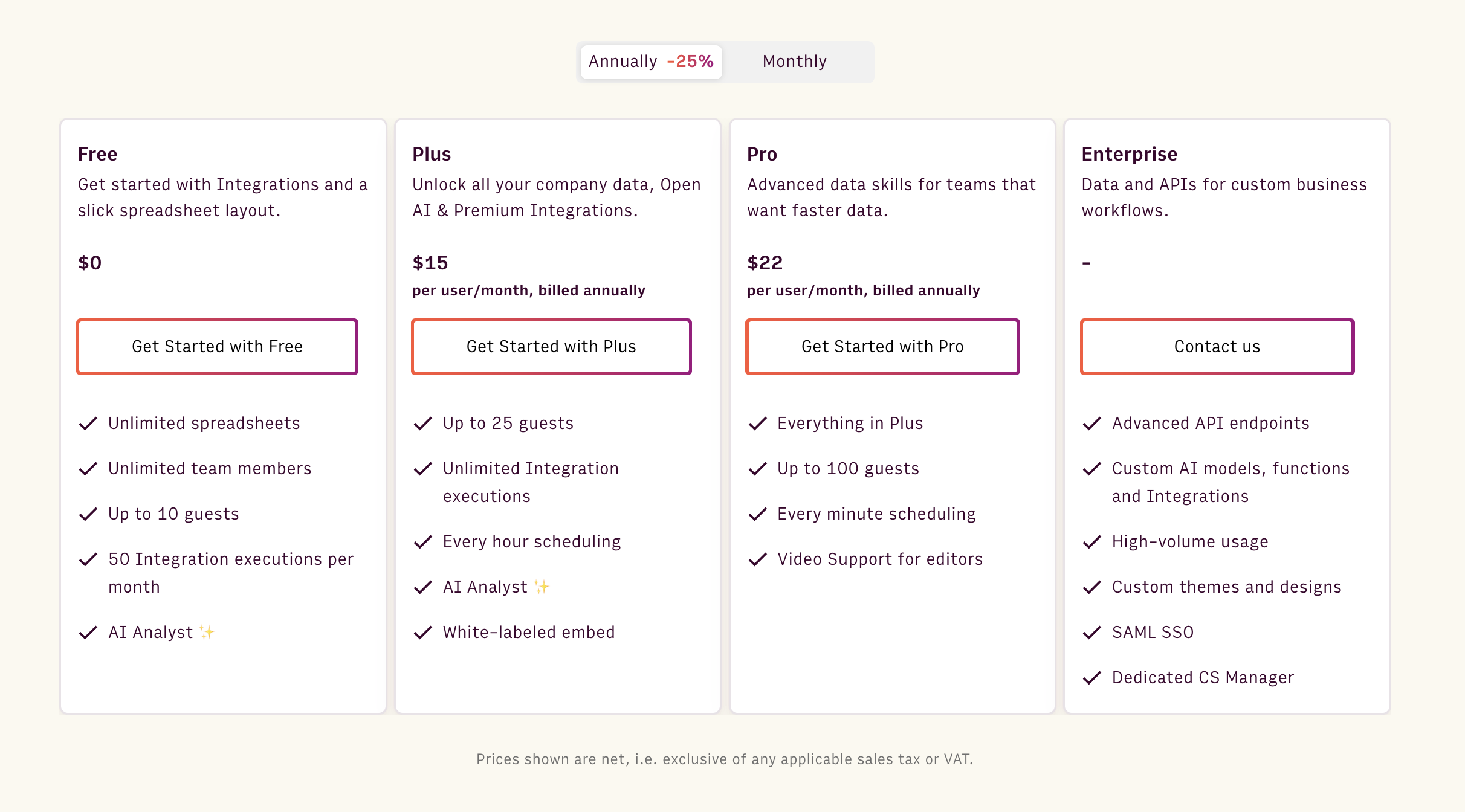
Pricing
Rows' free plan lets you onboard unlimited members and up to 10 guests, execute up to 50 integration tasks per month, create unlimited spreadsheets, and do much more.
If you want premium features and increased limits, Rows also offers 3 paid plans to choose from:
Plus: $15/month/member, up to 25 guests, unlimited integration tasks & daily data refresh.
Pro: $22/month/member, up to 100 guests, unlimited integration tasks & hourly data refresh.
Enterprise: Custom price for advanced API usage and workflows.
How Does Rows Compare to Metabase?
Despite its attempt to be friendly and self-service, Metabase is a proper BI tool for data teams and takes time to set up properly. As a result, it’s not an ideal solution for everyone in your organization, especially non-data-friendly users.
Rows is a data transformation and visualization tool for a broader, non-expert, self-service audience (marketing team, ops team, finance team, etc.).
Where Metabase offers a friendly UX to visualize data coming from multiple sources, Rows helps people build internal dashboards, combined with transformation and AI analysis, without knowing the underlying data structure or SQL.
Metabase is a BI tool for data experts. It’s comprehensive and flexible when it comes to building dashboards, which are the pillars of a company’s data infrastructure.
But it’s not a daily thinking tool that can be used to transform data. That’s where Rows comes in. Rows is for anyone who wants to use a spreadsheet and power it up with data ingestion and AI.
Pros and Cons
✅ Has easy-to-use API, so you can import data into Rows from anywhere.
✅ Non-data-friendly users can not transform and visualize data easily.
✅ AI functions, Analyst, and subtitles make data analytics easy for beginners.
❌ Rows (still) misses some dashboard components, like cards and fully-working drag-and-drop features
Curious to see Rows in action? Get a head start with our Google Analytics templates, such as SEO Backlink Checker or Social Media Report.
Wanted to try out ChatGPT on the grid? Use one of our templates and explore how to extract, classify, or clean up data using only natural language.
Your new AI Data Analyst
Extract from PDFs, import your business data, and analyze it using plain language.
Try Rows (no signup)7. Equals
Equals is an AI-powered spreadsheet editor and an excellent alternative to Metabase for data analysis. Its advanced functions and candid interface make data analysis less boring and more accurate.
Features
Use the no-code query builder to connect your database, data warehouses, and other popular apps like Shopify, Google Ads, Salesforce, and more.
Equals lets you use an AI assistant within cells to summarize data, ask questions, and generate formulas using natural language commands.
Supports auto expand functionality that enables cells to auto-expand and update calculations and charts as new data comes in.
Pros and Cons
✅ Equals has integrated AI capabilities for data analysis.
✅ An easy-to-use interface with stress-free, no-code analysis.
✅ A vast gallery of customizable charts and other data visualization elements.
❌ All essential connectors are a part of Equals' paid plan.
Pricing
Equals offers seat-based pricing at $39 per month per seat, inclusive of unlimited workbooks, queries, and dashboards. In addition, it has three other connector plans to choose from:
Essential: $99 per connector
Standard: $299 per connector
Enterprise: Custom pricing

8. Coefficient

Coefficient is a data connector tool, available as an extension to Google Sheets and Excel. It allows you to ingest live data from multiple data sources into your spreadsheets for analysis.
Features
Has 40+ data connectors for third-party data systems and apps, including Salesforce, Jira, Google Analytics, Mailchimp, and other marketing platforms.
Use Coefficient 2-way sync for bulk data transfer to and from spreadsheets to source systems and vice versa.
Use custom fields, dynamic filters, and live pivot tables on top of your cloud systems to harmonize cross-platform data collection and storage into a unified spreadsheet.
Set up real-time Slack alerts for when cell values change or to receive daily or weekly digests highlighting changes.
Pricing
Coefficient's free plan offers three data sources and an import size limited to 5,000 rows. If you want to extend these limits, choose a paid plan:
Starter: $59 per month
Pro: $119 per month
Enterprise: Custom Pricing

Pros and Cons
✅ Coefficient is easy to use and implement.
✅ An extensive range of data connectors for easy data import.
✅ Auto-data refreshes provide access to real-time data.
❌ At times, data extraction takes time to render.
❌ Has limited data connectors compared to Metabase.
9. Zoho Sheet
Zoho Sheet is an online spreadsheet software that helps organize, manage, and analyze data. It’s powered by an automated data processor, an AI-assisted data analysis, and 1,000+ integrations.

Features
Leverage the automatic data cleaning tool to fix data inconsistencies, human errors, missing values, and duplicate entries.
Offers data harmonization features like sorting, filtering, and conditional formatting to improve data quality.
Zoho Sheet supports 350+ predefined functions like data aggregation and complex calculations across various categories – text, financial, and spreadsheet.
Use edit history to review changes or restore previous versions for data added, modified, or deleted from each cell.
Zia, an assistive AI, provides formatting suggestions and answers questions about your database using charts, pivot tables, formulas, and simple explanations.
Pricing
Zoho's official website doesn't mention its pricing. Contact Zoho's sales team to get a customized quote that aligns with your business needs.
Pros and Cons
✅ Zoho has its proprietary conversational AI assistant.
✅ Supports more than 20 languages.
✅ Hundreds of predefined functions.
❌ At times, data rendering is slow and laggy.
Your new AI Data Analyst
Extract from PDFs, import your business data, and analyze it using plain language.
Try Rows (no signup)Automate Data Analysis with Rows
The tools mentioned above are all great alternatives to Metabase and help you resolve its drawbacks effectively.
Gathering data, analyzing, and then visualizing it is an important part of any business to make data-driven decisions.
But which Metabase alternative is best for you?
Well, there’s no better way than signing up for free trials and judging products for yourself.
If you or your team don’t have the time to try every product on our list, go to Rows.com, import data, automate your report, and see if it's the right match!