10 Best Data Aggregation Tools to Try Out in 2026 (Jan update)

There's a tsunami of data in different industries—from social media metrics to supply chain logistics and healthcare patient records to financial market indicators. And many companies are struggling to aggregate the data pool in their industry. This inefficient data management is sucking resources faster than a financial black hole.
So, if you are drowning in data, we've gathered the 10 best data aggregation tools. With these tools, you can get quality insights to drive informed decisions faster and more efficiently in your company.
Factors to Consider When Choosing a Data Aggregation Tool
Flashy features don't always translate to real-time value. A data aggregation tool must offer value beyond just collecting data from sources. Below are a few factors to note before you purchase that data aggregation tool. We've made it even better by framing the factors as questions.
Will It play nice with your existing tech stack?
Your data lives in multiple places—databases, SaaS tools, files, APIs. The tool needs to connect to these sources and facilitate data ingestion, not rely on manual exports or copy-paste workflows. Check if the API documentation is solid and if the integrations you actually use are supported.
How does it ensure data quality?
54% of businesses cite data quality and completeness as their largest marketing data management challenge. The best aggregation tool in the world is worthless if it can't help ensure data quality. Look out for a tool's robust data cleansing, validation, and enrichment capabilities.
Does it make people data-independent?
The best tools don't create bottlenecks where only technical users can surface insights. Can non-technical team members explore data, build reports, and answer their own questions? Does it facilitate collaboration through shared dashboards, annotations, and version control—or does it create new silos where only certain people can access or understand the data?
Is the tool easy to maintain?
Maintenance isn't a one-time setup—it's updating data sources when APIs change, adjusting permissions as teams shift, adding new integrations as your stack evolves, and adapting to new data types. Look for tools that make these ongoing adjustments straightforward rather than requiring developer intervention every time something changes. Can you modify connections yourself? Can you easily grant or revoke access? Is the tool positioned to incorporate emerging capabilities like AI and machine learning without requiring a complete rebuild?

Build better dashboards faster
Aggregate and visualize live data from 50+ sources, automate analysis with AI and share it interactively with your team.
Try Rows for FreeWhat are the best data aggregation software?
Rows
Microsoft Power BI
Tableau
Zoho Analytics
Domo
Looker
Qlikview
Metabase
Sisense
Alteryx
1. Rows
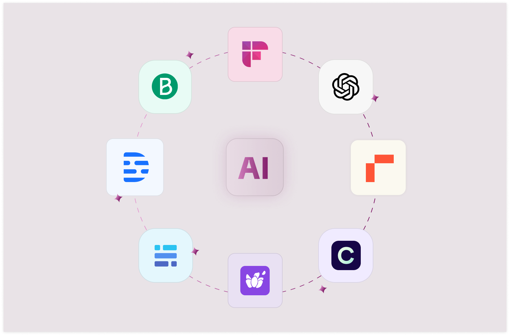
At the top of our list is our spreadsheet editor, which goes beyond traditional spreadsheets. It allows users to create visually appealing dashboards, tables and charts, connect to various data sources without coding, and collaborate in real time. Plus, AI makes all of this easier, giving non-expert business teams autonomy over their data.
In the context of data aggregation, 4 Rows features stand out:
50+ built-in data sources integrations in various domains
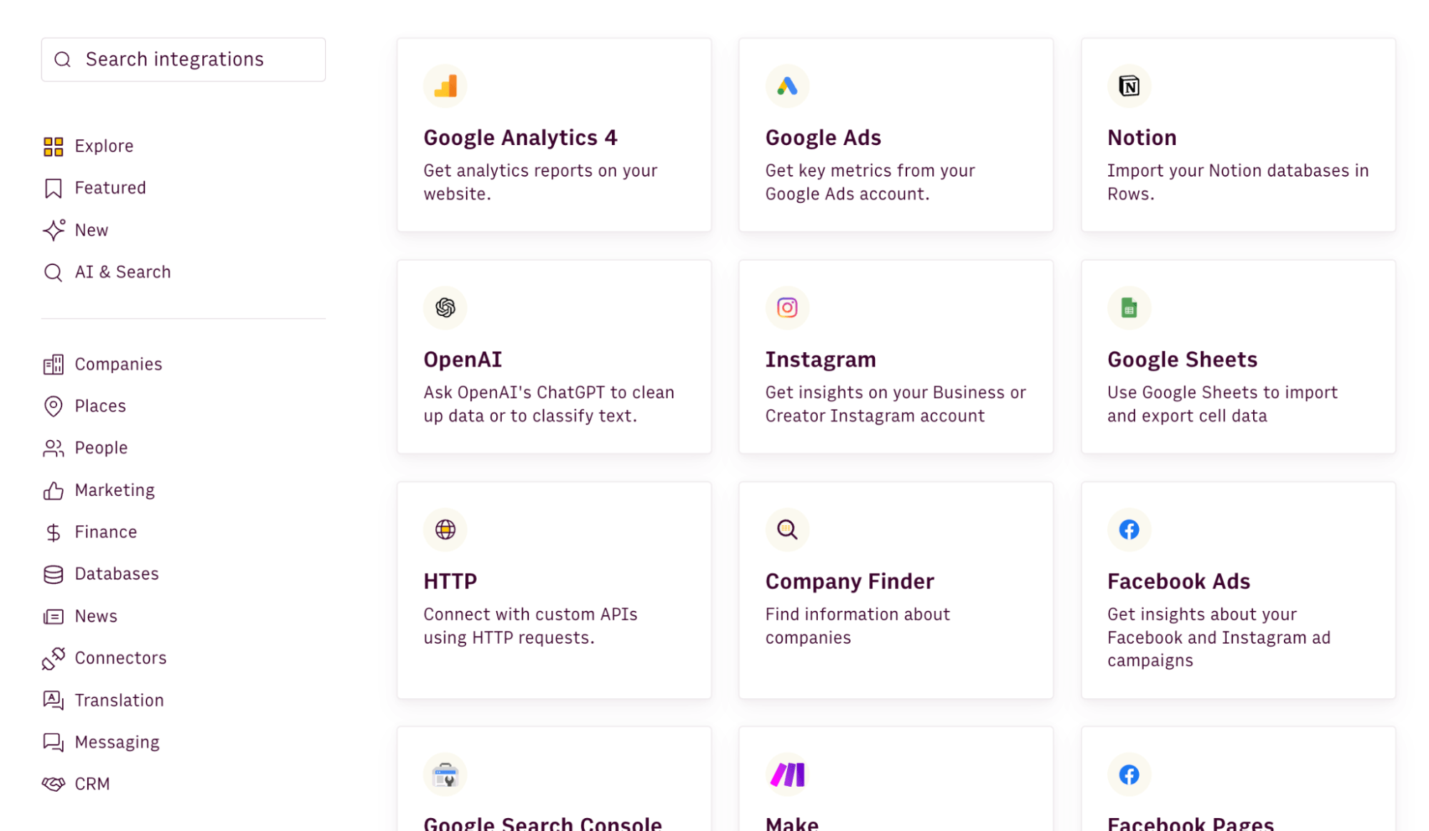
As mentioned, you must choose a data aggregation software with multiple built-in integrations. Rows boast over 50+ integrations across different facets like marketing, data warehouse, etc.
This saves your time and reduces your team's stress. Plus, many of Rows data integrations are supported in our AI copilot, meaning that you can simply skip the configuration and ask AI to pull data from your ideal source and it will take care of the rest.
Example of prompts:
SEO data: "
Pull page data from the last 30 days from Google Search Console, including only pages that contain /blog/"Finance data: "
Pull all transactions from my HSBC account and classify them into: software, marketing, travel expenses, revenue"Marketing data: "
Use GA4 data to rank the top sources of traffic from mobile in Brazil in the last 30 days"
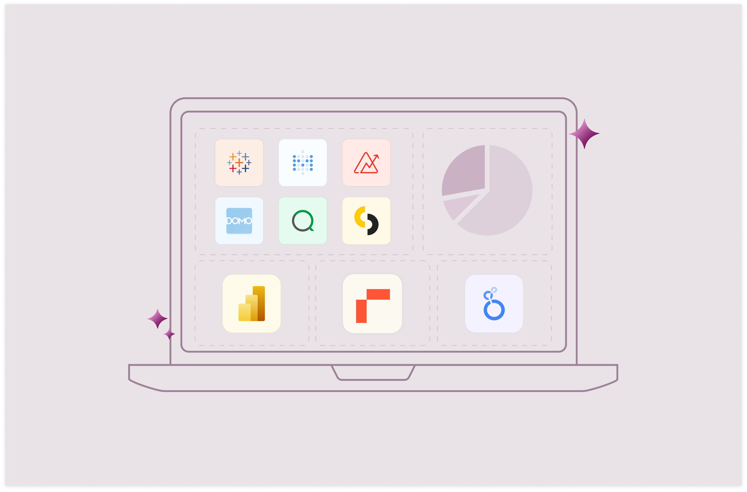
Here's a division of the built-in integrations in Rows:
Marketing: GA4, GSC, Facebook, Instagram, Tiktok
Finance: Stripe and Plaid (+12,000 supported banks)
Productivity software: OpenAI, Notion, Slack, Email, Translate
Data warehouse: MySQL, BigQuery, PostgreSQL, Snowflake, Amazon Redshift
Discover the full catalog here.
You also have the possibility of creating custom connections via our HTTP functions.
💡 Pro tip: When the tool you’re working with isn’t listed in our catalog, HTTP functions allow you to connect to any RESTful API, GraphQL endpoint, or other HTTP-based data sources, regardless of their structure or authentication methods. On Rows, GET, POST, PUT, and PATCH make the catalog of integrable tools virtually infinite.
Try out our HTTP tester below:
Extract data from documents and images
As mentioned above, Rows can ingest data directly from documents and images—not just as static imports, but as structured, editable tables.
It works with PDFs and multiple image formats (JPEG, PNG, HEIC...)
You can process batches at once rather than uploading files one by one.
All extracted data can get merged into a single table you can immediately work with, stay on separate tables or get appended to an existing one.
You can also add custom extraction instructions to pull exactly what you need. A very common use case is invoices management. By adding the prompt
"Extract date, vendor name, VAT amount, total amount, and description", Rowswill scan all documents and return a consolidated table with those specific fields—no manual data entry, no error, or formatting issues
Instructions can be enhanced automatically and saved for later.
An AI copilot
Rows AI copilot turns your spreadsheet into something closer to a data science environment for business people. It gives you autonomy over your data without requiring you hard-to-acquire skills.
You describe what you want in plain language, and it handles the execution, whether that's spreadsheet operations, data transformations, or running Python code to do the heavy lifting.
It works across four key capabilities:
Spreadsheet-native operations Standard spreadsheet tasks—pivots, conditional formatting, new columns, charts—happen through conversation instead of clicking through menus or writing formulas.
Example prompts:
→ "Build a pie chart showing share of profit by product"
→ "Add conditional formatting rule to column D: red if <100, yellow if <150 and green if >150"
Data Ingestion Pull data directly from PDFs, images, or connected tools without manual copying and pasting.
Example prompts
→ "Import all transactions from my N26 account and classify them as: marketing, software, travel, other"
→ "Pull keyword data from the last 90 days from Google Search Console"
Multi-step plans String together multiple dependent steps—build a dashboard, create a calculator from scratch, or execute a series of operations where each step builds on the last.
Example prompts:
→ "Add a column classifying keyword position into brackets: [1-3], [4-10], [10+], then create a pivot showing average CTR by bracket"
→ "Build a simple dashboard showing the performance of sales people in the last quarter"
Code-level analysis When you need statistical analysis, machine learning, or custom visualizations that go beyond standard charts, the AI Analyst can write and execute Python code to get there.
Example prompts:
→ "How does my revenue change if my margin increases by 5%?" (what-if analysis)
→ "How many orders do I need to hit $100k, $500k, and $1M in revenue?" (goal-seek)
→ "Calculate correlation between keyword position and clicks, then show statistical significance"
→ "Run a k-means clustering model to segment customers by purchase behavior and visualize the clusters"
→ "Create a Sankey diagram showing traffic flow from source → landing page → conversion"
Instead of switching between tools or learning specialized syntax, you describe the analysis you want and the AI Analyst figures out how to execute it: it scans your dataset, understands the key variables, and provides what you need.
To access AI in Rows you can either
click on the ✨ icon, at the bottom right corner of your viewport: this will open a chat UI panel that will work across your spreadsheet. You can ask questions in two modes, Build or Chat, based on whether you want to actually creating elements or just have in-line answers.
use the ✨ icon at the top right corner of each element: a contextual menu with a few shortcut will open right away allowing you to perform quick actions like summarizing the content or beautify a table
Data Visualization
On Rows, WYSIWYG: the spreadsheet IS the dashboard. And you can drag tables and charts to reorder them accordingly without stress.
However, if something breaks, you have a quick and easy flow to check parameters and reset, like in any regular spreadsheet.
Plus you can Embed any table and chart dynamically into Notion, Confluence, Slite, Miro or any other HTML-ready tool.
Rows Pricing
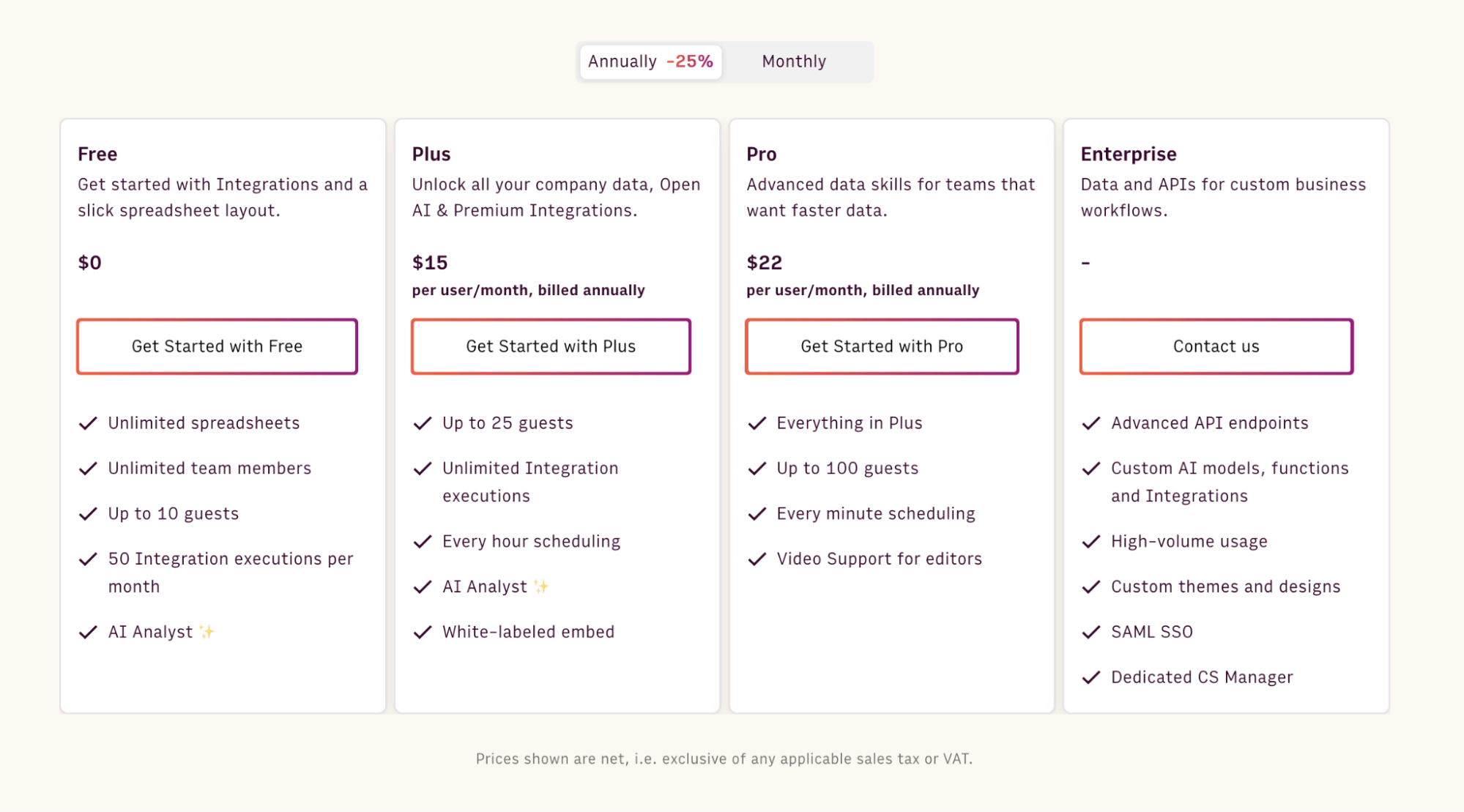
Rows offers a free forever plan that’s quite generous. It lets you onboard unlimited members and up to 10 guests and execute up to 50 integration tasks per month.
If you want to get rid of these limits and want access to more premium features, Rows has three paid plans to choose from:
Plus: $15/month/member, up to 25 guests, unlimited integration tasks & daily data refresh.
Pro: $22/month/member, up to 100 guests, unlimited integration tasks & hourly data refresh.
Enterprise: Custom price for advanced API usage and workflows.
Pros and Cons
✅ Has more than 50 native integrations.
✅ Easy to analyze and visualize data, especially for non-data-friendly users.
❌ Doesn’t have an offline app
$BLOG_CTA$
2. Microsoft Power BI

Microsoft Power BI is a business intelligence platform that provides tools for aggregating, analyzing, visualizing, and sharing data. It allows you to connect to various data sources, transform the data, and build interactive dashboards and reports. Its intuitive, Excel-like interface empowers business users to create visuals with little training.
Power BI Top Features
With its Power Query, you can connect to many different data sources and transform the data into your desired shape. It has a petabytr-scale data storage and processing capabilities.
Data Analysis Expressions (DAX) is a library of functions and operators on Power BI that can be combined to build formulas and expressions.
Power BI offers a range of visualizations, such as bar charts, column charts, line charts, area charts, pie charts, and donut charts.
Power BI’s Pricing

Free forever plan
Power BI Pro: $10/month
Power BI Premium Per User: $20/month
Pros and Cons
✅ Excel integration
✅ Regular updates
❌ Steep learning curve
❌ DAX function complexity
3. Tableau

Tableau is interactive data visualization software connecting almost any database by drag-and-drop. Users can create visualizations and share them with a click.
In Tableau, you can aggregate measures or dimensions. Tableau automatically aggregates its values when you add a measure to the view. You can also perform functions like SUM, AVG, and COUNT.
Tableau’s Top features
Tableau allows aggregating dimensions. Available aggregations for dimensions include minimum, maximum, count, e.t.c
You can disaggregate data on Tableau. So, instead of an aggregated summary, you get a separate mark for each measure.
Tableau calculates medians and COUNTD (counts the distinct number of values).
Tableau's Pricing

Tableau Desktop: $70/month
Tableau server: $35/month
Tableau Explorer: $42/month
Tableau viewer: $15/month
Pros and cons
✅ Data visualization
✅ Broad data source connectivity
❌ Security limitations
4. Zoho Analytics

Zoho Analytics is a business intelligence and data visualization platform that provides businesses with insights to make informed decisions.
Like Tableau, Zoho analytics allows the creation of aggregate formulas that use aggregate functions like SUM, AVG, and COUNT to perform calculations on a data set.
Zoho Analytics Top Features
Zoho Analytics supports integration with numerous data sources like MySQL, Oracle, Google Drive, Salesforce, etc.
Automated data synchronization is available to help you update data from connected sources.
Zoho Analytics offers “Group by Shifting expressions “ to control how data is aggregated.
It had a set of pre-built aggregate metrics, just like other tools.
Zoho Analytics pricing

Free forever plan
Basic plan at $30 per month
Standard plan at $60 per month
Premium plan at $125 per month
Pros and cons
✅ Good data visualization
✅ User friendly
❌ Limited customization for advanced users
❌ Steep learning curve
5. Domo

Domo is a cloud-based business intelligence and data visualization platform.It enables organizations to aggregate data from multiple sources and generate interactive visualizations.
Domo’s Top Features
Domo offers 1000+ pre-built connectors to integrate data from various business applications. This is the highest number of connectors per tool compared to others on the list.
Domo's ETL (Extract, Transform, and Load) helps you extract extra data from sources, transform it, and load it into Domo.
Domo includes time-based functions that make it easy to calculate running totals, averages, growth rates, and time differences over standard or custom time periods.
Domo aids cross-collaboration across teams, making it easier to share insights.
Domo’s Pricing
Domo offers a credit-based pricing model. The pricing is not based on the number of users. However, they have a free 30-day trial plan.
Pros and cons
✅ 1000+ integrations
✅ Drag-and-drop interface
❌ Not affordable for small teams
❌ The prices are not available on their site, which may be a turn-off for aspiring users
6. Looker

Looker’s Top Features
Looker Studios can connect to your database, Google products, and social media platforms to transfer data. It allows you to blend multiple data sources, which can help work around limitations with auto-aggregation in some sources like Google Analytics.
With tables and pivots on the dashboard, you can see displayed aggregated data in rows and columns.
Looker Studio helps create calculated fields that leverage aggregate functions, just like the above-mentioned tools.
Looker’s Pricing
Looker Studio is free to use. It has an enterprise version called Looker Studio Pro, but the pricing plan is not specified.
Pros and cons
✅ Easy-to-use web interface
✅ Convenient templates
❌ Lagging issues
7. Qlikview

Qlikview is a business intelligence and data visualization software. It allows you to aggregate, analyze, and visualize data from various sources. It is Qlik’s legacy on-premises product.
Qlikview’s Top Features
A standout feature of Qlikview is its “associative data model,” which establishes relationships between different data source systems.
Like every tool on the list, Qlikview allows users to integrate and combine data from multiple sources, including databases and spreadsheets.
It offers various data visualization options, including charts, graphs, tables, and dashboards.
Qlikview's Pricing
The price is not publicly available.
Pros and Cons
✅ Intuitive data exploration
✅ Mobile and offline access
❌ Unhelpful Customer Support
❌ Recurring Error 429
8. Metabase
Metabase is fast data analytics with a friendly UX and integrated tooling that lets your company explore data independently.
Metabase's Top Features
Free your data from the confines of SQL with Metabase’s visual query builder.
Easily create and share interactive dashboards, from TB-scale analytical workloads to day-to-day operational workflows, with 15+ visualization types.
Craft metadata-rich, semantic models that let people query on their own, keeping things consistent and avoiding repetition. With a single tab open, no CLI is needed.
Metabase's Pricing
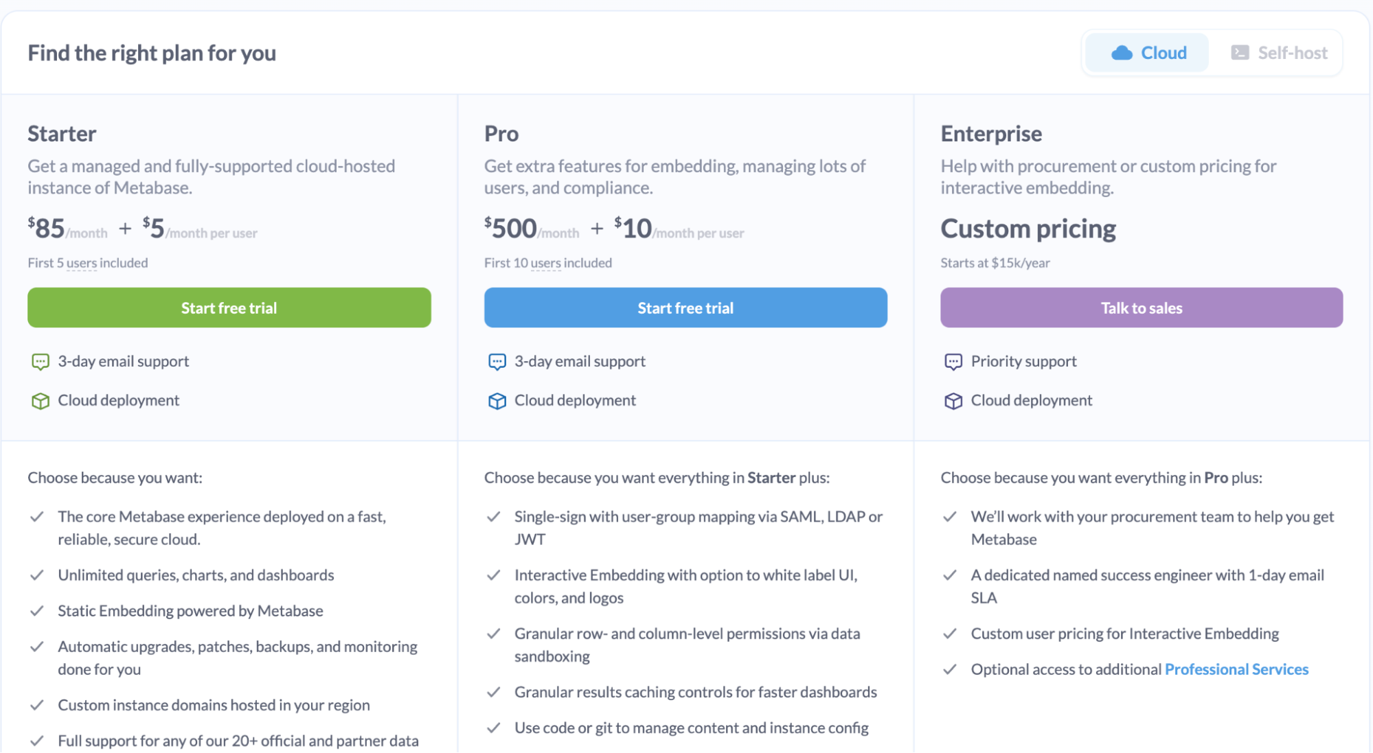
Metabase starter: $85/month + $5/month
Metabase Pro: $500/month + $10/month per use
Pros and cons
✅ Assistance in writing SQL queries
✅ Self-service analytics
❌ It is not affordable
❌ Limited Visualization Abilities
9. Sisense

Sisense is AI-powered analytics software with pro-code, low-code, and no-code capabilities. With Sisense Fusion and Compose SDK, you can build advanced analytics, deliver dynamic and personalized insights, and delight end-users.
Sisense’s Top Features
Among the tools on our list, Sisense comes close to what we have at Rows. Its top analytics use cases are to recommend places to begin data exploration, augment analytics, conversationally query data, and achieve narrative answers. However, it's still in beta.
Sisense offers several ways to help you manage your data security and governance and maintain HIPAA compliance. One key tool is our Add-Ons (called “Plug-Ins”) certification process.
Sisense allows you to apply a dashboard-wide "aggregation" filter to display data aggregated at different time intervals, such as daily, weekly, or monthly. This makes it easy to update the aggregation level across all charts in the dashboard.
Sisense’s Pricing
There's no available pricing on the site.
Pros and cons
✅ Very fast because of its chip methodology
✅ Great visualization
❌ Instability of the data cubes, runs, and failures.
❌ Not Affordable
10. Alteryx
Alteryx is a data analytics platform that helps organizations to gather, blend and analyze data from different sources.
Alteryx Top Features
Alteryx integrates with various reporting and visualization tools, such as Tableau and Power BI to present aggregated data.
It has built-in visualization capabilities such as charts, graphs, and maps. Users can create data aggregation workflows using a drag-and-drop interface, without coding. This makes it easy to design and automate complex aggregation tasks
You can automate data aggregation, from data preparation to reporting.
Alteryx Pricing
Alteryx’s pricing plan is not available on their site.
Pros and cons
✅ Intuitive user interface
✅ Workflow automation
❌ Pricing opacity
❌ Dependency on open source
Build better dashboards faster
Aggregate and visualize live data from 50+ sources, automate analysis with AI and share it interactively with your team.
Try Rows for FreeFAQs about Data Aggregation
What is Data Aggregation?
Data aggregation involves gathering data from various sources and compiling it into a spreadsheet to extract and summarize it into a more easily understandable format. What are the types of data aggregation?
What are the best data aggregation tools in 2025?
The best data aggregation tools include Rows, Power BI, Tableau, Zoho analytics, Domo, Looker, Qlikview, Sisense, Alteryx, and Metabase.
What are the best practices to execute when using data aggregation tools?
Validate every result you get from your data aggregation software.
Consider the data privacy of your software and speak to your team on how they can go about when importing data. This is more reason you should use a tool with strong data privacy like Rows.com.
Standardize your company’s ata formats across sources to facilitate accurate aggregation.
Regularly update and maintain your data aggregation processes.
Data comes to life with Rows.com
We've reviewed the best 10 data aggregation tools to try out in 2025. These tools match the checklist of features specific to data aggregation. However, some are complex to use and require engineering set-up—for example, Tableau, while powerful, tends to have a steeper learning curve for beginners due to its extensive features.
This means you need to opt for a tool that's easy to use and manipulate, like Rows. It's worth noting that most tools are not transparent with their pricing—this might mean you need to pay high fees beyond your budget.
With Rows, data comes to life. And the sweet part is that we have an AI analyst to do the trench work for you. If you or your team don’t have the time to try every product on our list, go to Rows.com, import data, automate your report, and see if it's the right match!