Rendering Tables in Live Mode


The Challenge of Data-Heavy Spreadsheets
The amount of data people produce and need to work with is mind-boggling. The spreadsheets keep growing long and wide.
But telling the browser to render a table with thousands or even millions of cells is prohibitively expensive. The result? The page never finishes loading, becomes unresponsive and eventually crashes leaving the users upset. 🤯
And that's just one table! That's nowhere near enough for people regularly working with spreadsheets. At Rows, we decided that we want to render multiple tables on a single page, whatever their size is, and alongside other elements like Charts. So our users are able to move through all the data they need without sacrificing the performance speed and quality.

So we got thinking – how, with these constraints, can we load multiple tables fast while having the application ready for user input quickly?
Solving the Problem
As a rule of thumb, a good way of making things faster is by doing less work (at least that's what I tell my manager). And we know that, in this case, the work that slows us down is rendering so much content. So, the most obvious thing to do was: not to render so much stuff!
That sounds simple enough. However, this must be seamless from the user's point of view, as if the content is still there. For example, the scroll bars must represent the full height of the document, so jumping to any position on the page should still work.
To sum it up, our solution needed to:
Render just enough of the table to fill the viewport.
Allow native scrolling that works and feels natural.
Virtualization
In this context, virtualization or windowing is the technique of rendering just a subset of data. It reduces the amount of work (and therefore time) required for the initial render, as well as every subsequent update. It also reduces the memory used by Rows. We realized it was the key to our problem!
There's a well known and battle-tested library perfect for this job: react-window. It excels (no pun intended) at encapsulating the complex logic of virtualizing a table while offering plenty of customizability for our needs.
To that extent, we implemented a component responsible for rendering each table. It delegates the grunt work to react-window's VariableSizeGrid, particularly:
Efficiently drawing just the cells that fit the viewport.
Providing a way to jump to any position on the table.
Besides that, our component has some complexity as well, of course. Something has to:
Know how many columns and rows a table has.
What's the height of each row and width of each column.
How much of the table fits the viewport.
Observe changes to the viewport's dimensions.
Handle the second part of our solution, as we shall see.
By default, react-window also controls scrolling, but we don't want that. Remember, we don't want our tables to scroll independently. So, cue the next part of our solution.
Inventing a Sliding Window
Sliding Window is what we fondly call the approach of faking full-size tables and synchronizing the scroll to the correct position on a table.
It's agnostic to the virtualization strategy and works well when mixing other types of content on the same page (e.g. tables and charts).
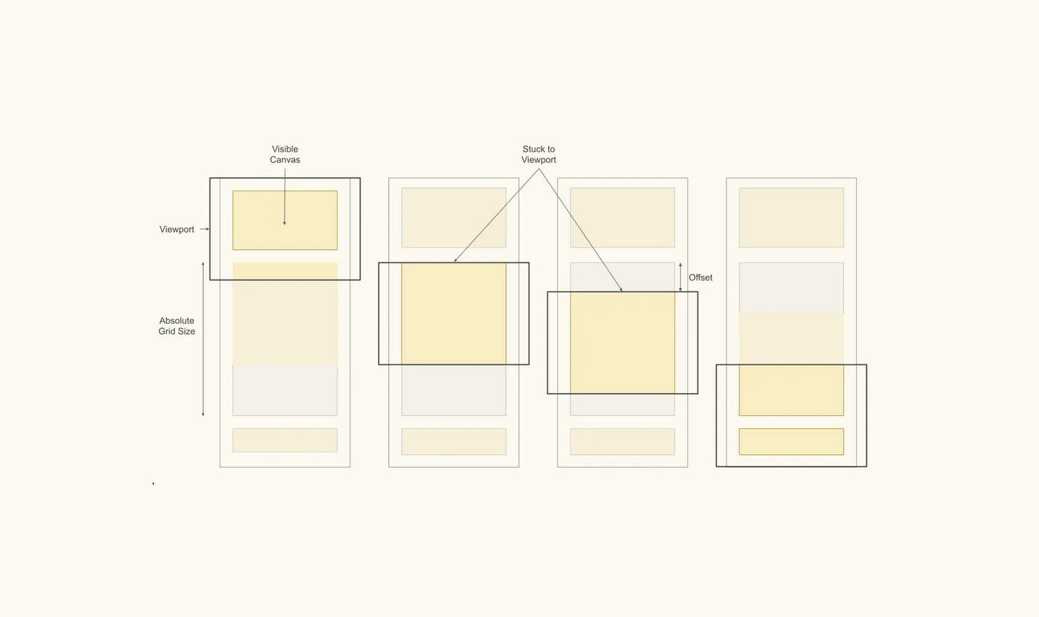
The concept isn't too complex, but an image might help explain it:

We wrap each table with a Sliding Window component. This component creates two nested DIV elements around the table:
The outer DIV has the total dimensions of the table.
The inner DIV has the visible dimensions of the table.
By total, I mean the sum of the width of all columns and the height of all rows. The visible dimensions represent the size of the virtualized table (i.e. what gets drawn onto the screen).
The outer DIV is what tells the browser the correct dimension of the page, which is essential to faking the idea that we're drawing the whole table. The other trick is setting the inner DIV to stick relative to its parent.
SlidingWindow is listening to the viewport's scroll events. As the page scrolls, eventually, the inner DIV sticks to the viewport as the outer DIV scrolls past. SlidingWindow uses the offset between these two elements (and a few more variables) to tell our virtualized table component where to scroll.
And that's the core of it. Of course, there are a few more details to the implementation, but this sums up the concept pretty well.
The Outcome: Advanced Performance
The improvements this solution brought were pretty obvious. Large spreadsheets that took up to a minute to render, were now ready just after a couple of seconds! That means some spreadsheets went from completely unusable to readily available to our users. 🙌
This is, of course, a huge deal! Moreover, as intended, we didn't change how our users interact with the spreadsheets. They should notice the application became a whole lot faster, for whatever reason, but looks just the same.
Finally, implementation-wise, we managed to create a decoupled component with a clear responsibility that could easily replace our previous implementation with little disruption. Besides the maintenance benefits, this helped reduce the potential conflicts with the work of other dev teams busy developing other functionalities.

Never Stop Improving
Although Virtualization and Sliding Window make a dramatic difference, resulting in a much faster page load and keeping it fluid, there's always room for improvement. To further enhance our UX, we have a few initiatives planned already:
Prevent mounting tables outside the viewport: we can spare even more work by not drawing hidden tables.
Fetching only the data we need: we're still fetching the entire content from our back-end, even though we're only drawing a subset.
At Rows, we continuously push to provide a better experience for our users. Having a less resource-intensive and faster application fits that goal pretty well.
Stay tuned for a future article about how we tackled these challenges. 💪
