Experimenting with user onboarding questions

This is the fourth post in our PLG Series, where we write a monthly deep dive on experiments, strategies and tactics that we used at Rows to accelerate our product-led growth motion.
In this post, we will walk through the results of a recent growth experiment from our onboarding flow. We’ll review the initial hypothesis, the product changes, and the results.
Make sure to check out the previous articles on How to use content in PLG growth i and the Do's and Don'ts of managing a product waitlist.
What is product onboarding
Product onboarding is the calling card of your product. It’s the first experience most of your users will have with your product. Needless to say, it’s a crucial step in the user journey, as it can make or break a user's experience with your product.
At its core, the #1 goal of onboarding is to set up new users to success. We often call this “activation”. This basically means guiding users through the actions that showcase the product's key benefits. What these “actions” actually are and how they’re measured are different for every product.
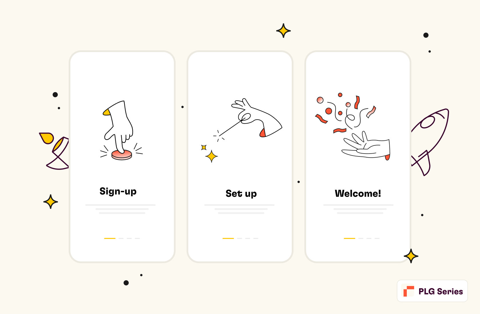
The onboarding journey is usually split into three different moments:
The Sign-up moment: This includes what information you ask from the user and the authentication methods.
The set-up moment: The questions and inputs you ask from the user before they experience the product for the first time. This is the moment you collect key information to use in the product onboarding experience to accelerate the "aha moment".
The "aha moment": The moment where the user first experiences the value of the product after signing up.
For more insights on activation, check out our article on How to pick your activation metric.
How we designed the new onboarding experience at Rows
As part of our last quarterly challenges, at Rows, we underwent a deep revamp of our onboarding flow in late November 2022.
Prior to this change, our onboarding funnel used to include the following steps:
Sign-up moment
There are two ways to sign-up:
Google Sign-in
First name, last name, email, and password
Set up moment
A series of questions, one screen each:
Workspace name (e.g., ACME)
User role (e.g., Marketing, Finance, Sales, Operations)
Self-assessed spreadsheet proficiency (e.g., Basic, Beginner, Intermediate, Advanced)
Tool stack (e.g., Google Analytics, Hubspot, etc.). The selection of tools that the user would choose from was depending on their role.
We used the information from steps 2, 3, and 4 to identify a user type and recommend the most suitable templates, docs, and other guides to get started. After running this flow for about a quarter, we observed the following facts in our product usage:
As Rows (the product) became better and easier to use, we saw an uptake in the number of power users (active 3+ days /week) using the product for simple “everyday spreadsheets”. These are things like cleaning up lists of leads, team budgets, roadmap templates, etc. For these people, Rows' modern UI combined with standard spreadsheet functions were their go-to feature. In spite of that, our product communication tended to overlook it and focus on more advanced features like the use of integrations.
New users often completed the onboarding process without understanding one key differentiator about Rows': our unique sharing experience in turning spreadsheets into mini-websites, or the ability to embed charts/tables/calculators seamlessly into tools like Notion or Confluence. We drew these insights from our user onboarding calls and general feedback.
Users who signed up with a company email were 3 times more likely to invite their teammates compared to users who registered with a personal email.
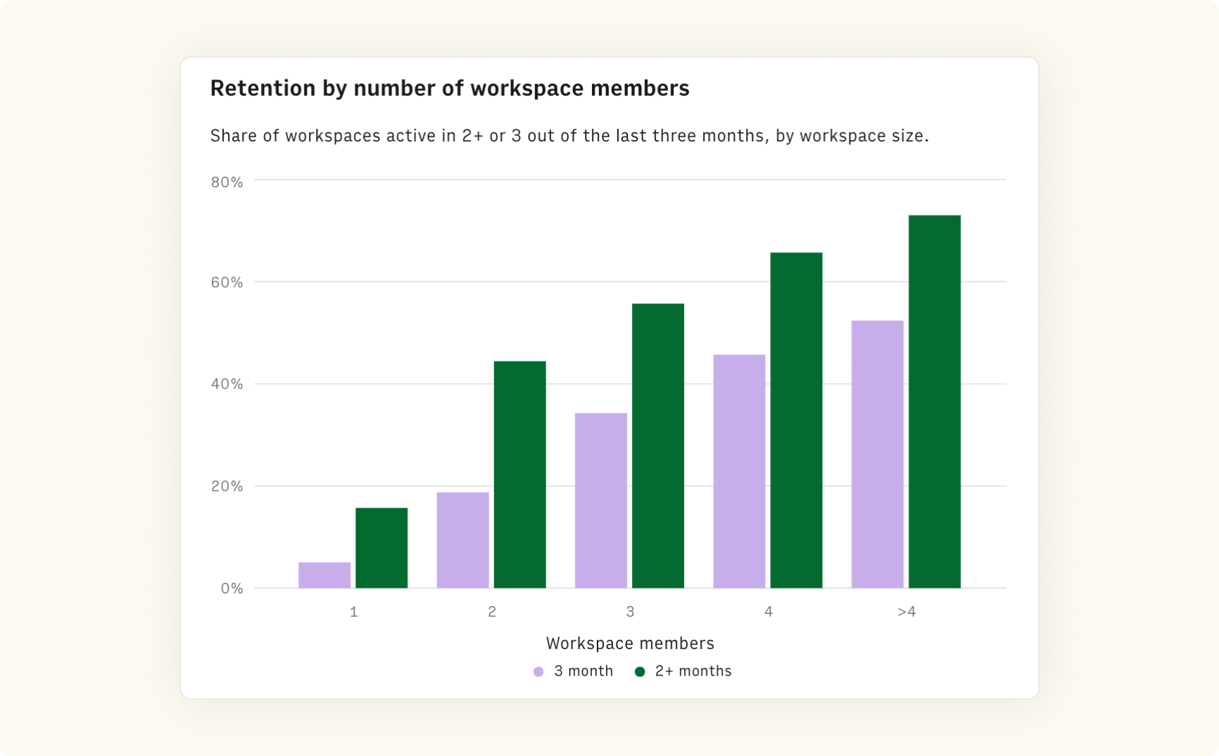
Finally (unsurprisingly) larger workspaces displayed significantly higher long-term retention than single-user workspaces. Invites are pivotal in our PLG motion as they are a key source of virality. We wanted to test how to foster them at the very beginning of Rows experience.
We chose to address these issues and rethink the onboarding experience by:
Using the set up moment to convey Rows' key value propositions
Enhancing our understanding of everyday use cases
Encouraging users to sign up with a company email
Prompting users to invite their teammates before opening their first spreadsheet.
Let’s go through each of them.
Using the onboarding journey to convey Rows key value propositions
We redesigned the UI of the onboarding questions to:
Minimize distraction and allow users to answer questions accurately
Communicate the product benefit related to the product theme of the question
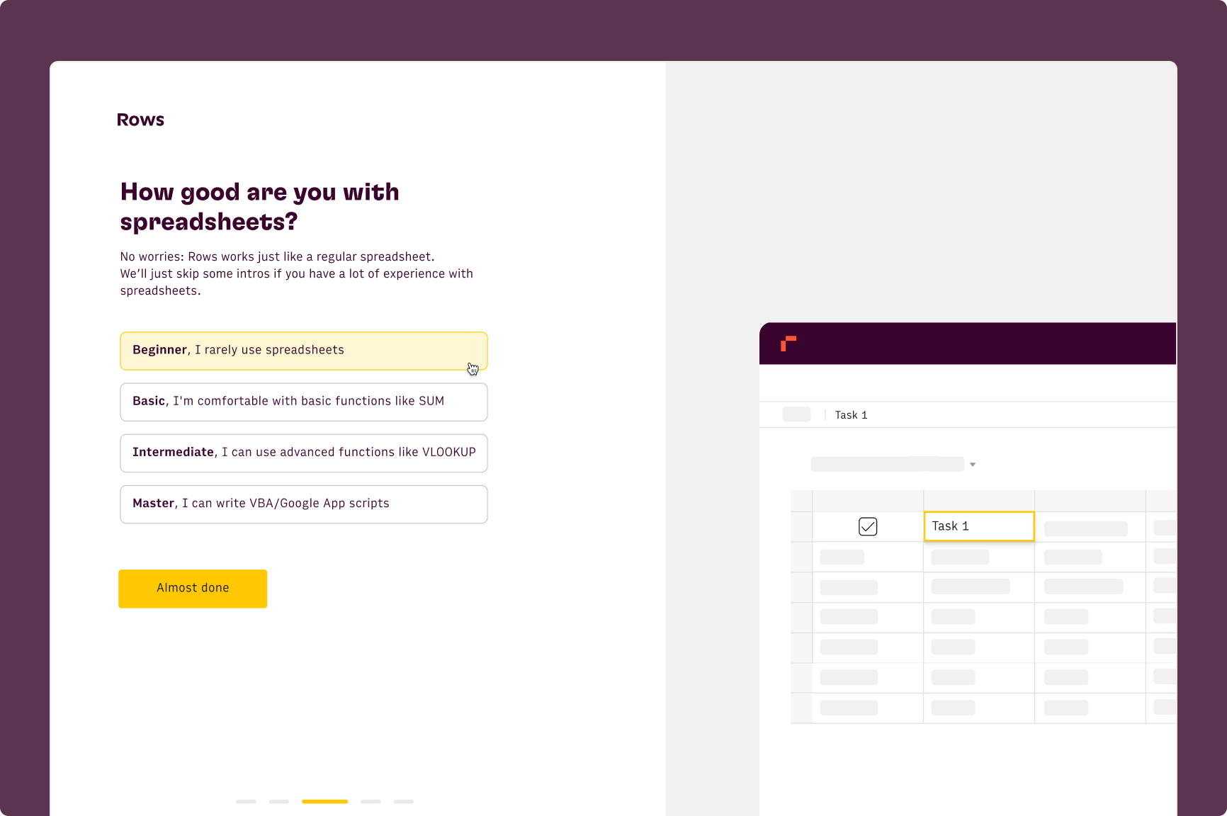
To achieve it, we split the screen in half and dedicate the right-hand side to showcase key features of Rows using product illustrations based on the answers.
As an example, while the user picks her spreadsheet level of expertise we now show a spreadsheet cell with different functions highlighted (i.e. SUM for basic users and VLOOKUP for advanced ones).
Enhancing our understanding of everyday use cases
Borrowing from this Elena Verna’s post
"It's an old myth that you should oversimplify your onboarding to reach high activation rates. In reality, only super low intent customers that would have never activated in the first place drop off”
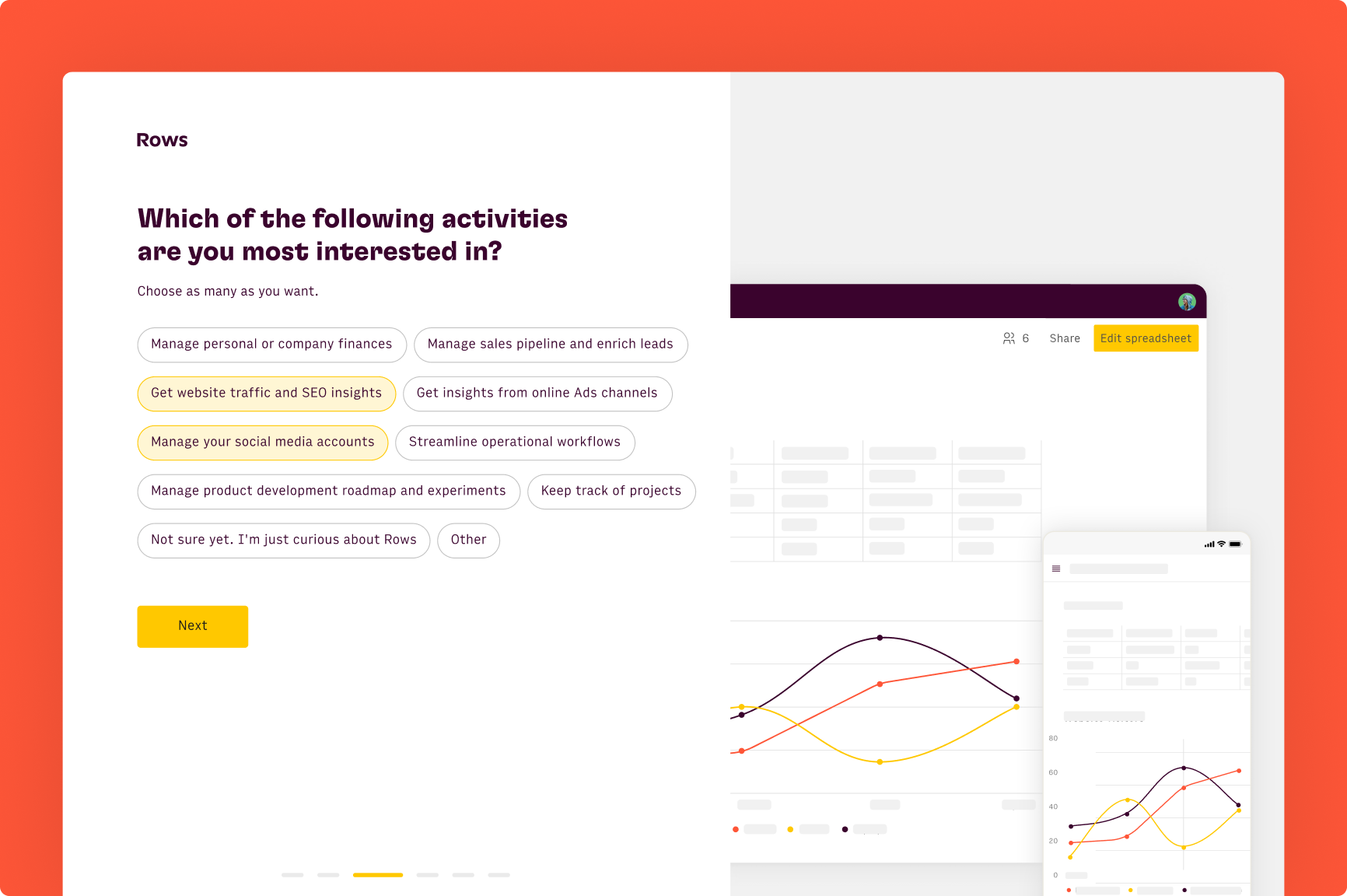
With this in mind, to draw further insights about the sign-up intent, we added a step to ask users what they envision using Rows for.
Encouraging people to signup with a company email
To encourage people to sign up using the company email and increase their perception of Rows as a business tool, we explored different alternatives:
Hard: Ask the user to double-enter the email address while displaying a nudge to ask him to use a business email.
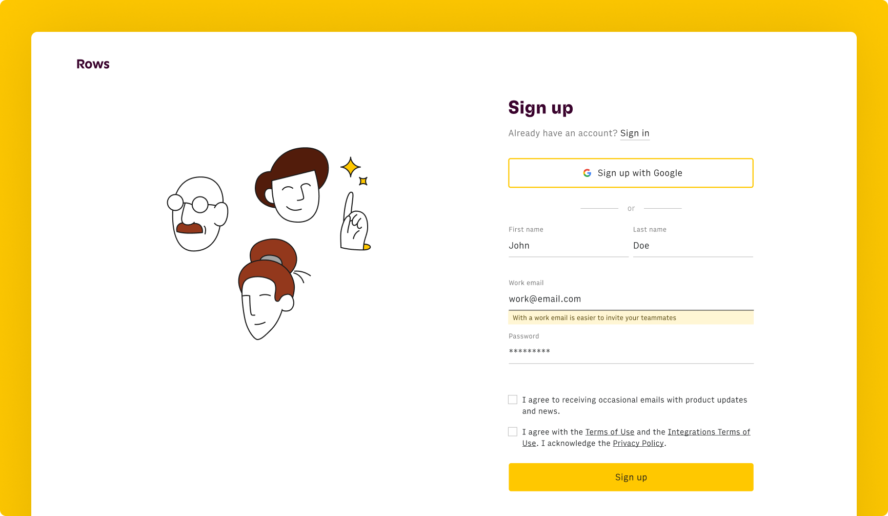
Soft: Change the placeholder of the email field in the signup modal to “name.surname@work-email.com”
Mid: Display a nudge highlighting the benefits of signing-up with a work email, when we detected a personal email address in the input field.
We went for the latter to keep a smooth signup experience while achieving our objective.
Asking users to invite their teammates
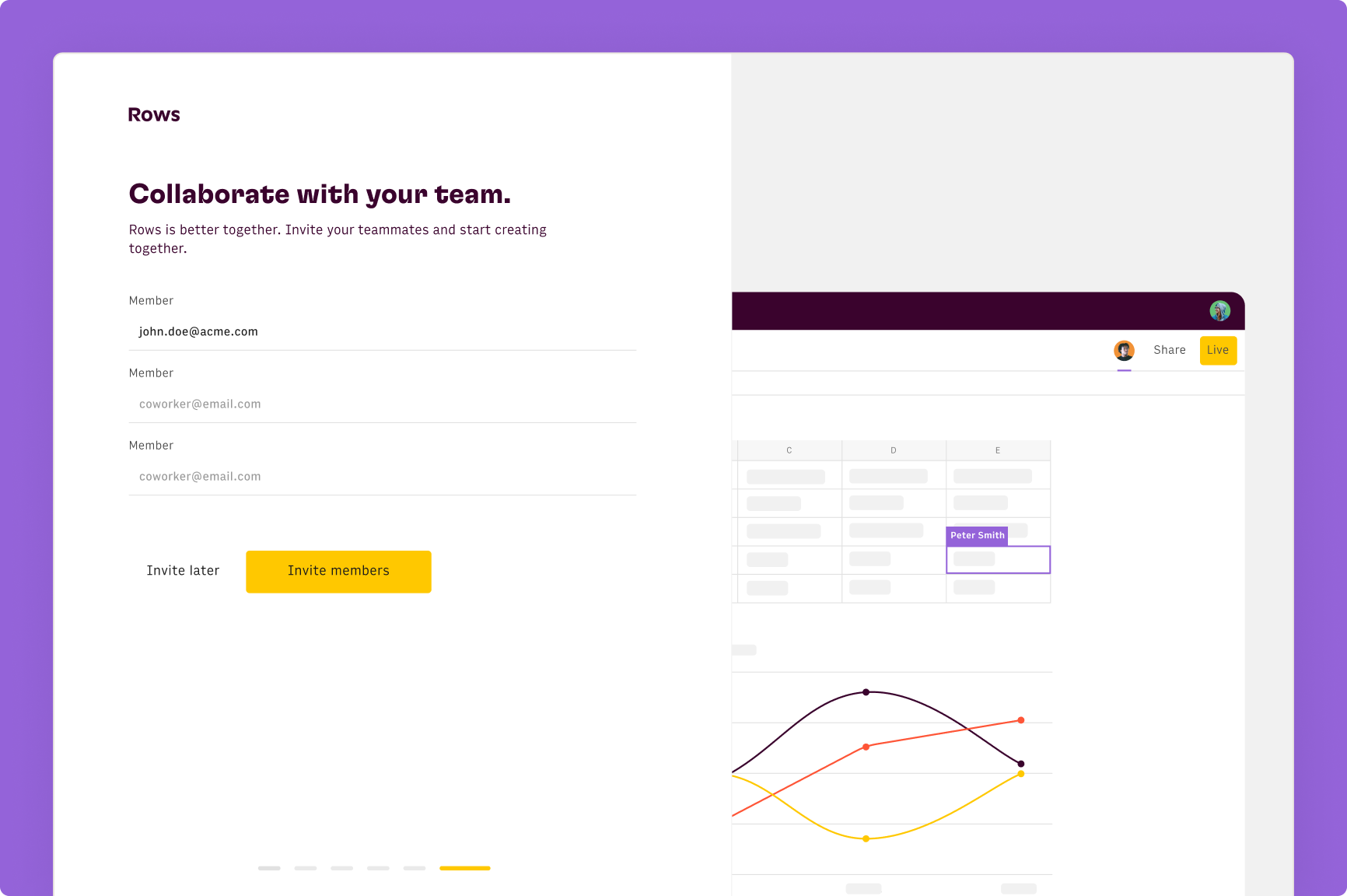
We added a final step asking users to invite their teammates. Here we highlight real-time collaboration on the spreadsheet: as soon as you add one email, the right-hand side of the screen shows additional avatars appearing on the spreadsheet’s topbar and highlighted cells on the grid.
Results
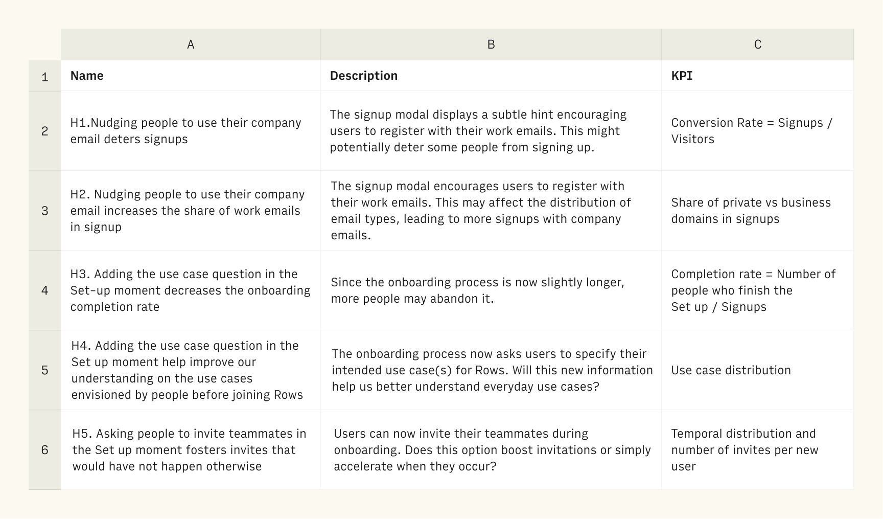
Four weeks after launching our new onboarding flow, we analyzed the first results from the change. There were 5 hypotheses to test, each with a corresponding KPI:
H1: Nudging people to use their company email reduces signup conversion
Description: The signup page displays a subtle hint encouraging users to register using a work email. This might deter some people from signing up.
KPI: Website conversion rate = signups / visitors
H2: Nudging people to use their company email increases the share of work emails in signup
Description: the signup modal encourages users to register with their work emails. This may affect the distribution of email types, leading to more signups with company emails.
KPI: Share of private vs business domains in signups
H3. Adding the use case question in the Set-up moment decreases the onboarding completion rate
Description: With a longer onboarding process, more people may abandon it.
KPI: Completion rate = Number of people who finish the onboarding questions/ signups
H4. Adding the use case question in the Set up moment help improve our understanding on the use cases envisioned by people before joining Rows
Description: The onboarding process now asks users to specify their intended use case(s) for Rows. This information should tell us more about those "everyday use cases"
KPI: Use case distribution
H5. Asking people to invite teammates in the Set up moment fosters invites that would have not happen otherwise
Description: Users can now invite their teammates during onboarding. What is the effect in the number and moment of invites per account?
KPI: Temporal distribution and number of invites per new user
We split users into two cohorts:
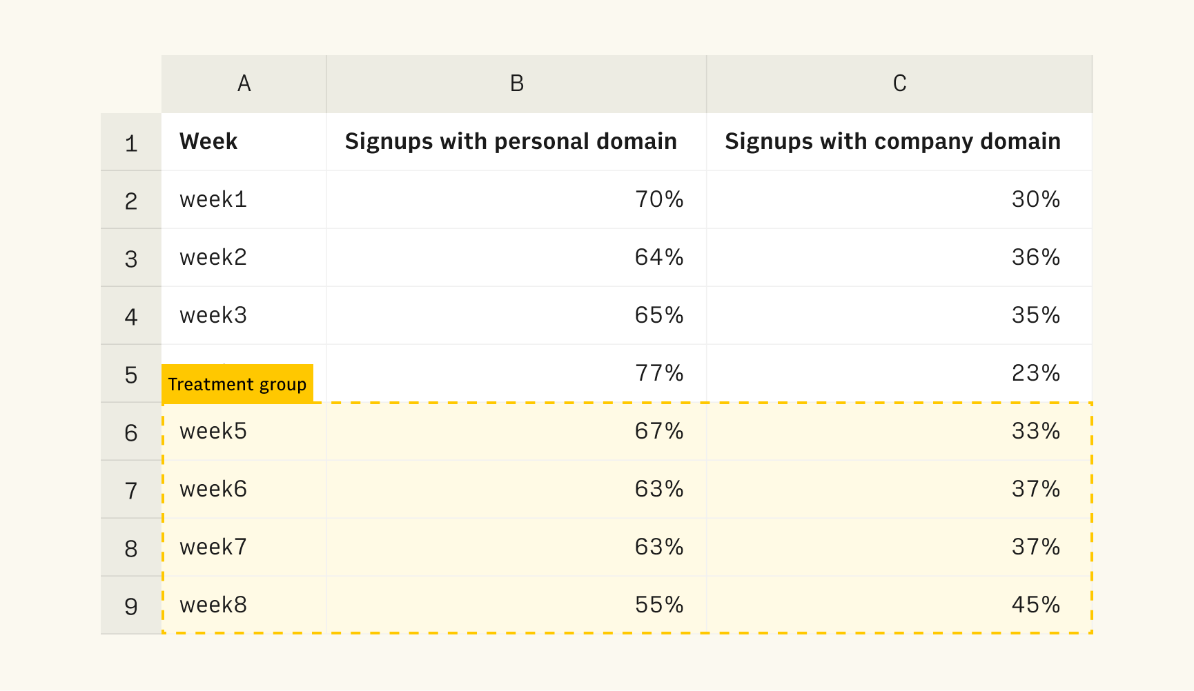
Control group: All signups from 4 weeks prior to the changes.
Treatment group: All signups occurred in the 4 weeks following the changes.
H1: Nudging people to use their company email reduces signup conversion
This hypothesis was disproved. Data showed the nudge had no adverse impact on website conversion rate, which remained at 5-6%.
Note: A better KPI would be the conversion rate of the sign-up page, but we did not have the right analytics in place to measure it accurately.
H2: Nudging people to use their company email increases the share of work emails in signup
This hypothesis was confirmed. The data revealed a 33% increase in the share of users registering with a work email in our treatment group, compared to the control group.
H3: Adding the use case question in the Set-up moment decreases the onboarding completion rate
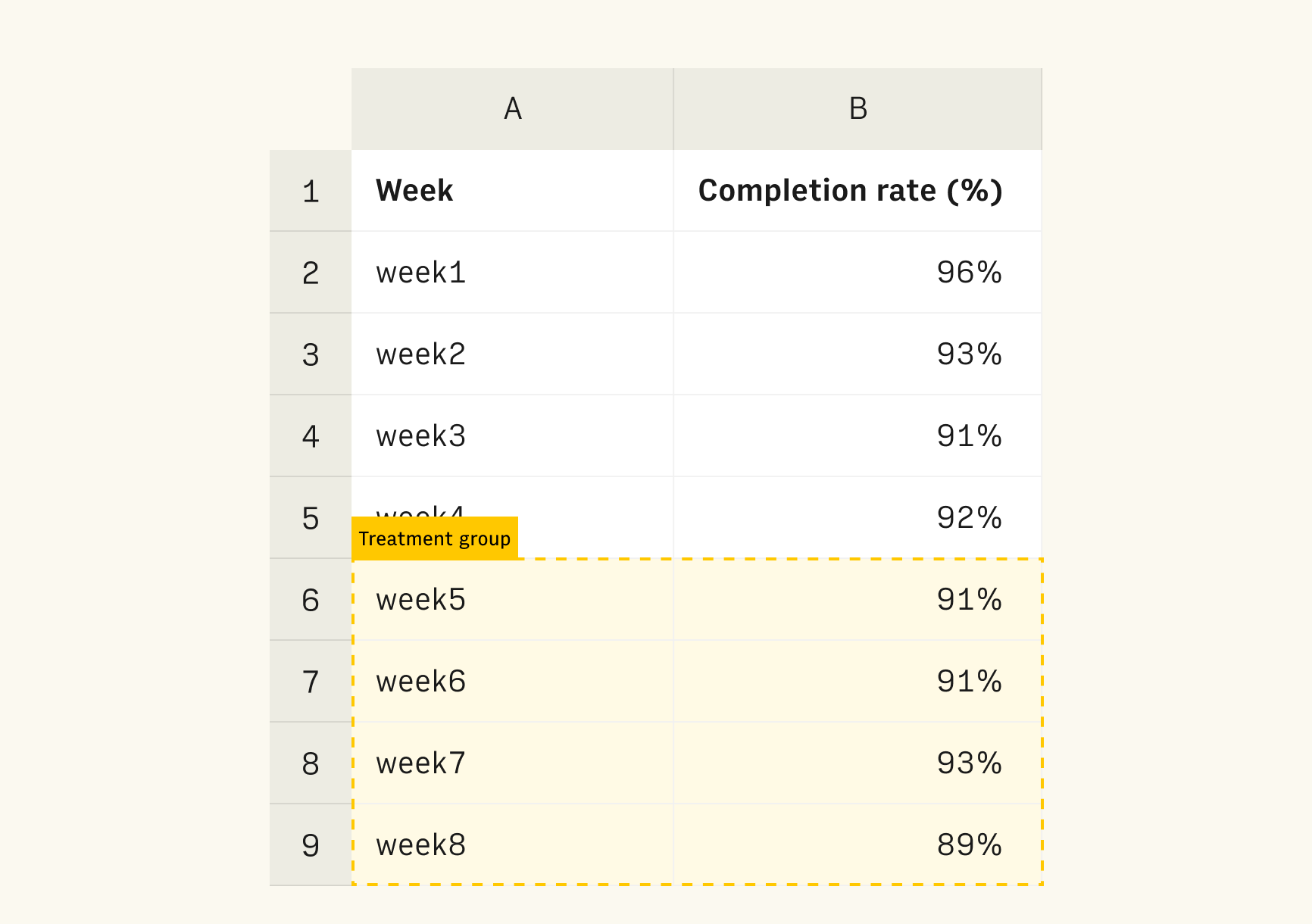
This hypothesis was inconclusive. The completion rate for the treatment and control groups was very similar. We witness a very small reduction 2% in completion rate (91% vs 93%).
H4: Adding the use case question in the Set up moment improved our understanding on the everyday use cases
This hypothesis was disproved. Regardless of role or level of spreadsheet expertise, "Not sure" or "Other" options were the most popular options, accounting for 25% of all selections. Other options displayed a nearly even distribution, offering little insight into preferred usage scenarios.
H5: Asking people to invite teammates in the Set up moment fosters invites that would have not happen otherwise
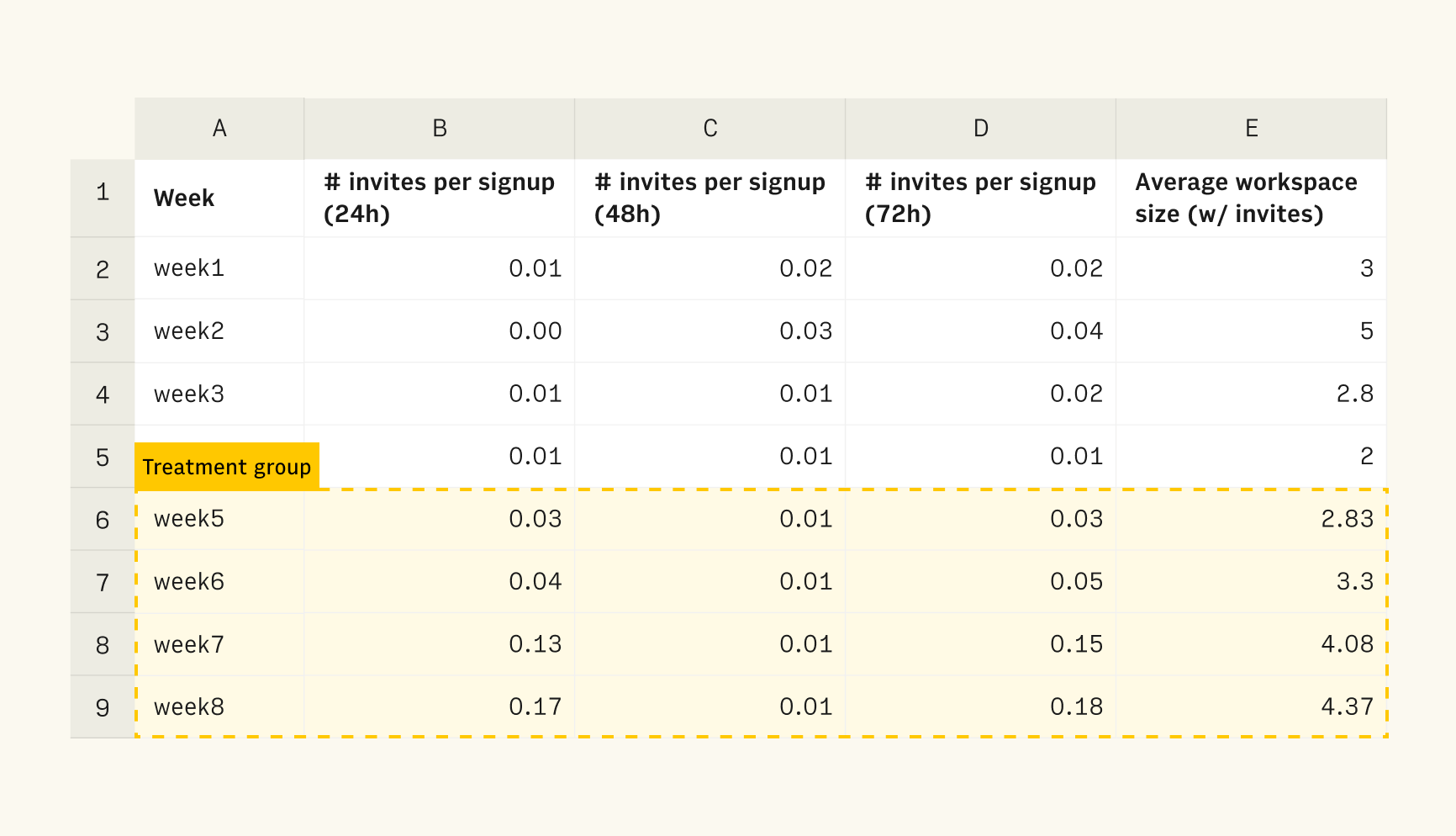
We measured the number of users who invited others to their workspaces and the time difference between sign-up and invitation: 2 minutes, 24h, 48h, and 7 day.
The data indicated that:
~1% of new sign-ups invited teammates using the invitation screen
Those who did invited teammates, did it faster and in larger numbers than in the control group (0.03 invites per signup vs 0.01 in the control group)
The average size of workspaces with 1+ members rose by 14%
We can reasonably conclude that this feature incentivized invites to a workspace, even if those were not necessarily done during the set-up moment.
Conclusions
The Rows onboarding redesign has hit the mark in three major areas:
Incentivizing people to sign-up with their business email increased the share of work emails without decreasing the sign-up conversion rate.
Adding a new question in the onboarding did not negatively impact the completion rate in a statistically significant way, although it has not proven useful in improving our understanding of envisioned use cases.
Allowing users to invite their teammates in the Set up moment fast-tracked, albeit not dramatically, the number of viral sign-ups.
And that's it. We hope this is helpful to other teams working on the user onboarding. We were skeptic of impact of some of these changes - in particular the impact of adding an invite screen - but they all proved net positive.
If you manage growth experiments, take a look at our Notion Growth experiment report and Rows Growth experiments tracker. If you have feedback, questions about the topic or want to continue the conversation, reach out.

