What is Rows
What is a cohort analysis
Virtually applicable to any business, cohort analysis achieved its well-deserved fame during the internet era as a tool to examine users' behavior and its impact on monetization strategies.
A cohort analysis is method of analyzing the behavior and performance of specific groups of users, known as cohorts, who share similar characteristics. These can include their signup or date, demographic information (like age or location), the device used to access your product, and the source/medium with which they were acquired. One of the most common cohorts is the signup date or the first date on which a subscription/product is bought, grouped by day or week.
Once the grouping is decided, the goal is to track a specific metric (such as retention or activation rates, or purchase) and examine how users belonging to different cohorts perform over their lifecycle.
Cohort analysis is especially valuable in the SaaS space is a powerful tool to show how a product can retain its users and generate recurring revenues.
Let's go through an example of a SaaS business: cohorts may refer to users who signed up and activate the free trial in the same week. The metric under investigation could be the retention rate: what percentage of those users are still subscribed to the service? In week 1, we'll record our first group of users in the process (cohort #1). In week 2, we'll add a second group (cohort #2), plus we'll examine how cohort #1 performed in week 2. The same will happen in week 3 when we will examine the behavior over the past two weeks. And so on and so forth.
In this short guide, we'll walk you through everything you need to build a cohort analysis in Rows and use it every week to monitor user retention.
Here’s a sneak peek of what you will get:

How to build a cohort analysis with Rows
To use our template, follow the link Cohort analysis, click on Use template and save it in one of your workspace’s folders.
This template offers you an easy UI to build and keep track of your business cohort analysis. It uses the month of the first purchase as a dimension to group users into cohorts and then evaluates how frequently they purchase again in the subsequent months.
Let's reverse-engineer it together.
The first page is designed to add your sales data.
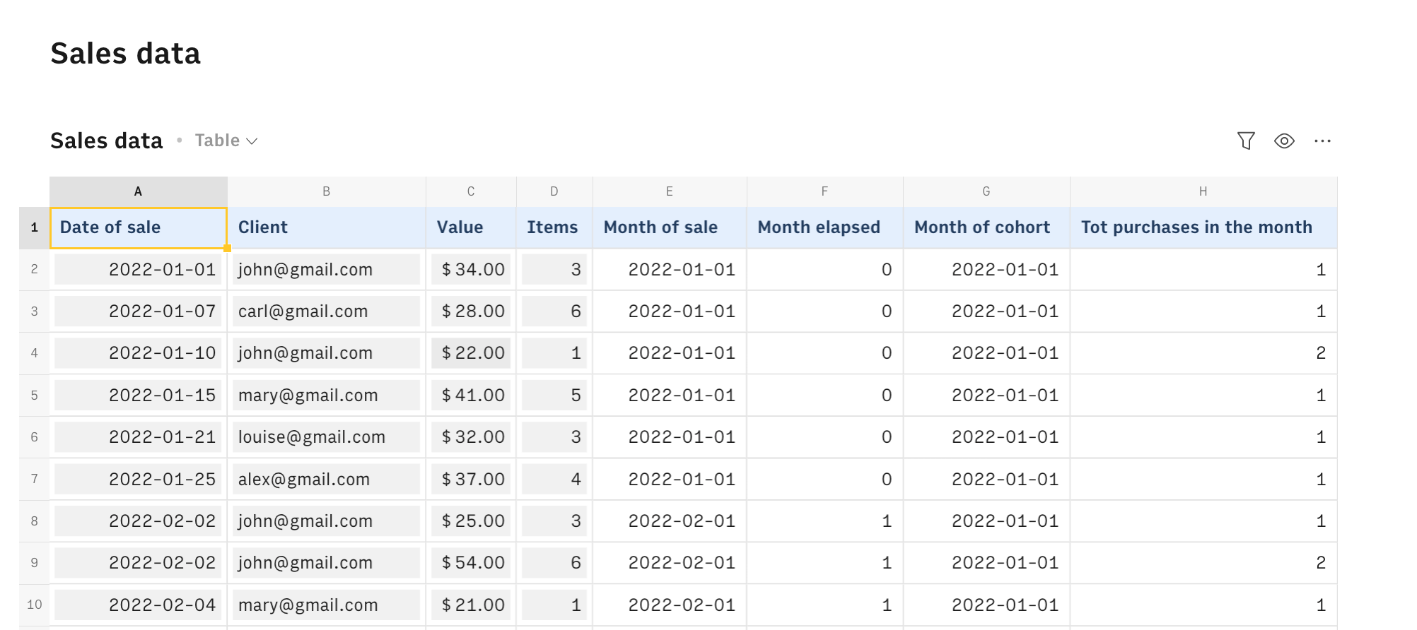
Use only the input fields (all cells with grey background) to type the date of purchase, the customer email (or id), and the amount and # items purchased respectively in columns A, B, C, and D. Column E automatically retrieves the month of sale, through the function
1=DATE(year(A2),month(A2),1)Column G automatically computes the month of the cohort, checking progressively when each user has become a customer in the first place. It does so by looking for the user email in the progressive range $B2:E$1 and returning the corresponding value in the 'Month of sale' column, through the following function:
1=XYLOOKUP(E$1:$B2,B2,$E$1)This way, we are able to assign each user to the right cohort. Column F automatically calculates the 'Month elapsed', as a difference between the (new) month of sale and the user month of the cohort, while column H counts how many purchases has each user in the month.
With all this data in place, we are ready to build the actual cohort analysis.
Page 'Cohorts' contains two tables showing two different metrics: in the first one the retention rate, namely out of all the users who purchased for the first time in a specific month how many are still clients in the subsequent months.
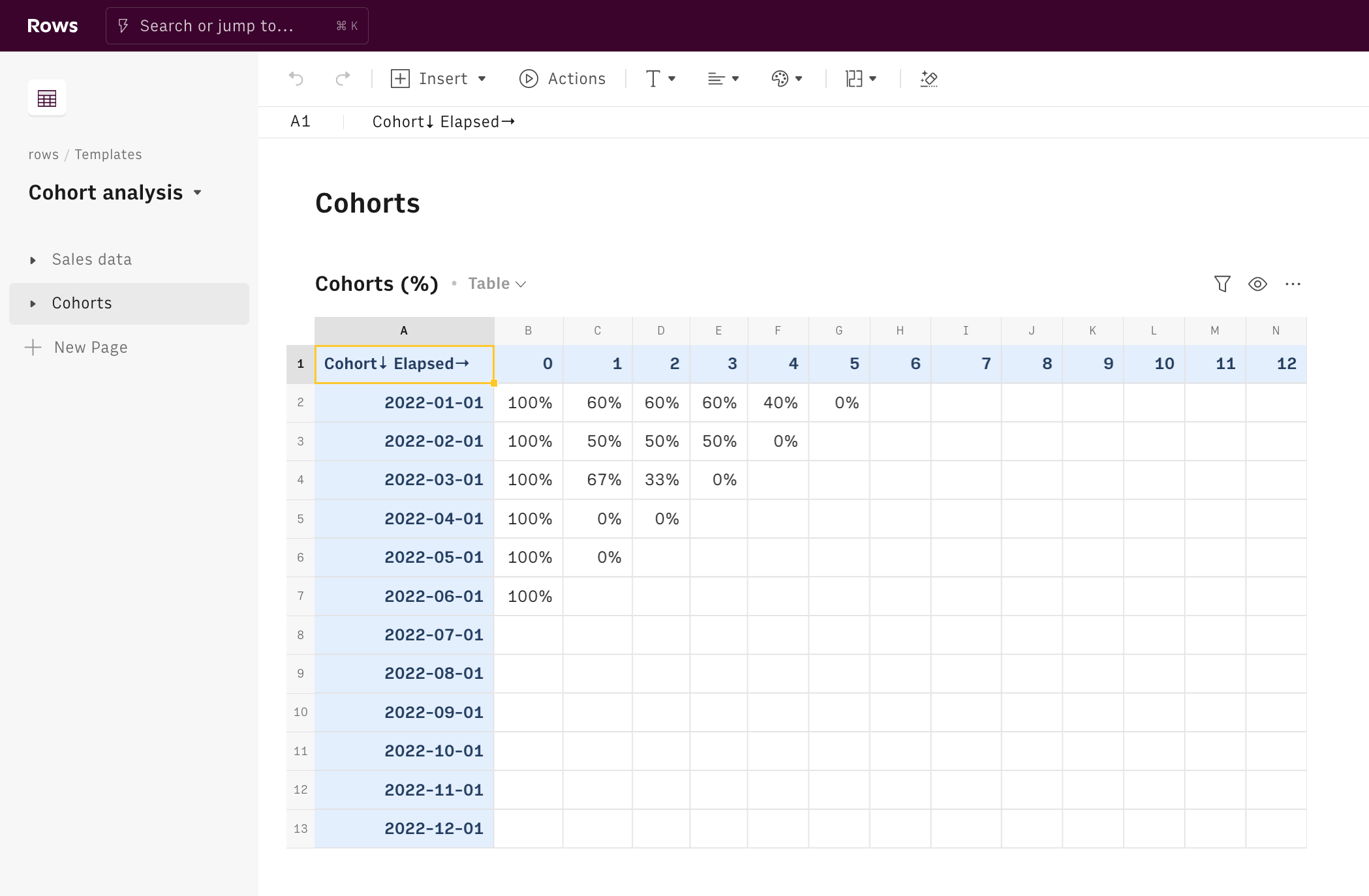
Each cell verifies two conditions through the AND() function:
- The latest purchase in the Sales list must be posterior to each relevant month AND
- There must have been at least one user in the cohort who purchased for the first time, and thus has 0 as 'elapsed month'
If the conditions apply, each cell counts the number of purchases in that month - filtering for those who have more than 1 purchase, to avoid double counting - for each cohort and divides by the cohort size, as follows:
1=COUNTIFS('Sales data'!$G:$G,$A2,'Sales data'!$F:$F,C$1,'Sales data'!$H:$H,1)
2/COUNTIFS('Sales data'!$G:$G,$A2,'Sales data'!$F:$F,0,'Sales data'!$H:$H,1)
The second, instead, shows the data in absolute terms: the # of purchases made by each cohort in the subsequent months.
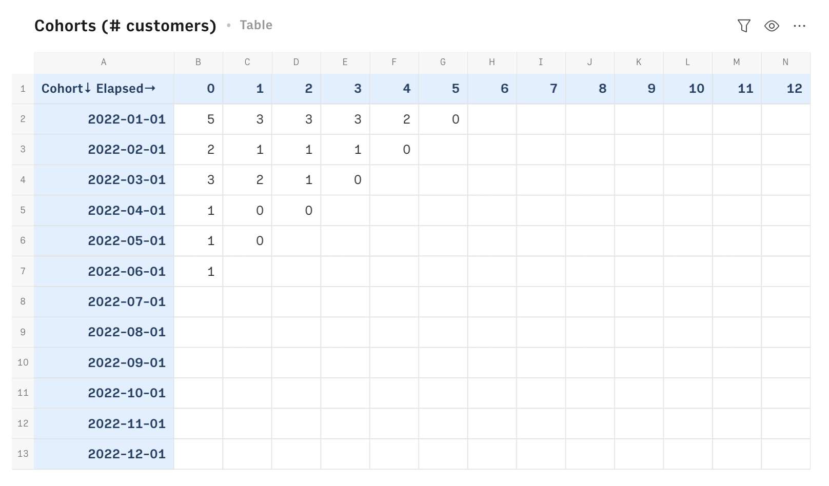
Each cell checks the same conditions above, and if true, calculates the number of purchases per month.
Finally, a chart displays the trend over time of different cohorts (colored curves) giving you a quick way to check the top performers, i.e. the flatter the better.
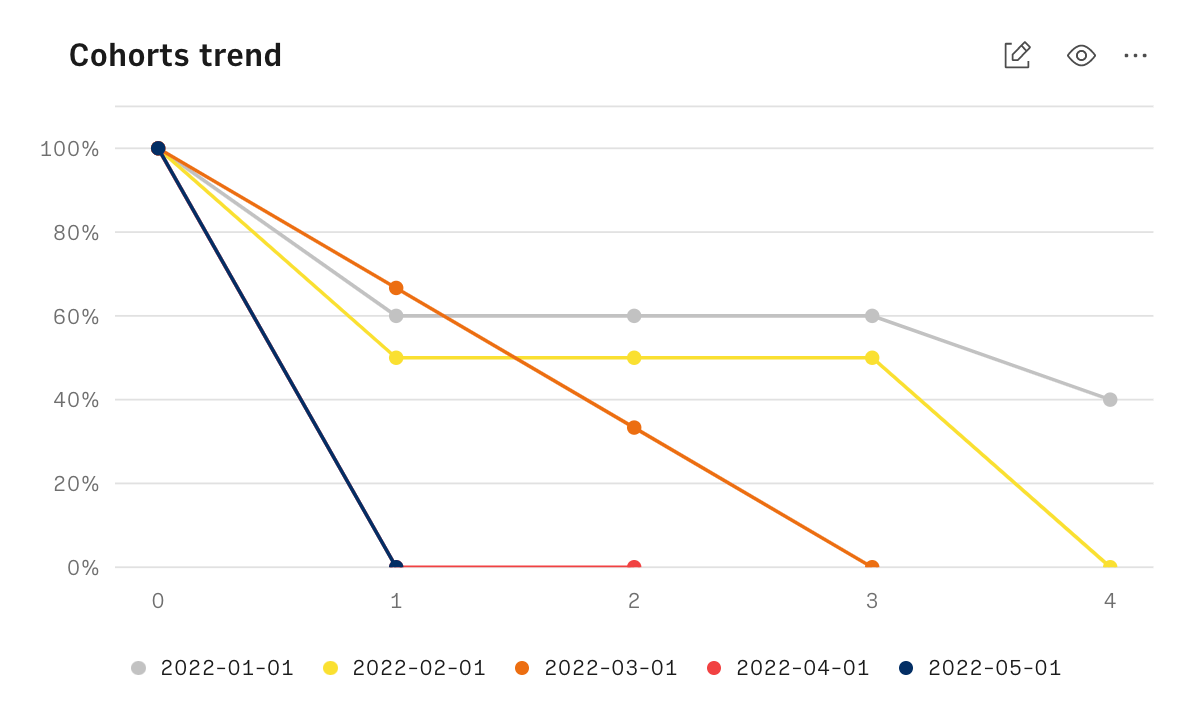
Whenever new data are available, just input them in the sales table and the cohort table will display the new rates.
Embed cohort analysis into your marketing documents
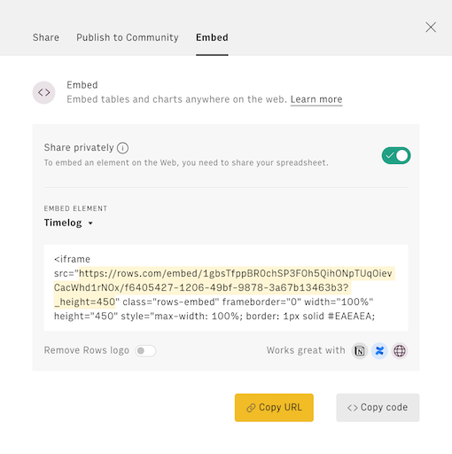
Finally, if you are using Notion or any other internal tools that support iframes to build a report, you can embed any table or chart of this spreadsheet in your document. Just click on the ... icon in the top right corner of any table or chart and pick Embed. A modal will open, as follows:
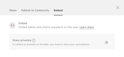
Before embedding, you need to grant access to it. To do so, toggle on the Share privately option and then hit the Copy URL button: your element is now ready to be pasted into your favorite tool.
Related articles
Check also