Why and How we rebranded

There’s a moment in every company’s life where people think about rebranding.
Should we rebrand? Should we rename our product or company? What’s in a name? Is it really that important? How do we go about it? Who’s in charge?
The Board’s view
At first, I started feeling the rebranding itch. Then my co-founder Torben joined in.
In April of 2020, we gathered our thoughts and took the topic to our Board of Directors. We said “We, the Management, want to rebrand.”
In the meeting, we summed up our reasons:
Why rebrand
Over time, we have (internally) developed the notion that “dashdash” is sub-optimal as a brand and domain for us.
people don't understand the name (dashdash means “=”).
hard to read instantly, as it's the concatenation of two similar words, without spacing or caps.
somewhat prone to writing errors (like dahsdash).
hard to understand when spoken, especially by the international crowd.
Separately, our design team would like a rethinking of colors and other branding elements for the web.
our short logo + the written “dashdash” word are hard to use at times.
our visual brand lacks in flexibility and sometimes feels a bit grotesk.
Overall, the name and brand don’t seem fit for a B2C brand with our ambition.
Externally, some external advisors & friends also asked us if we thought of rebranding. They pointed out that "dashdash" didn’t feel premium enough.
Now is the time to do this. We understand that the brand is not the critical element at the current stage (scaling is). But pre-launch is easier, as post-launch means more coordination and higher stakes.
We can complete the change within 6months, rebranding in parallel to other efforts. Engineering teams are focused, Business people are helping users.
Total cost equals about 1 month of burn. We are comfortably over 24 months of runway (note: that’s the money to pay the bills). We also spend little on marketing and an investment like this can make our product more attractive and pay off even before the term of the current runway.
Naturally, our board asked to discuss it thoroughly. They raised a number of interesting questions, yet they also were *super* supportive. Mostly, our investors focused their energy on telling us we shouldn’t do it without first speaking to a few experts (agencies and people) who’d done it.
Talking with experienced people is always a good idea; I guess that’s why its the go-to recommendation of all Board members, for almost any topic.
The brand/ design/ marketing Agencies were obviously very supportive (and interested in the work too), and they provided good insights. But the recommendation boiled down to:
That we see, there’s nothing terribly wrong in the current brand “dashdash”. You seem excited about a rebrand, and we can see much better than “dashdash”. A better brand at this stage will surely help you.
So, if you are also thinking about rebranding and renaming your company, that’s about as much reinforcement as you are going to get.
The team’s view
We also aligned with our team: we told them we had thought of the rebrand. Some people swore by the name “dashdash” and the old design. We explained the reason and we felt the team excited about it.
We pushed ahead. (That’s the job!).
Authority & Responsibility
At this stage, with a lot on our plate, we decided to focus.
Torben and I settled on 3 people for this job: one founder, one person from the business side, and one person from the technical side. I had been the one with the itch, so I guess “which founder” was an easy pick. We picked Henrique to represent the business side; as the Growth Manager, he was very exposed to the challenges around communication, messaging and our homepage. And we also picked Sandrina, a Product Designer, to represent Design, Product and Engineering.
The 3 of us had the authority to take decisions, and we had the responsibility to keep everyone else in the loop.
The Process
Given our experience and configuration, the 3 of us quickly agreed on a process and sequence:
We would pick a new name ourselves. Why? we’d picked company names before (EatFirst, Skin, AirCourts, EqualsMagic, dashdash) and we loved this task. I’d lead this.
We would hire a top Branding firm to create the Brand. We focused our requests on Messaging, Visual Identity and how to apply those to our existing web properties (public facing homepage, email comms, social). Henrique would focus on the Messaging, while Sandrina would focus on the Visual Identity part; both would work on the application of the new brand on our web properties.
We would hire our existing Design Agency to execute on our redesigned homepage. That’s because the Brand Agency would only design a few pages, for directional purposes. We would also send a brief to just another design agency, just in case.
We would ourselves execute all the rest: applying the new brand to the product (when you’re logged in).
Picking a name
While a “Brand” is not a “name”, naming a company and product is one of the most fun projects you can execute on.
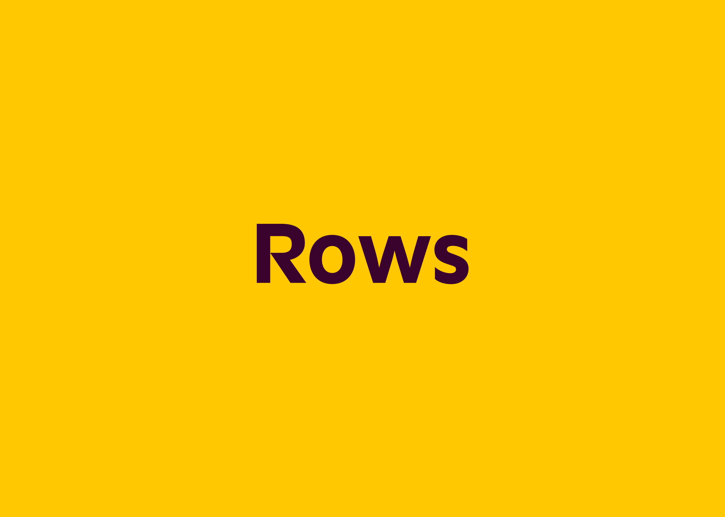
I personally went to hell and back for our name Rows. I talked to dozens of experts from GoDaddy, Uniregistry and smaller firms, and we manually tried hundred of simple words, and derivations, until landing at Rows. We locked it through the nice people at saw.com.

Why did we like Rows?
Rows are the daily achievements of your business.
When you meet someone new, you add a row in your contact list.
When you book a sale, you add a new row in your revenue control.
As your customers grow, you add rows to your CRM.
As you hire new colleagues, you add rows to your team.
Rows represent the size of your business, and Rows expands as fast as your ambition.
Rows are precious. They are data. You can review and track your progress, relate events to one another, compute lessons.
Rows are simple. In each table, they are one of a kind. You can sort and filter them. They are easy to read, and fun to scroll by.
Visually, while each row is an horizontal concept, rows as a group are a vertical concept, visually and dynamically. You can play around with this to achieve any visual effect.
Some of the names considered were Cells, Spreadsheets, Panda, Arrays, Plane, Datagrid, Mustard and a bunch of others, a few of which we will save for later.
If you’re renaming your product, beware: people will heavily disagree on names. Some of our team pushed back against Rows, they wanted different ideas.
Everyone who is part of a team must be able to separate preference (“I like Rows”) from your hard-objections (“I hate Cells”). We followed that framework, which helped us align. Ultimately, you have to pull the trigger. Rows it is.
Picking an agency

Our design team listed some of the best Brand & Design agencies in the world and some special agencies near us:
Burocratik
FocusLab
Mackey Saturday
Moving Brands
Moxy Studio
z1.design (MetaLab partners)
This is Pacifica
We sent them a comprehensive brief: 1) who we are, 2) what we want (detailed list of deliverables), 3) when we want it, 4) who’s working on this from our team, 5) how we will evaluate agencies, and 6) existing material for our brand. At the top, a summary with key highlights.
All of those agencies are great and have done great work. We had terrific conversations with a number of agencies, especially Mackey Saturday, Moving Brands and Focus Lab. Usually, the CEO or a super-senior person was involved in the conversation and talked with us about our challenges; that’s the commitment you’re looking for in an agency. The service level, preparation and digital experience of the international agencies was unmatched in our process.
We picked the last one, FocusLab. In case you are wondering, they have been terrific partners and we recommend their work (process and outcomes).
For implementation, we went with our usual partner, Moxy. They are fast, they deliver with high-quality and execute in a modern stack.
Some details on deliverables
The whole concept of the new brand was based on 3 attributes:
Dependable, because spreadsheets don’t break. You can trust them. Intuitive, because great software is simple. Vibrant, because we are doing something ground-breaking, new.
But it doesn’t do much to just write those terms on a document. You have to actually represent them on your work.
Intuitive traits: the Rows name is intuitive in itself. We adjusted the tone of voice to be approachable and avoid expensive words or purposeless lingo. We simplified our already familiar spreadsheet interface. We kept investing in the classic spreadsheet functions people already know, so that business people can feel at home.
Dependable traits: the use of meaningful animations and illustration. The continued obsession to deliver a fast and trustworthy computing experience. The redesign of a website where the header doesn’t have fancy transitions or floating gimmicks. The absence of captured-scrolling and over-the-top animations.
Vibrant traits: our use of color and the creative use of the illustrations. The excitement of tackling incredibly difficult problems with focus, drive and a positive attitude. Launching this new brand!

Asides from that, the deliverables were as follows:
2 big setup documents: Brand Strategy, Creative Brief.
4 communication deliverables: Messaging framework, Voice & Tone guidelines, Communications guidelines, Writer quick reference.
3 visual identity deliverables: Logo, mark, illustrations, Brand guidelines.
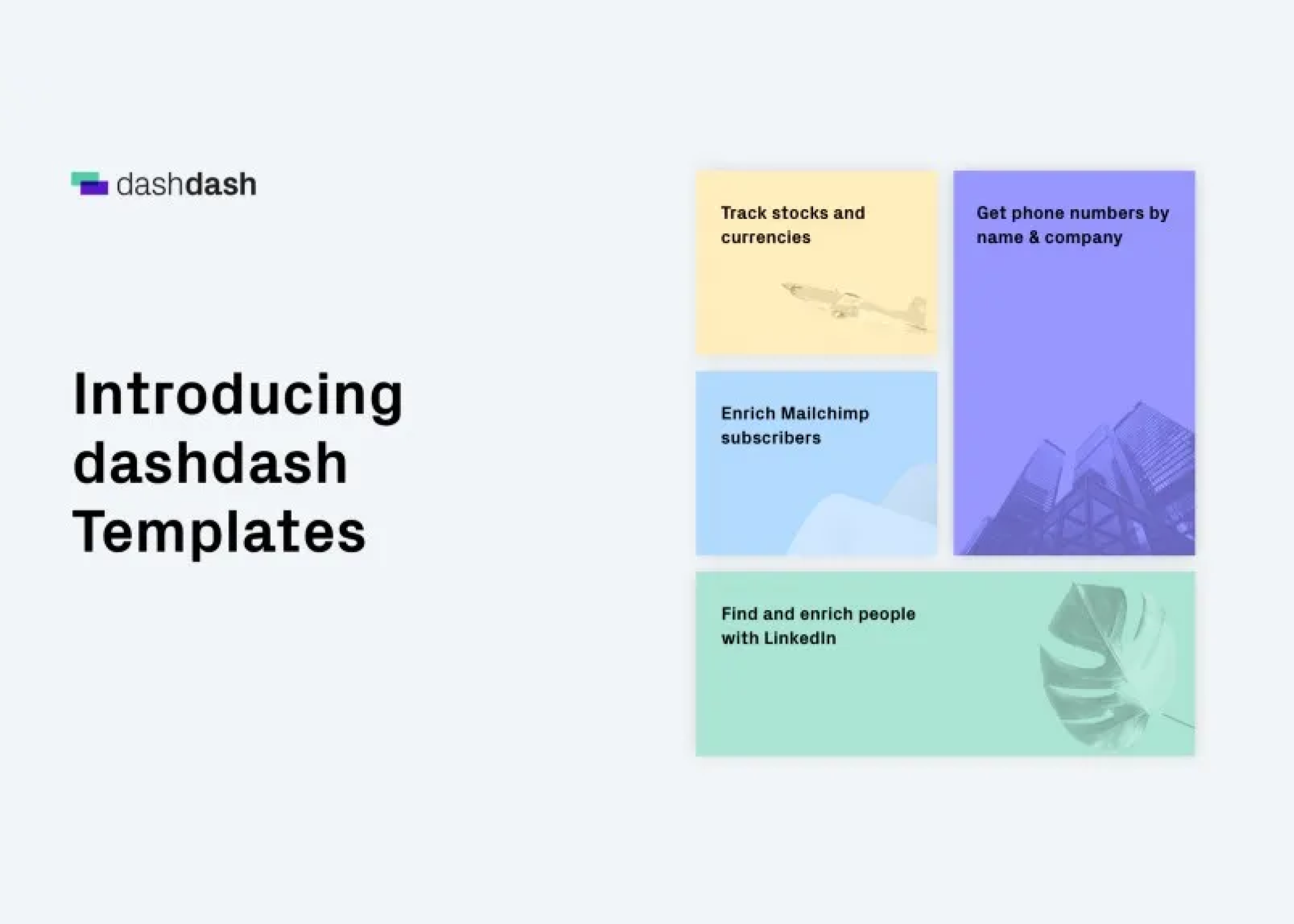
Multiple files for design application: homepage, specific product pages, social assets, t-shirts etc.
We aligned with the agencies that deliverables were handed in PDF & Figma.

The project by the numbers

6 months to complete the project
1 month to kickstart, pick a name, choose an agency
3 months for the brand agency
2 months for the design agency implementation
$100k for a 4-letter domain (Rows.com), but good names with few letters go from $50k to about $2m.
~$150k for a top USA agency to create a digital brand: that includes positioning, visual identity, application to web properties. It excludes actually developing the website, that was another agency. Prices will vary a lot by geography and prestige, we got quotes from ~$50k to $200k+.
Implementation of the visual identity on your homepage and website will depend on the complexity and existing relationship with the agency. In Portugal, where we hire our agency from, you can get it done for <<$100k for a website of the complexity of Rows.com (js, react, dynamic galleries, content linked to a CMS, preview tags, animations, etc).
The Brand is never really done
Rebranding is a tough job. It requires proper motivation and love for your product. It’s also usually expensive, in time and attention.
It’s also a privilege. If you can do, and if you are 100% convinced you should do it, go for it. It will be an opportunity to rethink some core aspects of communication and visuals. It’s a lot of fun.
A Brand is never really done. It’s not a static job. We did this rebrand, and now we will look at what works best and what doesn’t work. Our team will change it and adapt it.
We will make Rows our own, and make Rows our users brand for spreadsheets.