How to add charts to Confluence pages

Confluence has built a reputation as a documentation hub and the go-to solution for creating, managing, sharing and collaborating on corporate knowledge bases.
Adding charts to Confluence can make your documents easier to understand, more interesting and engaging, and provide a more professional look and feel. There are several ways to add charts to Confluence pages, depending on the software and plugins you use.
In this article, we’ll go through the step-by step guide to add interactive charts to Confluence pages using four different tools.
1. Rows
Rows is a web application for creating modern, beautiful and data-rich spreadsheets. It combines a modern spreadsheet editor, data integrations (e.g. Social media, Google Analytics, Salesforce, Stripe) and an innovative sharing experience that turns any spreadsheet into a website in one-click.
Follow the steps below to create an interactive chart in Confluence using Rows:
If you haven't signed up for Rows, do that here and login to your account.
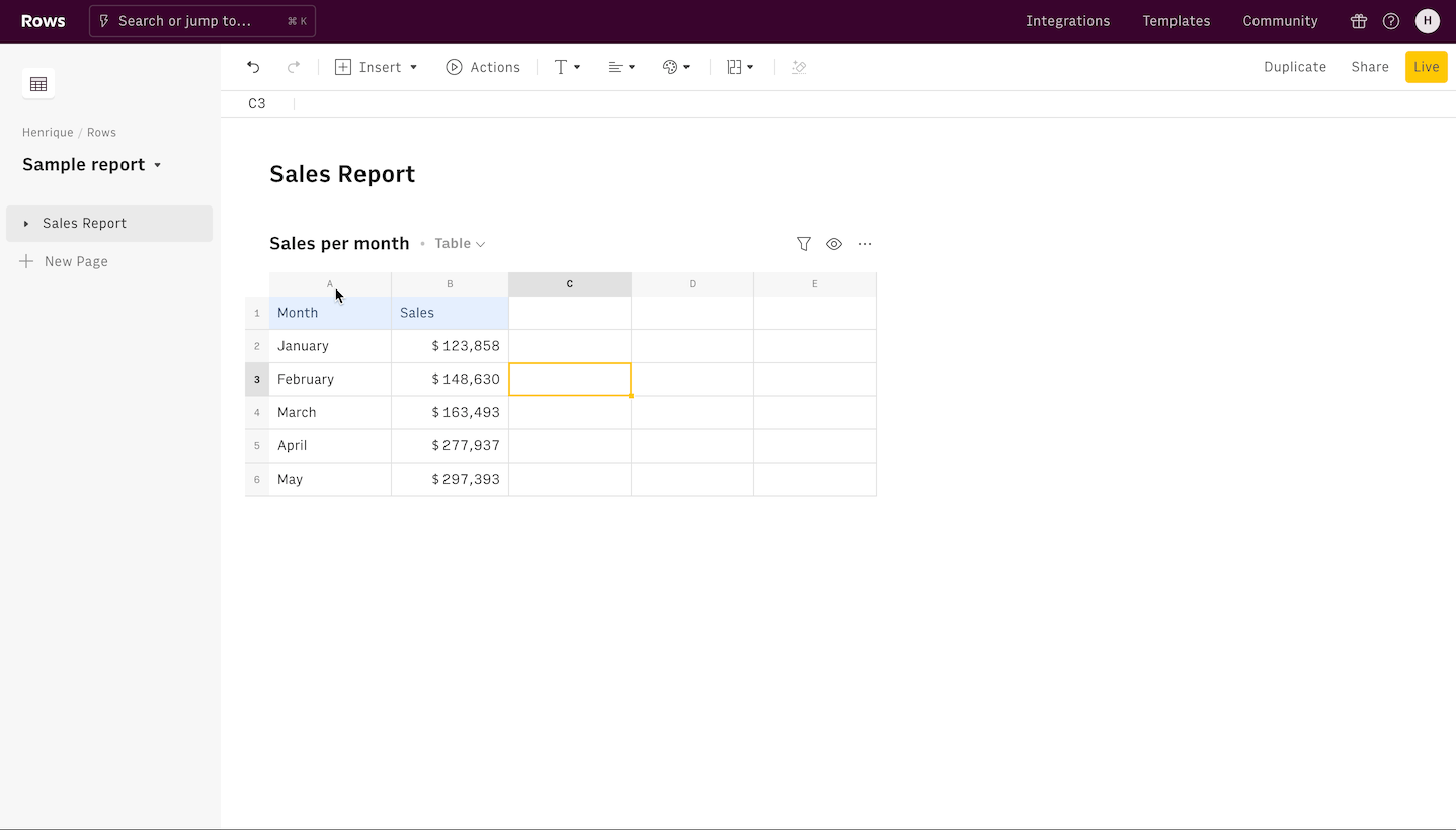
Create a spreadsheet. Do this by clicking on the Create Spreadsheet button.
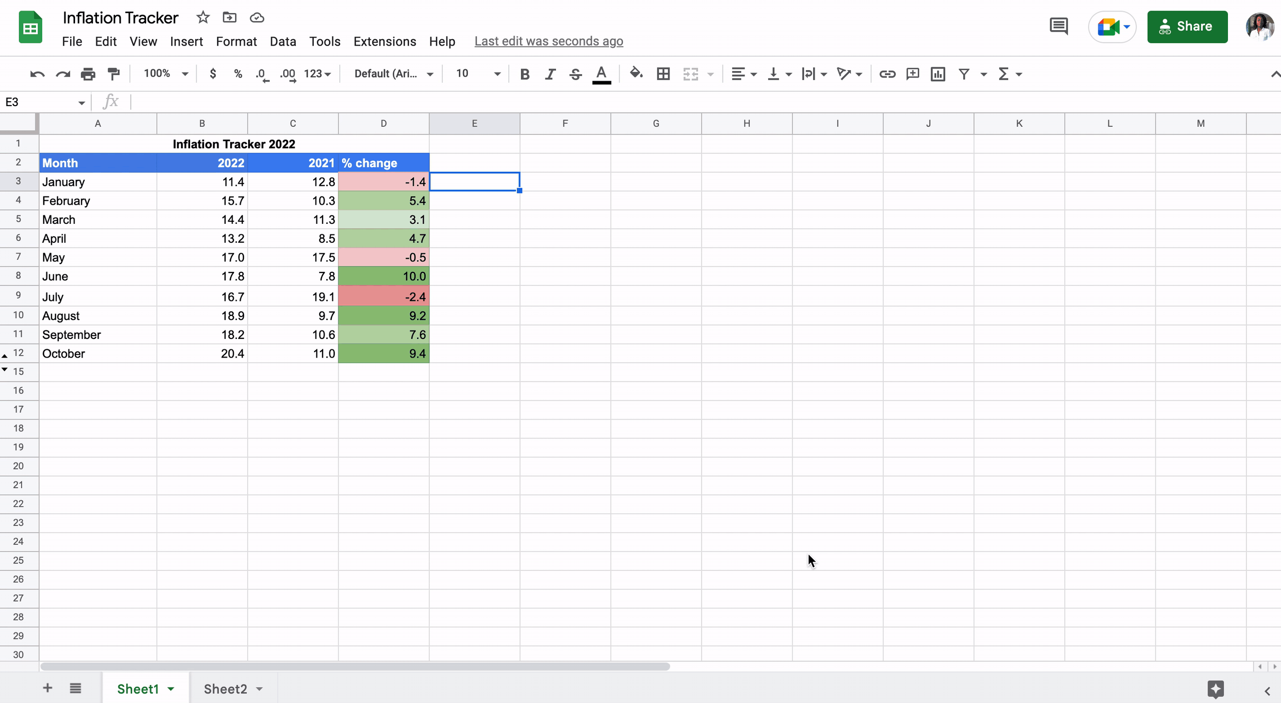
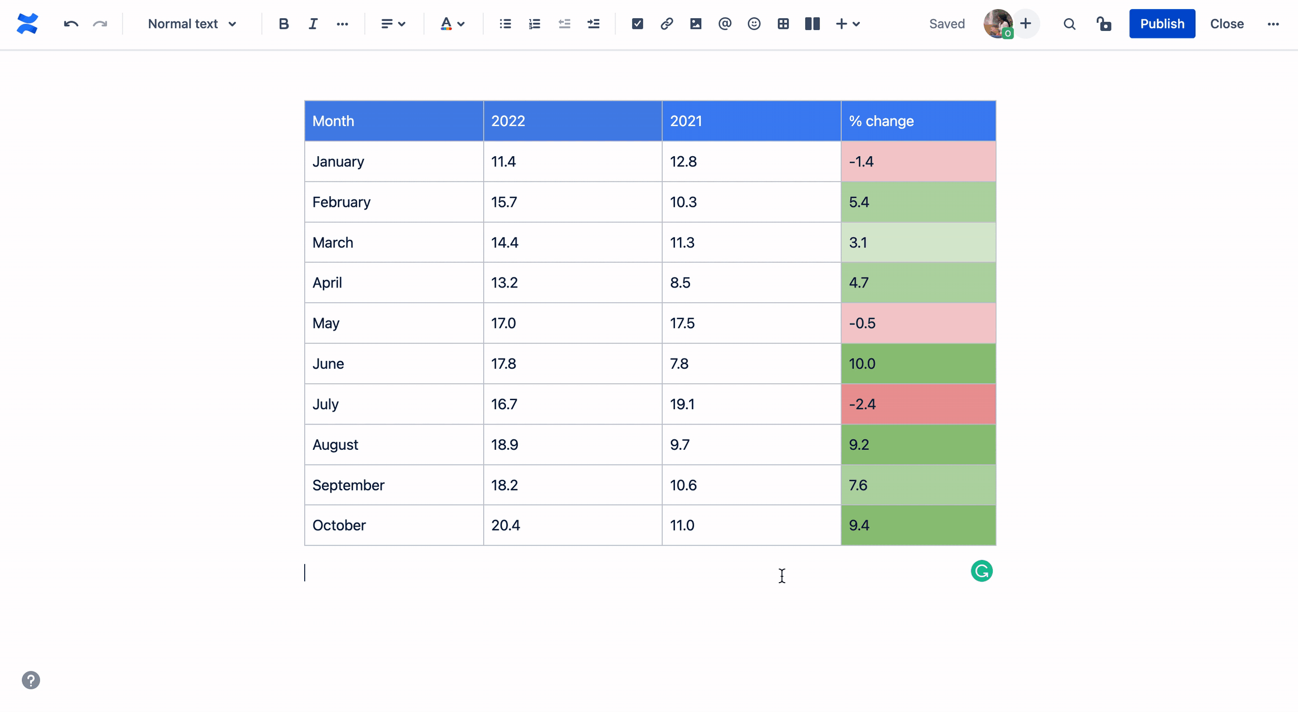
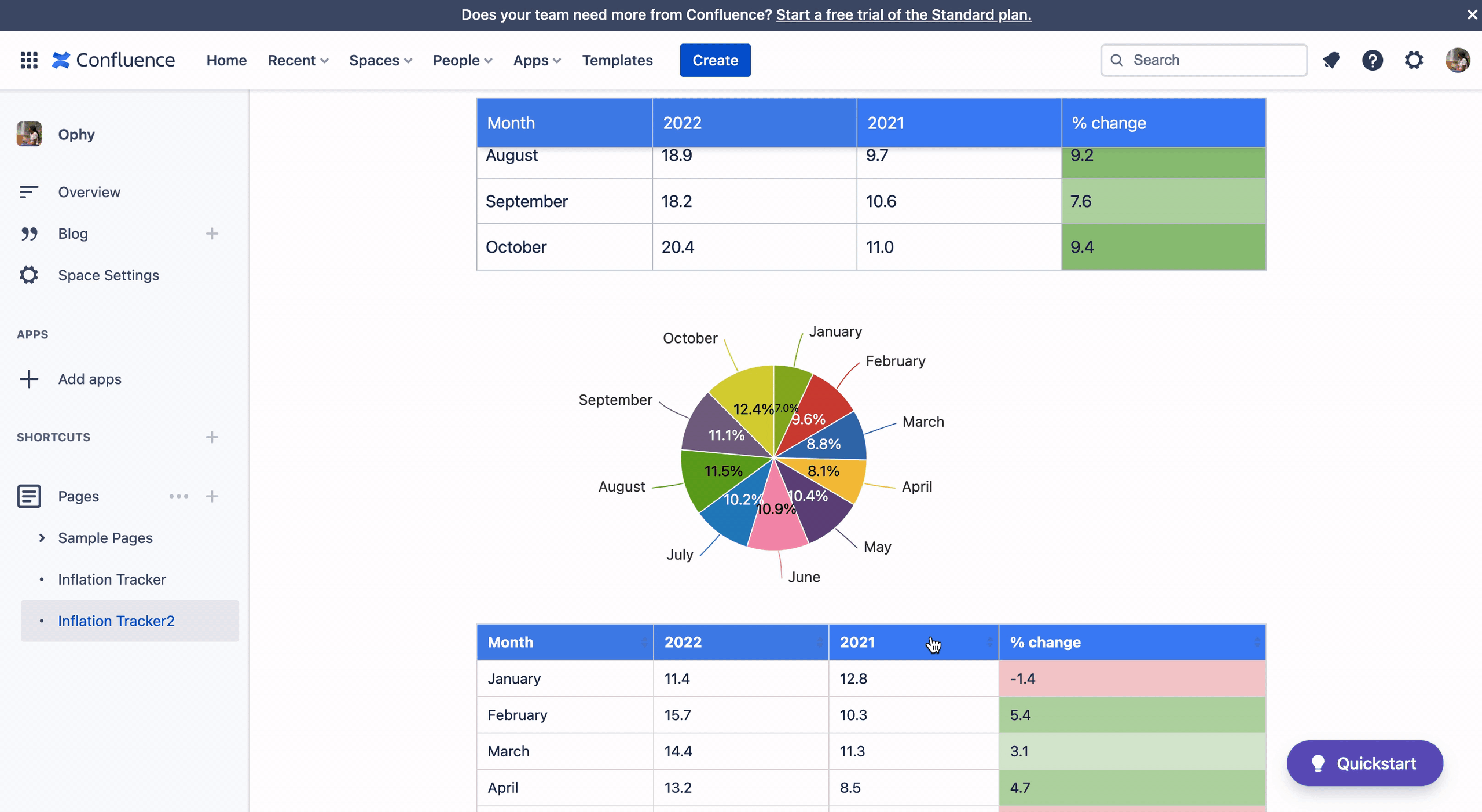
Fill in the table with the data that will be used to create the chart.
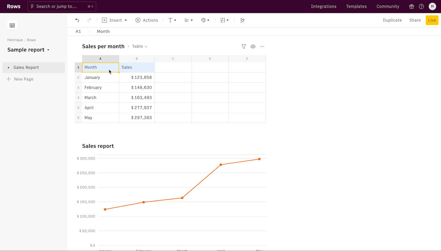
Once your data is ready, highlight all the data you want to use and click the Insert button on the top of the page. From the dropdown options, select Chart.
5. Once a Chart is generated, you can customize it using the Chart sidebar. This is where you can pick between chart types, add names to the axis, pick the chart series, among others.
6. The last prerequisite for getting your embed link is to turn on Share privately with the link on the spreadsheet. Do this by clicking on the Share button on the toolbar on the top right corner, next to the Live button.
 Enable Share privately with the link before embedding
7. Click on the chart you want to add to Confluence, and click on the “..” options menu on the top right corner of the chart. Click on the three dots and from the dropdown and select Embed. From the popup, select Copy URL to copy the link to embed.
8. Paste the link on a Confluence doc. Click the link and select Embed from the smart links options.
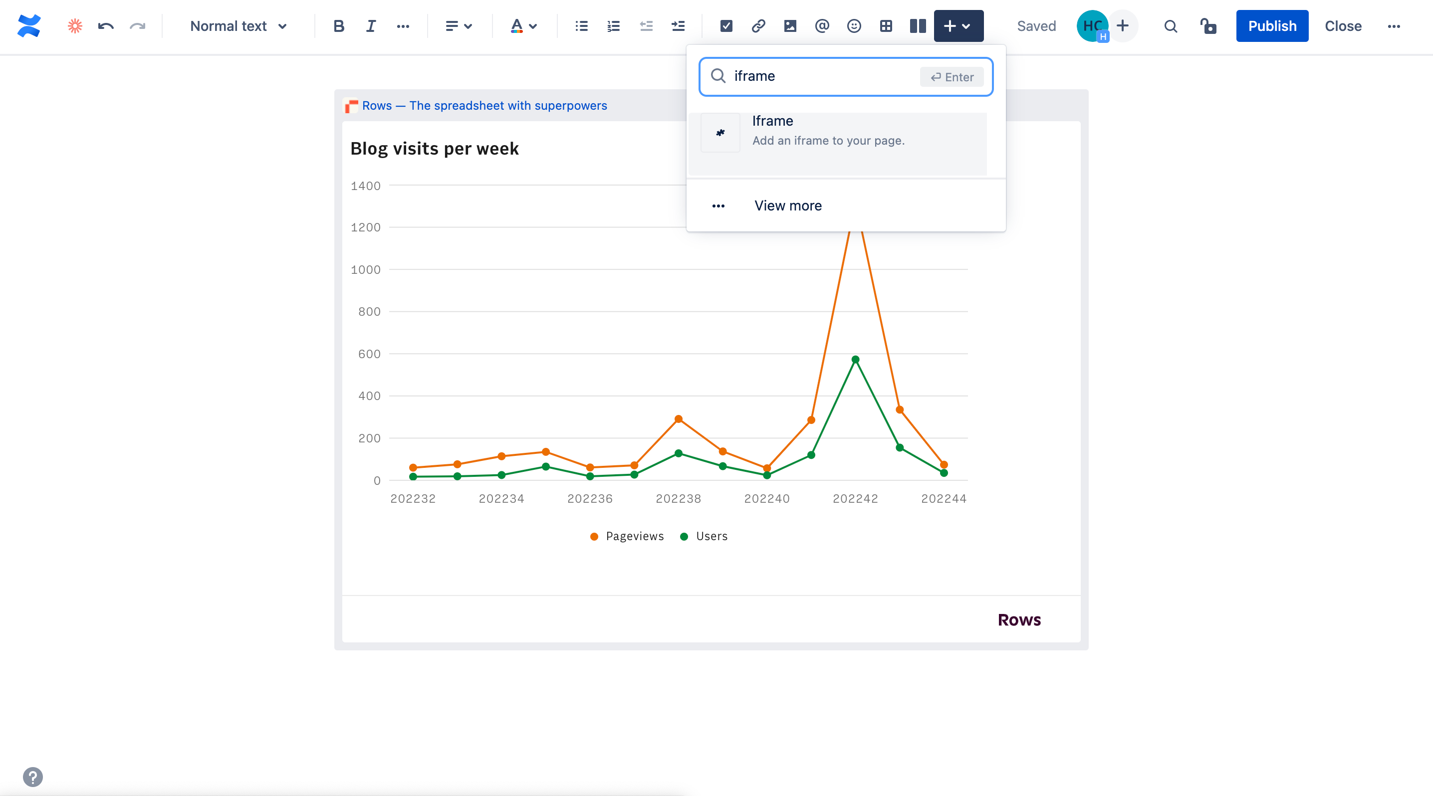
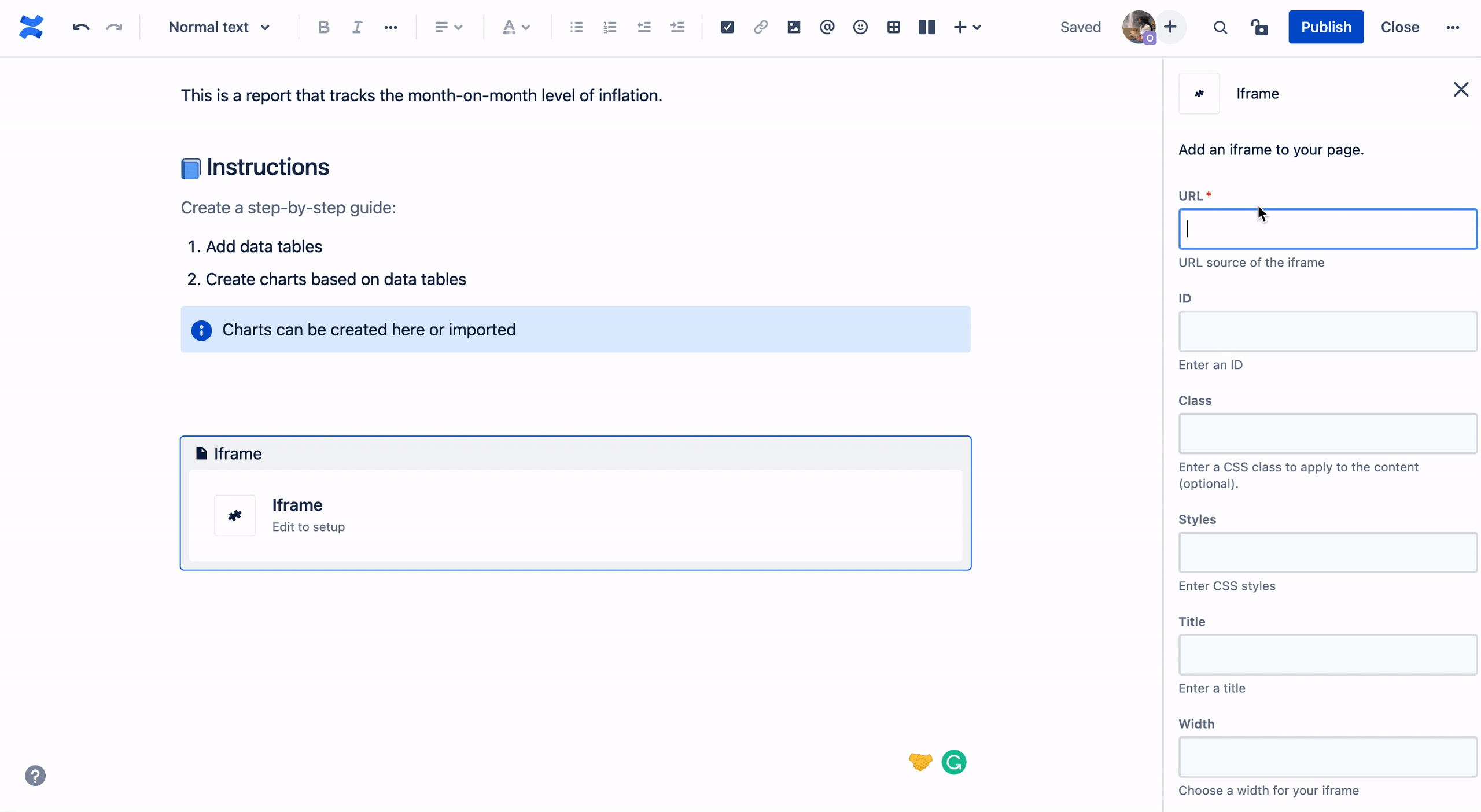
Alternatively, use the iFrame option in the Insert menu to add the embed. Type /iframe or click the Insert button (plus sign and dropdown symbol) on the toolbar and enter iframe in the search bar to select it. A side bar on the right hand of the page will appear for entering the iframe details. The iFrame option is perfect to add additional customization to the embed look and feel, including custom height, width or custom CSS style.
Now that the chart is embedded in Confluence, it has a live connection to the underlying data source. If the table with the data is updated on Rows, so is the chart.
2. Chart Macro
Chart Macro is the native tool for creating charts in Confluence. To create confluence charts from tables of data, follow these steps:
To create a chart with the in-built chart macro, you have to first add a data source. Do this by inserting a table and adding the data either manually or copying and pasting from a spreadsheet
Once the data is added, click the table to reveal the Insert Chart icon beneath it.
3. Click the chart icon to insert a chart based on the data source.
4. Easily customize it by clicking Chart Options. This brings up a side bar on the right of the page where you can change the chart type, data points, title, style and legend.
3. Google Sheets
Google Sheets is one of Google’s suite of online web-based applications. It is used to create, edit and collaborate on spreadsheets. You can also use it to create charts in Confluence or import spreadsheets through iframe embeds. Let’s see how to do it.
In order to successfully import charts based on Google Sheets data, you have to first create it within your Google Sheets. Do this by highlighting your data point and select Insert on the task/title bar.
From the dropdown options select Charts to generate a chart and to customize your chart, double click on it to reveal a sidebar editor on the right side of the page.
3. Next, click the three dots (ellipses) on the top right corner of the charts. From the dropdown options, select Publish. This brings up a popup with options for publishing. You can publish under link or embed it.
4. By clicking the publish icon, you’ll have to confirm whether or not you want to publish the chart. Finally, copy the url in order to embed it in Confluence.

5. Once done in Google Sheets, go over to Confluence and type /iframe. Alternatively, click the Insert button (plus sign and dropdown symbol) on the toolbar, enter "iframe" on the search bar and select it. It’ll reveal a side bar on the right side of the page for entering the iframe details.
6. Finally, paste the url and press enter. Add additional customization to the embed look and feel, including custom height, width or custom CSS style.
4. Stiltsoft
Stiltsoft is an external tool that can be integrated into Confluence to filter, aggregate and visualize table data. Popular for creating confluence gantt charts. The following steps will guide in creating a chart with Stiltsoft:
You first of all have to install the Stilsoft add-on on Atlassian's marketplace by signing up for it and setting it up.

2. After your installation and setup are done, go to a new page and ensure that you have your data source (spreadsheet or table) on there.
3. Next, type /chart and from the list of options, select Chart from Table. This brings a popup to preview the “Chart from Table” macro, click the Insert button to insert it.
4. Copy your data source and paste within the Chart from Table macro input box.
5. Once done, click the Publish button on the top right corner of the tools bar to generate your chart.
6. Customize the type of chart, labels, columns and size to your preference.
Conclusion
As a central source of truth, Confluence helps fast-moving remote-friendly teams to share knowledge for quicker decision making and faster work together.
Rows is the simplest, most flexible way to add charts in Confluence. It’s the spreadsheet of choice for modern teams that believe high-quality documentation is key to success. It has many customizable chart options, its chart data refreshes in real-time and it can be used for more than charts (e.g. embed large tables of data, embed calculators).
Sign up on Rows today to enjoy all these features and many more. If there are any tools we left out, share with us on Twitter.

