Hacking the /dataisbeautiful subreddit


This is the ninth post in our PLG Series, where we deep dive into the experiments, strategies, and tactics used at Rows to accelerate our product-led growth.
Make sure to check out the previous articles on 3 Matrices for building products with AI and Building a Loginless Experience for 1B people.
Growth is about experimenting. Finding new ways to acquire and onboard customers and get them to value as fast as possible. Some will work, others won’t. Today we’re writing about the latter.
About how we explored the potential of Reddit, specifically the /dataisbeautiful channel, as a growth channel for Rows. Why we did it, what happened, and why it stopped.
Let’s dive in.
Why Reddit and /dataisbeautiful?
Using Reddit as an organic growth channel had been considered before, but the decisive moment was a customer suggestion. During an otherwise very vanilla call, a customer mentioned:
“Rows has beautiful charts. Have you thought about sharing examples of your charts on the /dataisbeautiful subreddit?”
We had. Sort of.
/r/dataisbeautiful is the underworld for data visualization nerds like us. With 21 million members, it is the 32nd most popular subreddit. You can find all types of charts and other visualizations, with new ones coming every minute.
Our charts are indeed one of our distinctive features. Behind every chart, there’s a table, and very often a spreadsheet. It was a natural testing ground for a new growth experiment:
Can we drive traffic to rows.com by consistently posting charts made in Rows in the /dataisbeautiful subreddit?
Our approach was straightforward:
Selecting engaging topics: We focused on relevant, debatable, or counterintuitive topics to spark conversations and debates.
Data gathering and visualization: Using public data, we created spreadsheets and charts to visually represent the information.
Sharing mechanics: We published the spreadsheets on rows.com/community, shared PNGs of the charts on the /dataisbeautiful channel with a watermark linking back to Rows, and commented with the original data sources and Rows spreadsheet.
During 97 days, we posted 43 charts on two of our personal Reddit accounts.
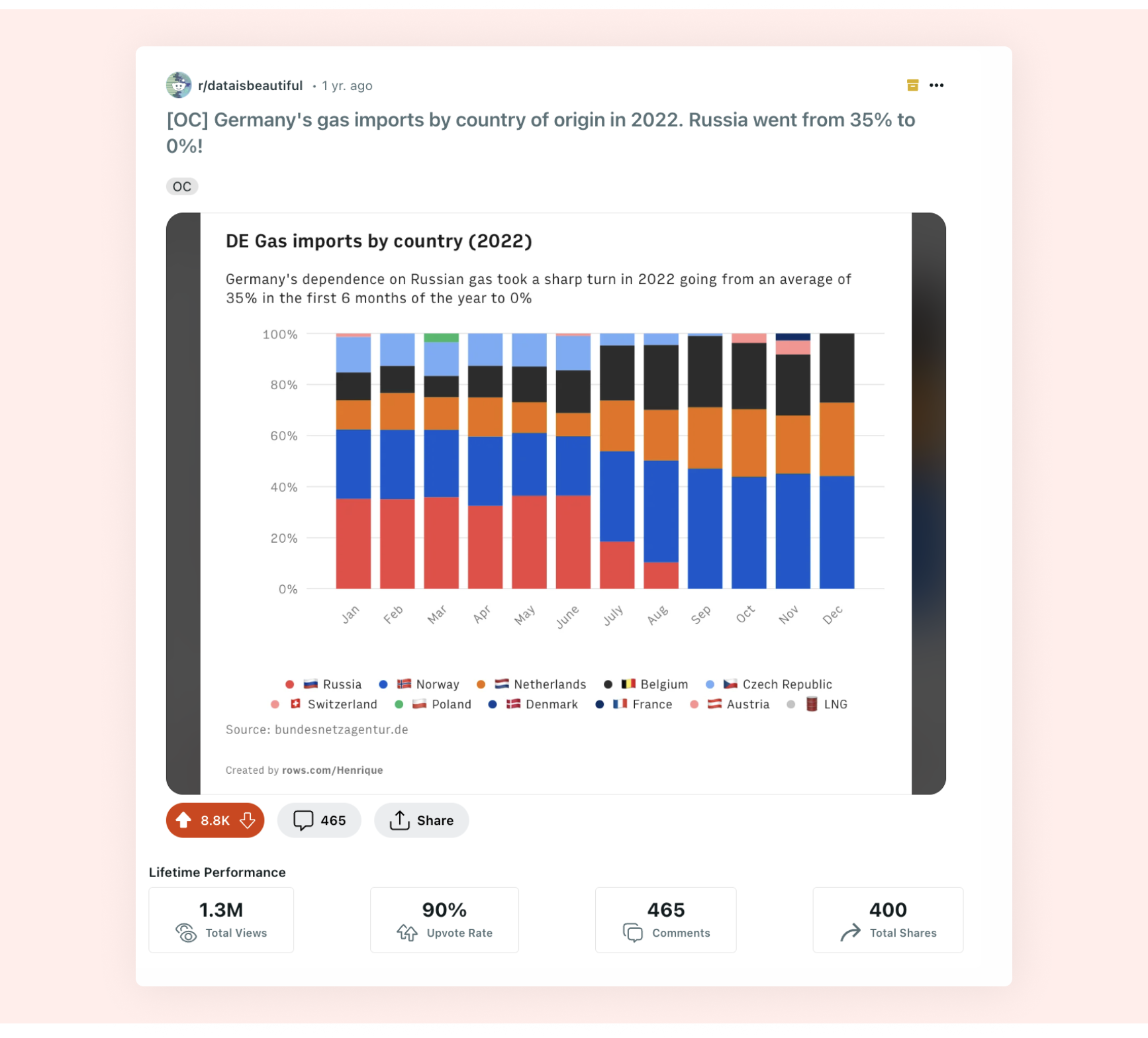 One of the most popular posts
The Metrics
To measure the experiment's success, we focused on these metrics:
Reddit Engagement: Views and shares of our posts.
Website Traffic: Visitors and page views to rows.com from Reddit.
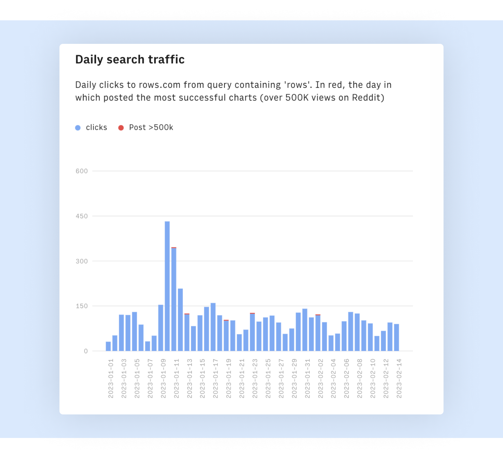
Search Traffic: Daily search traffic to Rows.com, focusing on spikes correlated with Reddit posting days to measure indirect traffic from the Reddit audience.
Conversion via spreadsheets: Views and duplicates of the actual spreadsheets hosting the charts.
The Outcomes
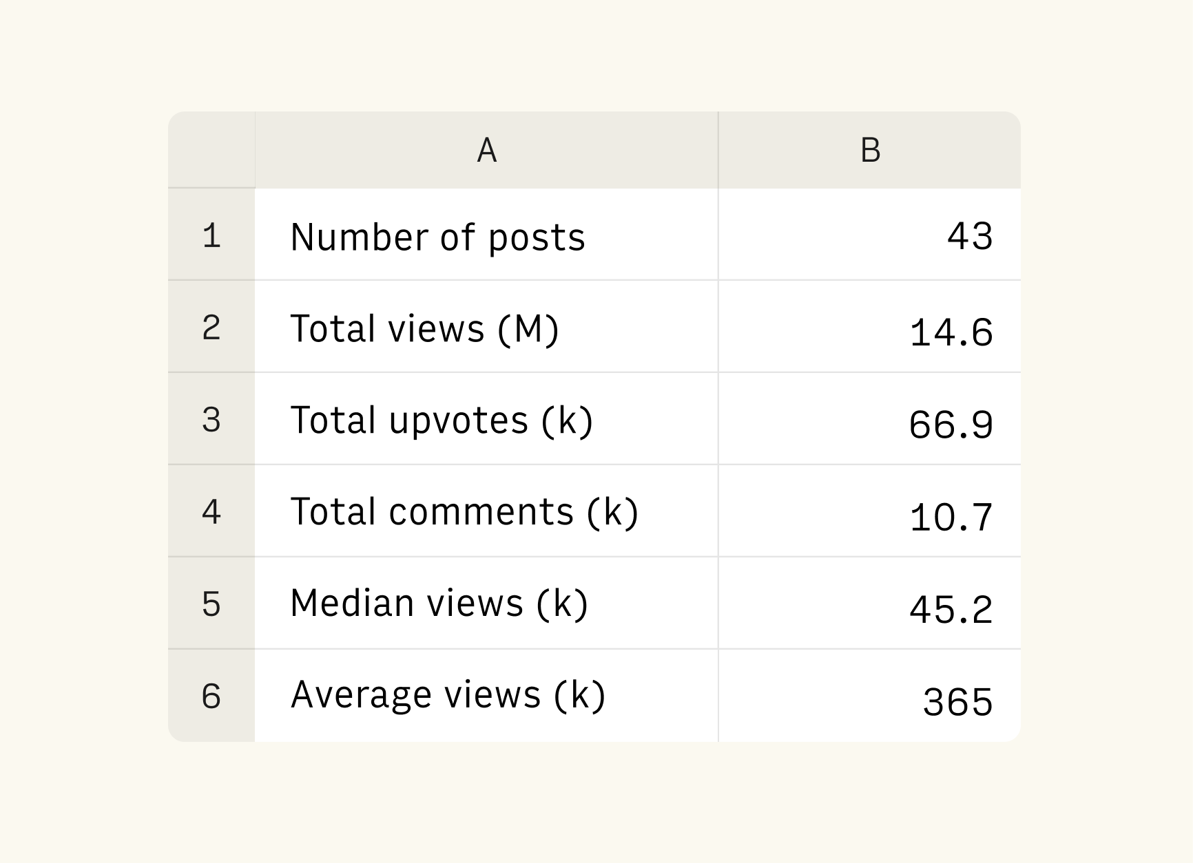 Table with the overview stats of the experiment
Our Reddit experiment yielded fascinating results:
High Visibility
We posted 43 charts, with a total of 14.6 million views. The median views per post was 32k, with an average of 339k views. That’s a lot of views! Some , like this one about aid sources of aid to Ukraine, went viral, with >3 million views.
(Plus, our individual Post Karma on Reddit went from 0 to >9k.)
Direct Traffic Boost
The initiative directed 1,052 users to Rows, resulting in 3,021 page views, correlating with our most-viewed Reddit posts.
There was no clear increase in direct search traffic to Rows.com. Traffic from queries containing ‘rows’ shows the same weekly pattern before, during, and after the Reddit posts.
Conversion via spreadsheets
The spreadsheets had 1,359 views and 12 duplicates, resulting in 42 direct signups from the public spreadsheet “Sign up” CTA.
On average, it took 12.4k Reddit views to generate a view of the underlying spreadsheet, with significant variance across posts.
Despite impressive metrics, the impact on user acquisition was less than we hoped.
Wrap up
The Reddit experiment was popular within Reddit but fell short in direct user acquisition. At ~1 sign-up per post, it wasn't worth the effort. I’m still glad we did it.
We came away with a few important learnings:
You can quickly gain followers on Reddit and get eyeballs on your content by posting unique and engaging content.
Unlike Twitter, converting Reddit virality into product adoption is difficult, especially in subreddits like /dataisbeautiful where there's no direct link between the shared content and the product website.
If I could redo the experiment, I would have used Reddit Ads on the subreddits feed to blend brand awareness from organic posts with conversion-focused ads.
Uploading a PNG file doesn't showcase one of our most beloved features - Embeds.
And one to-do:
Keep investing in Charts. We received a lot of feedback from the Reddit community, including requests for new chart types, feedback on data label positions, and data series colors. Our Charts, with footnotes and AI-generated subtitles, are a strong differentiator, but we’re committed to making them 10x better.
Next time, we’ll write about the time we turned our mobile website into a Tiktok-like experience.
If you haven’t yet, head out to rows.com and see what the future of spreadsheets (and charts) looks like.