Right now, we offer a core set of charts that cover most business-oriented use cases such as marketing performance or sales reports.
When creating a report in Rows, you can insert the following chart types:
Line chart
Use a line chart when you want to find trends in data over time. For example, get trends in sales or profit margins each month, quarter, or year.

Column chart
Use a column chart when you want to compare categories of data or show changes over time. For example, compare revenue and expenses each month.

You can also change the Stacking settings to create different types of Stacked Column charts. Stacking helps to show the proportions of data that contribute to an overall metric.
You can choose between normal stacking and 100% stacking. Here’s what they look like:
| Stacked | 100% Stacked |
 |  |
| Use a stacked column chart to show part-to-whole relationships and find trends in data over time. | Use a 100% stacked column chart to show part-to-whole relationships and find trends in data over time, when the cumulative total isn’t important. |
Bar chart
Use a bar chart when you want to compare individual items. For example, compare ticket sales by location, or show a breakdown of employees by job title

Bar charts also have Stacking settings that allow you to create Stacked Bar charts. Stacking helps to show the proportions of data that contribute to an overall metric.
As before, you can choose between normal stacking and 100% stacking. Here’s what they look like:
| Stacked | 100% Stacked |
 |  |
| Use a stacked bar chart to show part-to-whole relationships and find trends in data over time. For example, show how 4 office locations contributed to total sales. | Use a 100% stacked bar chart when you want to show the relationship between individual items and the whole in a single bar, and the cumulative total isn’t important. |
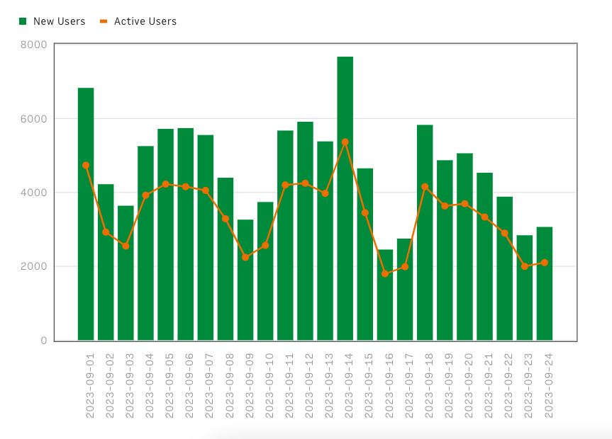
Combo chart
Use a combo chart to show some kind of relationship or trend between multiple data types.
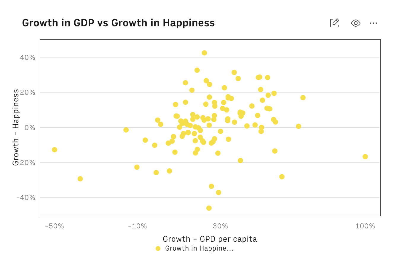
Scatter plot chart
Use a scatter plot chart when your trying to determine whether the two variables are related —
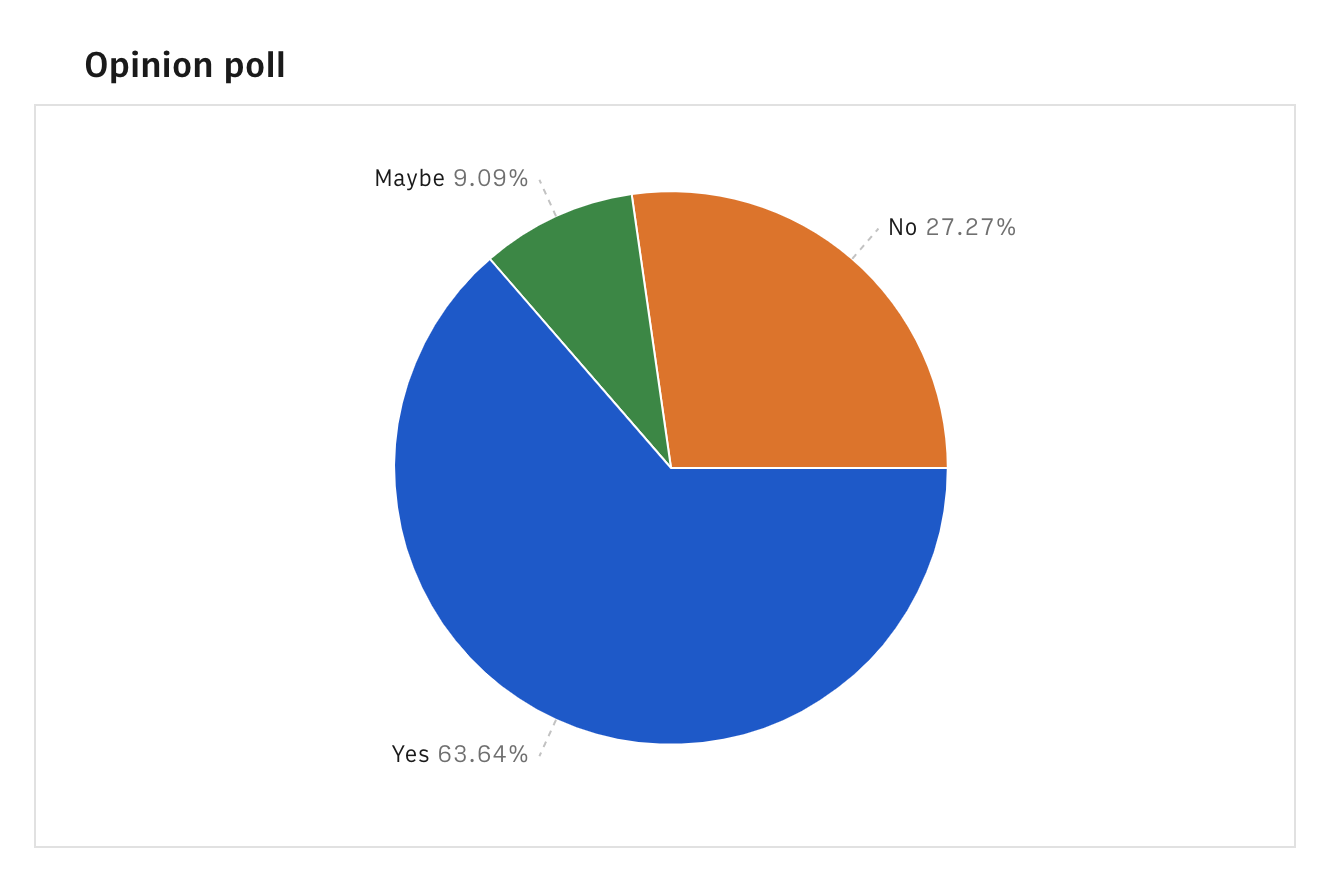
Pie chart
Use a pie chart when you want to get a breakdown of different dimensions from your dataset —